
Slicing up the Pie: New dashboard launched to track drugmaker market share
Earlier this week, Emma Court from Business Insider rocked the drug pricing newscycle with a deep dive into a large federal antitrust lawsuit being brought against nearly 20 generic drugmakers for allegedly collaborating to drive up drug prices. Emma’s coverage of the unredacted suit is an absolute must-read for those (like us) looking for a better understanding of all of the blind spots that exist within the drug supply chain.
As the article points out, this lawsuit brings new scrutiny to the business practices of generic drugmakers. Generic manufacturers have a vital role in our supply chain to bring drug prices down through the following process:
Patent on brand-name drug expires
Generic is introduced by Manufacturer XYZ to market at (modestly) lower price
Other generic manufacturers see opportunity to make money at the current price point, so they seek approval for a new generic, and then bring it to market
Drug price falls
Repeat steps 3 and 4 until the market has driven price down to a level where it’s no longer financially attractive for a new entrant to come to market
This process actually works well for many drugs, as can be seen by poking around with different generic drugs in our Drug Pricing (NADAC) Dashboard. But clearly, as Emma points out, this process is broken for some drugs. This was the motivating factor for creating the NADAC Change Packed Bubble Chart – we wanted an easy way to identify pricing action across all generic drugs. The bubble chart was an eye-opener for us. In most months, there are hundreds of generic drugs that experience sequential increases (some very substantial) in price!
But when it comes to the actual financial impact, it’s not enough to only know price – the change in price must be applied to some sort of utilization to size the overall dollar impact. We use Medicaid data to do this. When you multiply it all out, the generic marketplace, in the aggregate, tends to do its job – it brings the overall spending down.
Note: As a quick aside, last month the generic market in aggregate didn’t do such a great job in bringing drug prices down relative to previous months. Overall annualized deflation using Medicaid’s drug mix was only $17.5 million, way down from last month’s $169 million. For more details on this, see What’s Happening to Generic Drug Prices: December 2018 NADAC Survey Update, published separately today.
But this still leaves a nagging question unanswered – what is the story behind all of those generic drugs that are increasing in price each month? The short answer is that there is no short answer. Some could have legitimately fallen too far, and are now correcting to find the proper market price to earn manufacturers enough money to produce the product. Some could be experiencing real drug shortages (e.g. Valsartan). Some could be experiencing “manufactured” shortages created by supply chain inefficiencies (e.g. Isoproterenol). And then, as we learned this week, some could be subjected to flat out collusion.
When it comes down to it, each drug must be researched to understand (or at least form a theory on) what’s going on beneath the surface of the price.
Drugmaker Market Share Dashboard
To assist with this process, we are launching a new dashboard today: the 46brooklyn Drugmaker Market Share Dashboard. We’ve embedded it for you below, but highly recommend accessing it directly on our site (or even on Tableau Public, where the scaling of the dashboard will be even larger) to get the best experience using this tool. There’s a lot going on in this dashboard, so it will display best on a desktop/laptop – there was just too much information to compress it all into a format that works well on a tablet or mobile device!
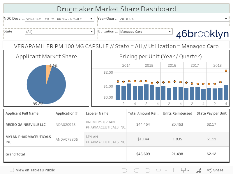
A few notes to hopefully help orient you to this dashboard:
The filters at the top let you select the drug/strength/dosage form (i.e. “NDC Description”), Year-Quarter, State, and Medicaid Utilization Type (Fee-for-Service or Managed Care).
The pie chart will show the market share by drug applicant for the selected parameters. A drug applicant is the name of the entity that filed either a New Drug Application (NDA), or for generics, an Abbreviated New Drug Application (ANDA) with the FDA. This information is available in the FDA’s Orange Book, which we have joined into our other data to create this dashboard.
The table at the bottom provides detailed information on the total Medicaid spending for the selected parameters by applicant name and also by drug labeler. The drug labeler is the entity that is directly marketing the drug. As you poke around, you will see that there can at times be multiple labelers that are marketing off of the same drug application number. One extreme example is the OTC strength (20 mg) of generic Prilosec (Omeprazole) tablets. Dexcel Pharma (NDA022032) is the only holder of an approved drug application for this NDC Description, but this one approved drug is marketed through six different labelers (more on this drug later!).
The chart to the right shows the historical price trend for the selected drug, state, and utilization type (by Year-Quarter). The blue bars show the average per unit National Average Drug Acquisition Cost (NADAC) for all National Drug Codes (NDCs) that CMS rolls up to any given NDC Description, while the orange dots are what the state paid for the drug on a per unit basis. The difference between the two, as we have written about extensively, is the PBM markup (Note: Essentially, “markup” is the difference between the average invoice price that a pharmacy pays to acquire the drug, and what the PBM charges Medicaid managed care plans for the prescription … while the PBM and pharmacy split the “markup,” the PBM controls how much either party receives).
Acetazolamide ER
One of the first drugs highlighted in Emma Court’s report was Acetazolamide ER, a drug that the antitrust suit alleges was subject to price fixing collusion between Heritage Pharmaceuticals and Teva Pharmaceuticals. We found Acetazolamide ER 500 mg Tablets in our new dashboard to see what additional information was available within the government’s public data. As shown in Figure 1, in Q1 2014 market share for this drug was evenly split between three manufacturers: Heritage, Teva, and Zydus Pharmaceuticals. According to Business Insider, this was right around the time that Heritage and Teva started communicating.
Figure 1
Source: Data.Medicaid.gov, FDA.gov, 46brooklyn Research
What happened next – as illustrated in a slightly different view in Figure 2 – is fascinating. Over the next six quarters, Zydus’ Medicaid market share gradually fell to less than 20%, while the price remained stable. That was the high point for the combined share for Heritage and Teva. Starting in Q4 2015, Teva’s market share started to rapidly fall – it was down to the low-single digits by the end of 2016. Fast forward to Q1 2017 and the price of Acetazolamide ER finally started to meaningfully fall, likely not a coincidence as more competition came to market (Nostrum Laboratories). Then in 2018, Novast Laboratories brought a fifth version of this drug to market. This is where we stand today – five approved applications for Acetazolamide ER 500 MG Capsule. More competition appears to have substantially healed this pricing distortion. As of 12/19/2018, this drug had a NADAC of $0.78 per unit, down 73% from its peak NADAC of $2.86 per unit in March 2015.
Figure 2
Source: Data.Medicaid.gov, FDA.gov, 46brooklyn Research
Generic Prilosec OTC (tablets)
As we played around with this dashboard, it helped shed light on some other drug pricing questions that we have piling up on the back burner. One of the drugs that we have been scratching our heads on for some time now is generic Prilosec OTC tablets (Omeprazole 20 mg Tablets), especially in Ohio Medicaid managed care. This drug first popped onto our radar back when we put together the Top 20 Over $20 visualization. This drug was shockingly #5 on the list (Figure 3).
Figure 3
Source: Data.Medicaid.gov, 46brooklyn Research
Why “shockingly?” Well, because as an over-the-counter drug, we were surprised that it could experience such poor price transparency within Medicaid, especially when it only takes a quick Google search to find a 42-count package for $14.99 at Target ($0.36 per tablet), $14.97 at Walmart ($0.36 per tablet), and $16.49 at CVS ($0.39 per tablet). Yet here we have Ohio Medicaid being charged an average markup of $153 for each prescription dispensed in their PBM-controlled managed care pharmacy program.
The Medicaid Market Share Dashboard can help shed light on what is going on here. We applied the following filter to the tool:
NDC Description = Omeprazole 20 mg Tablet
Year-Quarter = 2018-Q2
State = OH
Utilization Type = Managed Care
This outputted the graphic displayed below in Figure 4.
Figure 4
Source: Data.Medicaid.gov, FDA.gov, 46brooklyn Research
Two things immediately jump off of this graphic, both highlighted in red. First, looking at the red arrow, starting in Q2 2017 the price being charged to Ohio for this drug started increasing faster than bitcoin in late 2017. Second, looking at the red circle, we can hypothesize why – the state is paying $6.74 per tablet for the version of this drug produced by Major Pharmaceuticals, and between $0.50 and $0.60 per tablet for all the rest. Keep in mind these are the same drugs we are talking about – literally, exactly the same drug (this dashboard makes clear by showing that all labelers are marketing off of the same drug application, owned by Dexcel Pharma). Yet one costs 12x more than all the rest, and that’s the one Ohio Medicaid managed care is predominantly buying.
If you were to pull up the dashboard and flip through each quarter, you would see exactly what happened. Major’s price never really changed over time. It’s just that Ohio’s utilization shifted to this higher cost item. But rather than making you do this, we’ll steal that helpful tactic from those cooking shows where as soon as they are done mixing ingredients together for a cake, they simply pull a fully-baked version of it out of the oven to save time for everyone. Figure 5 is the fully-baked cake.
Figure 5
Source: Data.Medicaid.gov, FDA.gov, 46brooklyn Research
There are a few market failures that likely created this situation.
First, Major Pharmaceuticals set its Average Wholesale Price (AWP) for this drug way back in 2010 at $8.78 per tablet for a 14 count box. It remains at the same price today. Compare that to Perrigo’s AWP, which was set back in 2012 at $0.69 per tablet for a 14-count box (unchanged today). As we have discussed, AWP is an arbitrary pricing benchmark for generics that has no relevance to the actual market-based price of a drug. Hopefully, this example illustrates how irrelevant it is, and how widely it can vary for literally the exact same drug.
However, even with this failure, the state still should have never been subjected to these prices. One of the most valuable functions that the PBM provides is to normalize payments across substitutable drugs that have the same active ingredients, strength and dosage form. Clearly, the PBM dropped the ball (whether purposely or not) with this drug, subjecting the state of Ohio to the wildly off-the-mark AWP set by one manufacturer to grab market share.
The third market failure relates to formulary management. Omeprazole 20 mg is also available in a Capsule form, that has seven competing manufacturers and as a result, sports a NADAC of only $0.04 per capsule (compared to the tablet’s NADAC of ~$0.50). Ohio Medicaid managed care actually did a wonderful job controlling costs on this dosage form, charging the state only $0.12 per capsule. If there is this large of a pricing gap between the two dosage forms, why wouldn’t the PBM use its preferred drug list to direct beneficiaries towards the capsule instead of the tablet?
West Virginia has been very public about their experience in carving out their prescription benefits program and the resulting benefits of this decision. Results aside, one thing that they have undoubtedly accomplished is a full alignment of the incentives of the people managing the prescription benefits (the state) with those of the people paying the bill (also the state). The same “people” now do both! So we wondered, in a fully aligned model, how often would you dispense Omeprazole 20mg Tablets? The answer is you wouldn’t. There are actually no records in our database for the tablets in West Virginia’s Medicaid Fee-for-Service program. Which makes sense… If it was your money, would you pay $0.50 for something that costs $0.04, unless you really had to? Or if you’re Ohio, how about $4.00?
“Done is better than Perfect”
Here’s some behind-the-scenes information for readers that have made it this far in this report – we have, in one way or another, been tinkering around with this dashboard for nearly two months. Venturing into the world of market share has resulted in more questions than answers, and lots of iterating to try to produce something that is of some value to the public. We acknowledge we are not quite there yet with this tool - it’s very much a work in progress. There are many other data sources out there that we are hearing about almost daily that can help us better understand where we have real versus manufactured shortages. We need to incorporate these into this tool over time.
But to quote time management guru, Laura Vanderkam, “done is better than perfect.” It was time to stop noodling and to just be done. Hopefully this new tool is a helpful addition to your drug pricing analytics toolbox. If you have any suggestions on how we can make this more useful, don’t hesitate to reach out.