
What’s happening to generic drug prices? June 2019 NADAC Survey Update
NADAC survey results week has passed, which means it’s time to check in on generic drug price changes.
There was a lot of movement on drug prices this month, so be sure to click through our new updated visualizations (NADAC Change Packed Bubble Chart and Drug Pricing Dashboard) to see the impact.
As a reminder, each month retail pharmacies across the country are surveyed by Myers Stauffer (on behalf of the Centers for Medicare and Medicaid Services) on their wholesaler invoice prices. The results are then compiled and released either the third or fourth week of the following month. On June 19th, survey results were released that reflect National Average Drug Acquisition Cost (NADAC) price changes from May. Here are our top takeaways on the results:
1. A marginally less ugly month for generic prices
Each month, we first look at how many generic drugs went up and down in the latest month’s survey of retail pharmacy acquisition costs, and compare that to the prior month. As shown in Figure 1, after a horrid May, June’s numbers got a bit better. There were a lot more drugs that decreased in price this month when compared to last month, and a lot less drugs that increased in price.
Figure 1
Source: Data.Medicaid.gov, 46brooklyn Research
To put some numbers to this, for every generic drug that experienced a price decline this month, there were 1.15 generic drugs that experienced a price increase. That’s way down from a ratio of 1.79 last month, but still significantly higher than the rock-bottom 0.62 we saw two months ago.
In May, there were 2% fewer generic drugs that experienced a 0-10% price increase, and 45% fewer generic drugs that experienced a price increase of more than 10%. Conversely, there were 31% more drugs that experienced a 0-10% price decrease, and 2% more drugs that experienced a price decrease of more than 10%.
Overall, our assessment is a resounding, “Meh.”
2. This month brought $49 million of annualized inflation using Medicaid’s drug mix
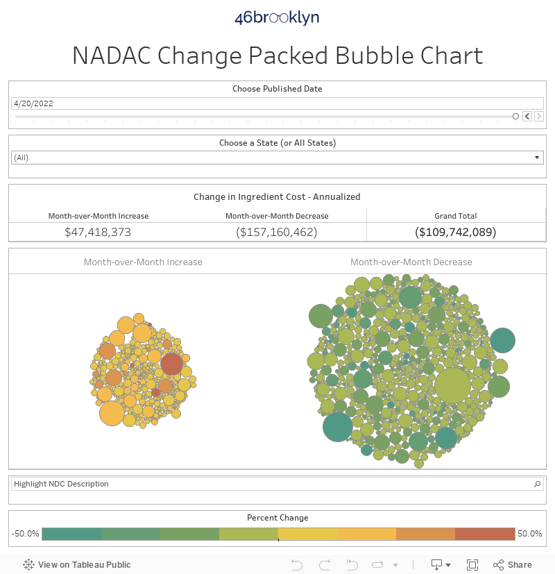
As we’ve written in prior updates, knowing the price change alone is not enough. We need to apply utilization (drug mix) to the price changes, which is the purpose of the NADAC Change Packed Bubble Chart. We use Medicaid’s 2018 drug mix to arrive at an estimate of the total dollar impact of the latest NADAC pricing update. The green bubbles on the right of the dashboard below are the generic drugs that experienced a price decline in the latest survey, while the yellow/orange/red bubbles on the left are those drugs that experienced a price increase. The size of each bubble represents the annualized weighted impact of the drug on Medicaid – i.e. we multiply the survey price change by aggregate drug utilization in Medicaid. Add up all the bubbles, and we get the total annualized inflation or deflation. This month, there was $49 million of inflation. This marks the first time we have seen two consecutive months of inflation since we started tracking this last August.
3. Year-over-year deflation falls into the single digits
As pointed out by Pew Charitable Trusts earlier this year, there have been great strides in increasing generic approvals, but competition for many of these drugs appears to be lagging. In last month’s update, we took a stab at calculating year-over-year (YoY) deflation over a longer time period. Of course, our NADAC Change Packed Bubble Chart is a useful way to see which drugs are moving the needle the most each month, but the more months of data we compiled, the more we found ourselves looking for more context. Stated more bluntly, we needed to answer the “so what?” question.
Last month, we set out to develop a way to quickly measure current year-over-year generic deflation and assess whether it’s getting better or worse. We provided you with a comparison of year-over-year (YoY) deflation over the past five years (each year ending in May). A helpful start, but with another month to ponder the best way to present this data, we decided we had to take this analysis further. We realized to truly answer the “so what?” question, we needed a robust time series of monthly year-over-year deflation.
So, this month we bit the bullet, rolled up our sleeves, and calculated YoY deflation for the last TWENTY-FOUR months. 😓 While exhausting, as you’ll see further down in Figure 2, it was worth the effort. We can now not only see current generic deflation, but the visual (complete with average and standard deviation lines) immediately provides context on how “good” or “bad” current month deflation truly is.
Before we share our takeaways, here’s a few notes on our methodology. Please note, we slightly tweaked the methodology from last month to make this analysis a bit easier to replicate each month.
Methodology
For each monthly period, we:

Download NADAC prices for all National Drug Codes (NDCs) in the month (“n”) and the same month in the prior year (“n-1”). Eliminate all NDCs that do not have NADAC prices available in both periods. Note: we are analyzing oral solids only to avoid units of measure mismatches. For an explainer on why that’s necessary, see discussion here.
Multiply NADAC unit costs by total Medicaid “units reimbursed” in the prior calendar year period. For example, to size June 2019 deflation, multiply by total 2018 Medicaid units reimbursed. To size March 2018 deflation, multiply by total 2017 Medicaid units reimbursed. To size November 2017 deflation, multiply by total 2016 Medicaid units reimbursed. You get it.
Add up all cost in period n-1. Add up all cost in period n. Subtract the latter from the former. That’s the total dollar deflation. Divide total dollar deflation by n-1 cost. That’s the percent deflation.
Repeat 23 times!
Results
Here is the new chart. 24 months of YoY deflation (oral solids only) with an average line and standard deviation bands. It turns out that for 23-months deflation was innocuously bouncing between 14% and 18%. So last month’s drop to 14% was statistically speaking, quite normal.
Figure 2
Source: Data.Medicaid.gov, 46brooklyn Research
This month is a different story. You may want to go ahead and at least locate your pitchforks and torches, because in one month, deflation plummeted from 14% to under 10% (9.8% to be precise). The U.S. drug pricing system is heavily reliant on generic drug deflation in order to offset price increases on current brand drugs as well as new, expensive, and innovative (hopefully) treatments entering the market. What this new data shows is that the generic marketplace is underperforming (relative to prior time periods) in its role to drive costs down.
It is important to note that this is only one data point. It could be an errant data point – possibly reflective of a “paucity of new generic introductions?” Or it could be the early signs of the impact of generic manufacturer product rationalization after multiple years of double-digit deflation browbeating. Too early to tell… but one thing is certain – anyone interested in drug pricing should be keeping a close eye on this.
What are you seeing?
Well, we spent way too much time developing this new monthly generic deflation tracker and ran out of time to dig deeply into individual NDCs. We saw generic Gleevec (Imatinib Mesylate) jump more than 50%, and we also saw generic Cialis (Tadalafil) prices crash. But after nearly a year of these monthly updates, we feel very comfortable leaving this work in your very qualified hands this month. So, what are you seeing? Can you figure out what’s driving the movements in generic drug prices highlighted in this visualization? Be sure to use all of our updated Visualizations that rely on NADAC prices as you are doing your research. If you’re seeing any interesting movement on drugs in the dataset, let us know.
Be sure to check out the new analysis from the Massachusetts Health Policy Commission (HPC) that dove into the wild world of prescription drug markups. The HPC study gives 46brooklyn a shout-out too, as their team adapted some of our methodology in identifying markups occuring in the Massachusetts Medicaid managed care program. As an added bonus, the HPC study also examined Massachusetts commercial payer data, and unsurprisingly, the same problems identified in Medicaid seem to be occurring with employers as well.
Thanks to Ed Silverman at STAT News for his excellent write-up on the efforts of New York and Massachusetts to shed light on the role PBMs play in inflating generic drug costs. 46brooklyn's Antonio Ciaccia weighs in on the insightful work of these two latest states to scrutinize the prescription drug supply chain.