
The Medicaid Markup Galaxies: Discover which drug markups are out of this world
“The waiting is the hardest part”
In case you were curious, here is our morning routine over the past two weeks. Get coffee. Open laptop. Go to Data.Medicaid.gov. Surf over to CMS’ 2018 State Drug Utilization Data page. Get more coffee. Check the “updated” date hoping to see today’s date (which means that CMS posted Q3 2018 data) and not “October 24, 2018” (the day when CMS posted Q2 2018 data). This morning it still says October 24, 2018 (sigh). The waiting is the hardest part.
Based on history, CMS should be posting Q3 2018 state utilization data any moment now, and we’re anxious to incorporate this new quarter of data into our visualizations to see what changed in the latter part of 2018. We remain naively optimistic that one day Medicaid managed care unit costs will better align with drug acquisition costs. This whole random drug pricing markup nightmare will be a distant memory, bringing some semblance of logic to generic drug costs in managed care.
The impermanence of 46brooklyn
With unprecedented attention mounting on drug pricing distortions, we feel like we’re inching our way closer to this organization’s extinction, which for everyone else but us, would be a fantastic thing to happen. 46brooklyn Research exists to use data to shed light on the many ways that the drug supply chain is failing us. What a wonderful day it will be when drug pricing data make logical sense. We will have nothing to write about!
But that day is not today. Our drug supply chain still very much resembles an M.C. Escher painting. It’s nearly impossible to look at from one angle and understand what you are seeing. By analyzing it from multiple angles, we can start to understand its true nature. This is what our tools are intended to do – provide different angles from which we can view this very confusing and troubling “painting.”
To that end, today we are releasing yet another way to visualize generic drug markup in U.S. state Medicaid programs. We call it the 46brooklyn “Medicaid Markup Galaxies” dashboard. But before we talk about galaxies, let’s zoom out and revisit the universe.
Medicaid Markup Universe – revisited
A few months ago, we released our Medicaid Markup Universe Viz. This dashboard collects all generic drugs dispensed within different state Medicaid programs and displays each as a bubble. The larger the bubble, the greater the cost the state is paying for that drug relative to its acquisition cost (i.e. “markup”).
In most managed care programs you’ll see a lot of high-markup drugs congregating at the center of the universe, but also many low-markup drugs around the periphery (Figure 1 shows this dynamic for Arizona managed care in Q2 2018). This is because most managed care contracts between health plans and their pharmacy benefit managers (PBMs) do not include any sort of requirement for the PBM to price drugs to the state based on their actual cost. The PBM does typically commit to deliver a certain overall Generic Effective Rate (GER) for the Plan, where GER is the discount the health plan pays to the cumulative Average Wholesale Price (AWP) for all generic drugs dispensed over some period.🤯Of course for any given drug AWP has nothing to do with the drug’s actual cost, so the value of this commitment is debatable.
Figure 1
Source: Medicaid.gov; 46brooklyn Research
Anyway, the point of this digression is that it should come as no surprise that managed care drug costs for individual generic drugs don’t really have much connection with their acquisition cost. Nor should it come as a surprise that what the state pays for individual drugs (see our reports on Generic Gleevec, Generic Plaquenil, and Pennsylvania) does not trend with acquisition cost. The system is inherently designed to not make any sense at the individual generic drug level.
This is not the case in Medicaid fee-for-service programs, where CMS has mandated a generic drug pricing model that adds a pharmacy professional dispensing fee to each drug’s actual acquisition cost, or “AAC”. Clearly, the markup universe charts look very different for most fee-for-service programs, showing much more uniformity in size across all of the bubbles (Figure 2 shows this dynamic for the Georgia fee-for-service program).
Figure 2
Source: Medicaid.gov; 46brooklyn Research
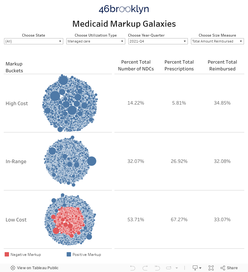
Medicaid Markup Galaxies
While the Medicaid Markup Universe provides a good qualitative feel for individual drug pricing distortions, it doesn’t help quantify the distortions. This, to us, was our next logical project. To better quantify the pricing distortions in each Medicaid program, we designed a new visualization that drills down to three different groups (or celestially-speaking, “galaxies”) within the universe. We call them the High-Cost, In-Range, and Low-Cost galaxies.
Let’s start with how we defined the In-Range galaxy. This galaxy simply includes all drugs in a given quarter that have a markup between $5 and $15 per prescription. Where did we get that range? Mostly from analyzing the professional dispensing fees (i.e. surveyed pharmacy operating costs) reported by 42 states to CMS as of September 2018. The average professional dispensing fee across all states is $11.30 per prescription, but it ranges from the high-$8s (Rhode Island) to the $20s (pharmacies with no road access in Alaska). If you are interested in all the nitty-gritty details on how a state conducts one of these surveys read this.
Figure 3
Source: Medicaid.gov; 46brooklyn Research
Note: Some states have set a tiered dispensing fee based on pharmacy size. This map averages all tiers for each state, and rounds the average to the nearest dollar. All dispensing fees on a per prescription basis.
There’s no real science behind the $5-15 per prescription definition for this galaxy. It generally aligns with the range of operating cost surveys collected from retail pharmacies across the country, with a few dollars of padding on either end to help account for the error inherent in our work, given the limitations of working with aggregated data. And then there’s the fact that $5 to $15 is easy to remember. Just being honest. 🤷♂️
Now that we’ve defined the In-Range galaxy, the other two are simple – High-Cost includes all drugs with a markup greater than $15 while Low-Cost includes all drugs with a markup of less than $5. With that as context, we’ve embedded the dashboard below. You can also access it at its home on our visualizations page.
Massachusetts case study
The first thing you will likely notice is a lot of bubbles over on the left side of the dashboard. Each bubble is a different generic national drug code (oral solids only, again to avoid units of measure mismatches). Hover over any bubble to bring up information on that NDC. The bubbles are grouped into the three different galaxies depending on their markup in the selected year and quarter. To change the time period, use the drop-down filter at the top of the viz. Same deal with State and Utilization type (managed care vs. fee-for-service), as shown below in Figure 4.
Figure 4
Source: Data.Medicaid.gov, 46brooklyn Research
We’ve added another feature as well that hopefully will help users gain a better understanding on how these programs are being managed. In the top left, there is a drop-down called “Choose Size Measure.” This provides you with the ability to change how the bubbles in the visualization are sized. The dashboard defaults to markup per prescription as the size measure. But you can also switch this size measure to either number of prescriptions or total amount reimbursed. As shown in Figures 5 and 6, for Massachusetts Medicaid managed care, switching the size measure tells a vastly different story.
Note: The dark orange bubbles have a negative markup – i.e. the state’s reported cost for this NDC was lower than its average pharmacy acquisition cost (NADAC)
Figure 5
Source: Data.Medicaid.gov, 46brooklyn Research
Figure 6
Source: Data.Medicaid.gov, 46brooklyn Research
The percentages on the right side of the visualization help show what’s going on without having to flip between size measures. Putting it all together, here’s the story for Massachusetts, at least in Q1 2018:
Massachusetts paid less than a $5 markup for the majority (71.49%) of its NDCs and its prescriptions (84.54%) – Figure 5
But there were some monstrous markups among the only 6.15% the state’s High Cost prescriptions – Figure 4
As a result, 6.15% of the state’s managed care prescriptions resulted in 41.33% of the state’s managed care cost – Figure 6
Make sense? Of course it doesn’t make sense. Again, managed care drug pricing is not currently designed to make any rational sense at the individual drug level. This is not just a Massachusetts issue. Work your way around the country using the dashboard’s state filter, and you’ll see that the same dynamic is occurring in most state managed care programs.
However, switch over to fee-for-service in states that have implemented an acquisition cost-based model for drug pricing (Massachusetts is one of those states) and you’ll see a vastly different story. The majority of NDCs, prescriptions, and cost resides in the In-Range galaxy (Figure 7).
Figure 7
Source: Data.Medicaid.gov, 46brooklyn Research
To be fair, fee-for-service has its share of pricing distortions as well, although these tend to be concentrated within the states that have dragged their feet on implementation of the CMS Covered Outpatient Drug Rule requirement to price generic drugs using an acquisition cost plus professional dispensing fee model. Washington state was sued by the Washington State Pharmacy Association (WSPA) for setting dispensing fees, “dramatically lower than any other state in the country.” Figure 8 suggests that WSPA has a pretty solid argument – 94% of prescriptions in Washington fee-for-service had a markup of less than $5 per prescription in Q1 2018.
Figure 8
Source: Data.Medicaid.gov, 46brooklyn Research
The complete polar opposite to Washington is Missouri, who until Q4 2018 was apparently still reimbursing pharmacies for generic drugs in fee-for-service based on a discount to AWP. Figure 9 shows what that sort of a model looks like – 90% of prescriptions had a markup of more than $15 per prescription in Q1 2018.
Figure 9
Source: Data.Medicaid.gov, 46brooklyn Research
Pricing spread
As we’ve written extensively, markup is not spread. In Medicaid fee-for-service programs, which by definition are full pass-through programs, the markup should all go to the pharmacy. Conversely, in Ohio Medicaid managed care, our analysis indicates that the majority of markup was taken as spread by the PBM/health plan.
Regardless, as you are looking at this dashboard for managed care, consider that each bubble represents margin that is “feeding” two different mouths – the PBM and the pharmacy. In managed care, as long as the PBM meets its AWP-linked guarantees to the health plan, it pretty much has unchecked latitude to decide how much margin it’s going to feed its pharmacy network versus how much margin it will keep for itself.
Sticking with our analogy, for the High-Cost drugs, the PBM is setting the price at a level where there is a lot of food to go around, but we are left in the dark on how PBMs decide to share the bounty. For the Low-Cost drugs, the PBM is setting the price at a level that – at least according to CMS’ pharmacy operating cost surveys – will cause pharmacies to starve, even before we account for any potential pricing spread. The In-Range drugs may look fine on the surface, but the PBM could be taking all of the margin and starving pharmacies, or taking none at all and passing it all through. We simply do not know. Instead, we are asked to trust that this is all working and turn a blind eye to the dangerous knock-on effects (e.g. pharmacy closures -> patient access issues -> reduction in medication adherence -> increase in hospital expenses) that this system could be creating.
What $208 million of spread looks like
Thankfully, states are wising up to what’s going on and are starting to perform audits on their Medicaid managed care programs to assess pricing spread. Our home state of Ohio got much attention for finding $208 million of generic drug spread within managed care (31.4% of gross generic costs) over a recent 12-month period. With a number this large, you may expect the galaxy dashboard to be heavily skewed to High-Cost drugs. But this is not the case. Figure 10 shows the galaxy dashboard for Ohio Managed Care over the audit period (Q2 2017 - Q1 2018) with the size measure set to “Number of Prescriptions.” Over this period, 76% of all prescriptions fell in the Low-Cost galaxy. In other words, 76% of all prescriptions were priced less than $5 above average pharmacy acquisition cost. With over three quarters of Ohio’s prescriptions priced at less than half the pharmacy’s cost to dispense, it should come as no surprise that HealthPlan Data Solutions found managed care to be $145 million less expensive than CMS’ fee-for-service drug pricing model (excluding the “potential increase in rebates… which would offset the increase in prescription claim costs in fee for service”).
Figure 10
Source: Data.Medicaid.gov, 46brooklyn Research
The surprising part to us after seeing Figure 10 is that managed care was only $145 million cheaper than fee-for-service when only pharmacy reimbursement differences are factored in. We calculate the weighted average markup of the Low-Cost drugs to be a paltry $1.23 per prescription. With costs this low on the majority of drugs, Ohio managed care should be delivering nearly $300 million in relative cost savings for the state (to pharmacy’s chagrin).
Flipping the size measure to “Markup per Prescription” helps complete the picture (Figure 11). The High-Cost galaxy is chock full of generic drugs with egregious markups. The weighted average markup across the 2,298 NDCs in this galaxy was a staggering $51.91 per prescription, and included 139 NDCs with a markup north of $200 per prescription. That’s a bumper harvest worth of “food” to go around, and Ohio found most of it tucked away in the middleman’s storage silos.
Figure 11
Source: Data.Medicaid.gov, 46brooklyn Research
Audits hold the supply chain accountable
For those of you who don’t know our backstory at 46brooklyn, our launch was born out of our work over the last few years trying to untangle the Medicaid drug pricing problem in Ohio. Eric was on the short end of the stick in his role in management of a small chain of pharmacies, and Antonio has been living it through his government affairs work for the Ohio Pharmacists Association. As we learned about the wild pricing subjectivity in the Ohio Medicaid managed care program, we began educating administration officials, lawmakers, and local media on the nature and mechanics of the pricing distortions buried in the drug supply chain. This helped lead to the Ohio audit that provided much needed transparency into how Ohio taxpayer money is being divvied up across the drug supply chain. Because we feel very strongly that transparency is a necessary precondition for drug pricing reform, we launched 46brooklyn as a way to help the public fill the knowledge gaps that we once had. We all have to pay for this system. We believe we deserve to know what we’re buying.
But ultimately, there is only so much that can done with public data to understand what is going on with spread pricing. Hopefully, we are able to provide a slightly clearer picture of the “painting” with each new visualization we publish, but no matter how many angles we look at this picture from, we’ll always be limited by having to view it from a distance. States shouldn’t have these same limitations with the amount of money they are paying to managed care plans, PBMs, and pharmacies. States should be grabbing the painting off the wall, tearing it to pieces, and putting the pieces under a microscope to fully assess what is going on. Ohio did exactly this nearly eight months ago and is still struggling with how to implement a fix to the problem that closes all of the loopholes. Other states should take notice. Getting the facts on what is really going on, while seemingly a daunting task, will prove to be the easy part when compared to implementing an effective fix.