
New CMS Medicaid drug pricing data released with stunning findings
“If you torture the data enough, nature will always confess.”
At 46brooklyn, we believe that the details matter. And “details” ultimately means “data.” We’re excited to share that CMS has gifted us with even more data to play with. Recently, CMS updated their State Utilization databases, which provides quarterly drug pricing data that shows what state Medicaid programs are spending on prescription drugs. This most recent data update ended up filling in most of the Q2 2018 potholes and extended the 2018 data to include large portions of the third quarter. We have updated all of our dashboards that rely on this dataset, rolling all of them forward to Q3 2018, and there are some insightful takeaways.
This update is a really big deal for us at 46brooklyn, because it is the first time that a dataset’s timing will overlap with our existence as an organization. We formally launched 46brooklyn on August 1, 2018, after months working to peel back the drug pricing onion in the Medicaid managed care program in our home state of Ohio, where a state audit revealed $224.8 million in previously hidden “spread pricing” being captured by pharmacy benefit managers (PBMs). If you haven’t heard about the drug pricing controversy that has blown up in the Buckeye State, things have moved beyond just the Medicaid program and are heating up rapidly. To follow the timeline of events in Ohio, read up on the Columbus Dispatch’s award-winning Side Effects series.
With our launch in August 2018, this meant that CMS’ latest utilization data update for Q3 2018 would be the first real quarter of data that at least theoretically could have been impacted by our work and Ohio’s work to bring transparency to drug pricing in state Medicaid programs and beyond.
With that, there are several important takeaways from our first glances at the data, but we highly recommend for you to spend some time digging through our updated visualizations to see if you can catch any drug pricing distortions that maybe we missed. To check out our various newly-updated dashboards, click the links below:
Here’s our insights from the newly-updated Q3 2018 State Utilization Data:
Generic Gleevec markups continue to climb
Of all the drugs we’ve analyzed since we first launched, generic Gleevec (Imatinib Mesylate) has been the apple of our eye. Our very first drug pricing report was solely focused on the expensive leukemia drug, and we’ve continued to track it in our drug pricing reports over the last few months. It’s also been a big focus for Robert Langreth and the good folks over at Bloomberg.
It’s a really important drug to watch for a number of reasons:
First, due to the big price tag of brand-name Gleevec, the release of a generic was highly anticipated and was slated to serve as an industry-wide “educational event.”
Second, once a generic for Gleevec was released (Imatinib Mesylate), the cost for patients stayed stubbornly high.
Third, it’s the drug that is always prominently featured in our Visualizations, because it routinely has the highest markups out of any other drug in the marketplace. From Q3 2017 to Q2 2018, state Medicaid managed care programs reported average markups of $2,514.11 per prescription.
Fourth, generic Gleevec has enough datapoints in publicly-available pricing files, where it registers both a National Average Drug Acquisition Cost (NADAC) price as well as Medicaid State Utilization Data as well. This is not always the case for many specialty drugs, either because there isn’t enough dispensing data to determine how much state Medicaid programs are being charged, or because specialty pharmacies aren’t submitting invoice acquisition costs to CMS for their NADAC survey. If either one of these is missing, we are not able to pinpoint markups, thus making analysis very difficult.
Lastly, as one of the first major oral specialty drugs to go generic, it serves as an important test case for what could happen in the entire specialty drug market when future generics and biosimilars are released.
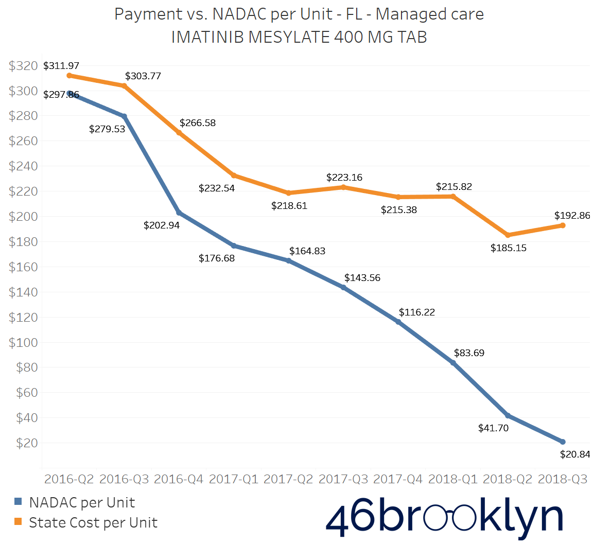
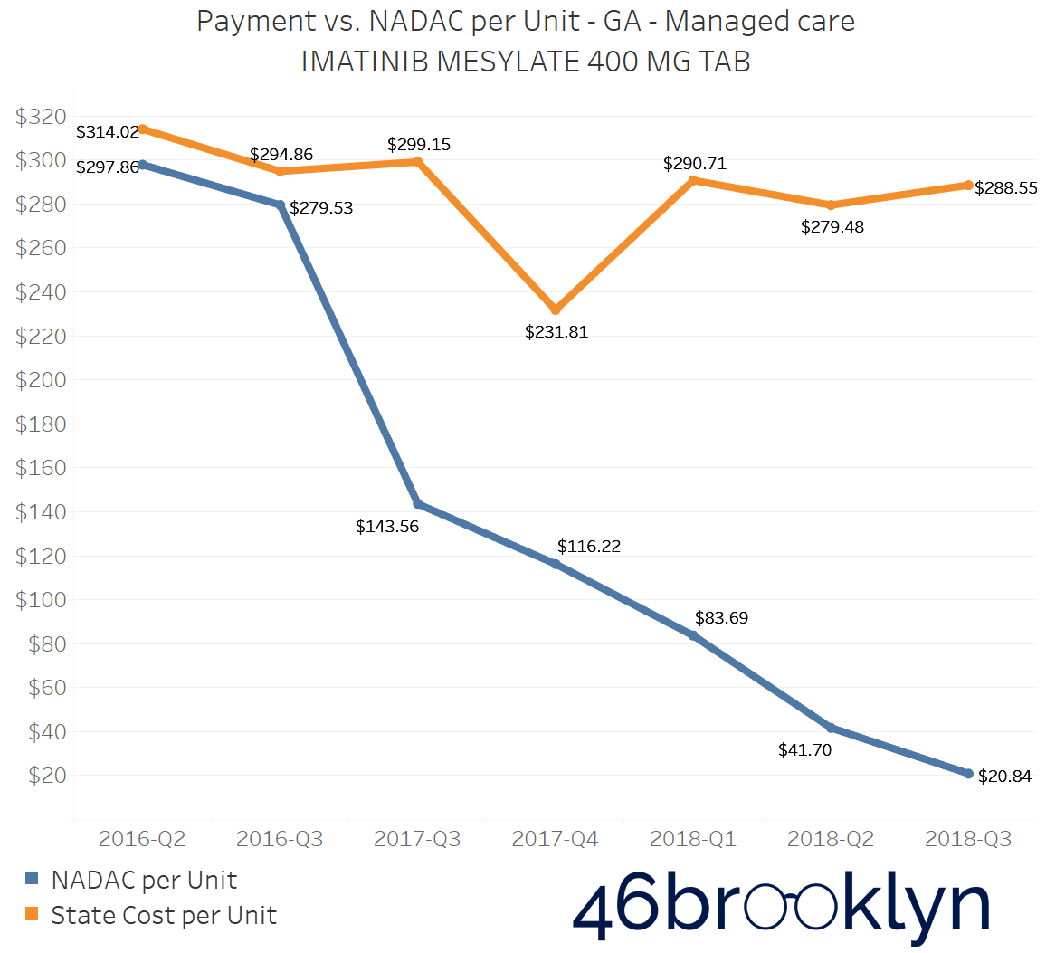
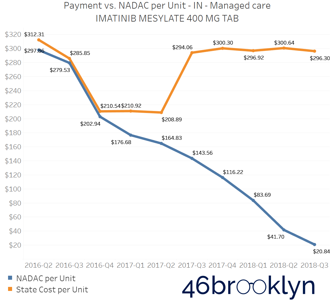
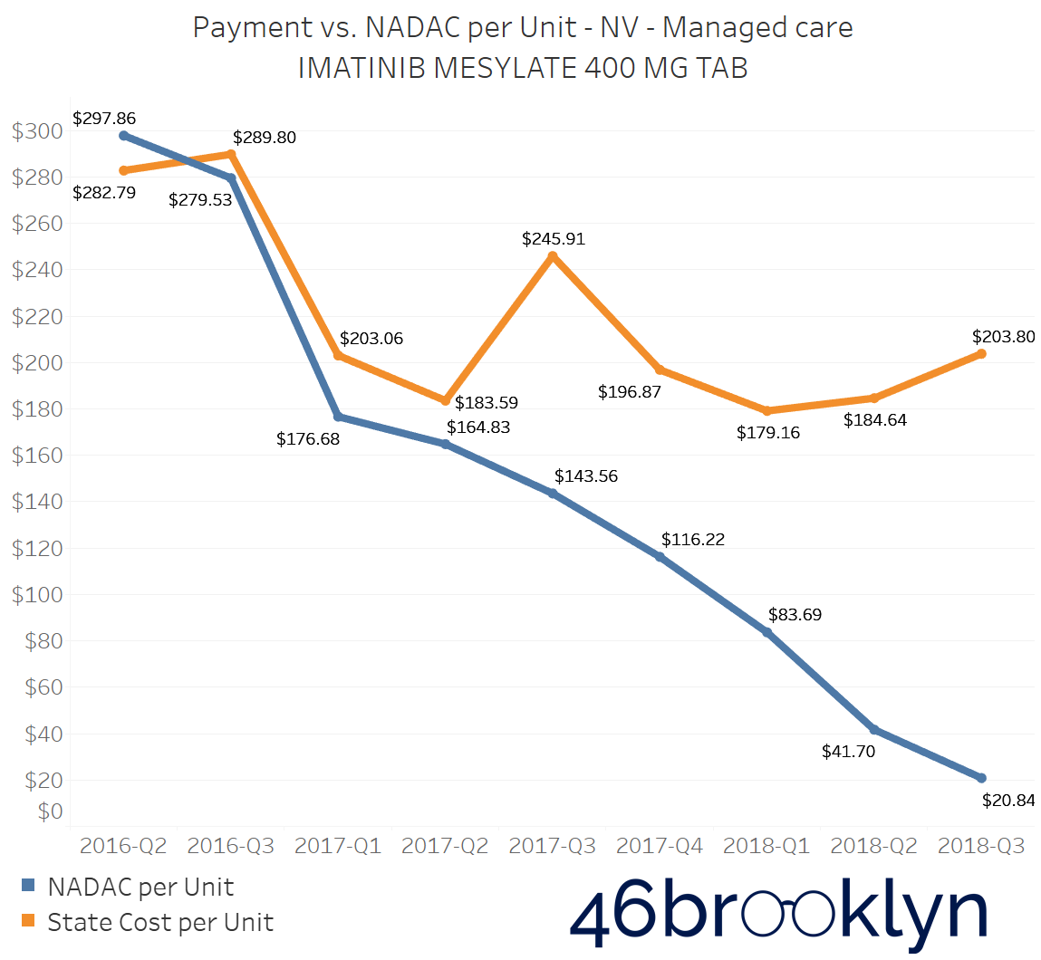
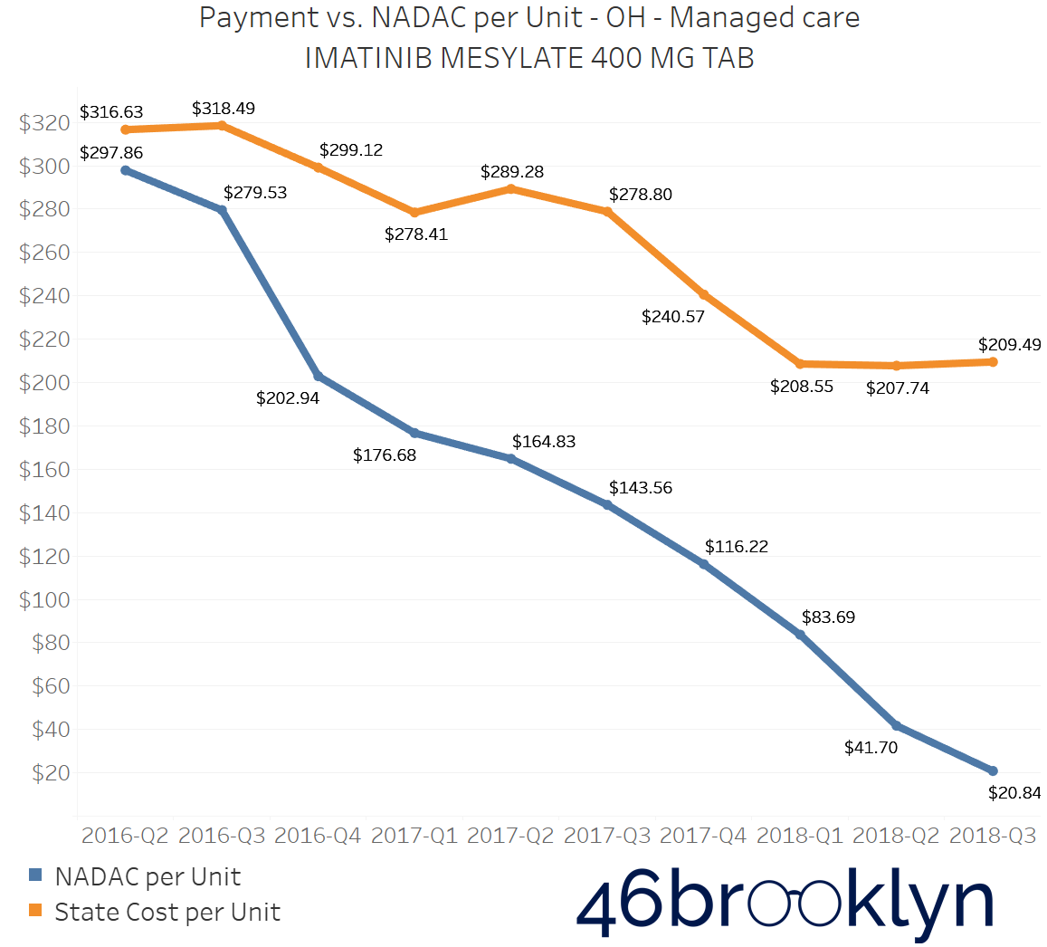
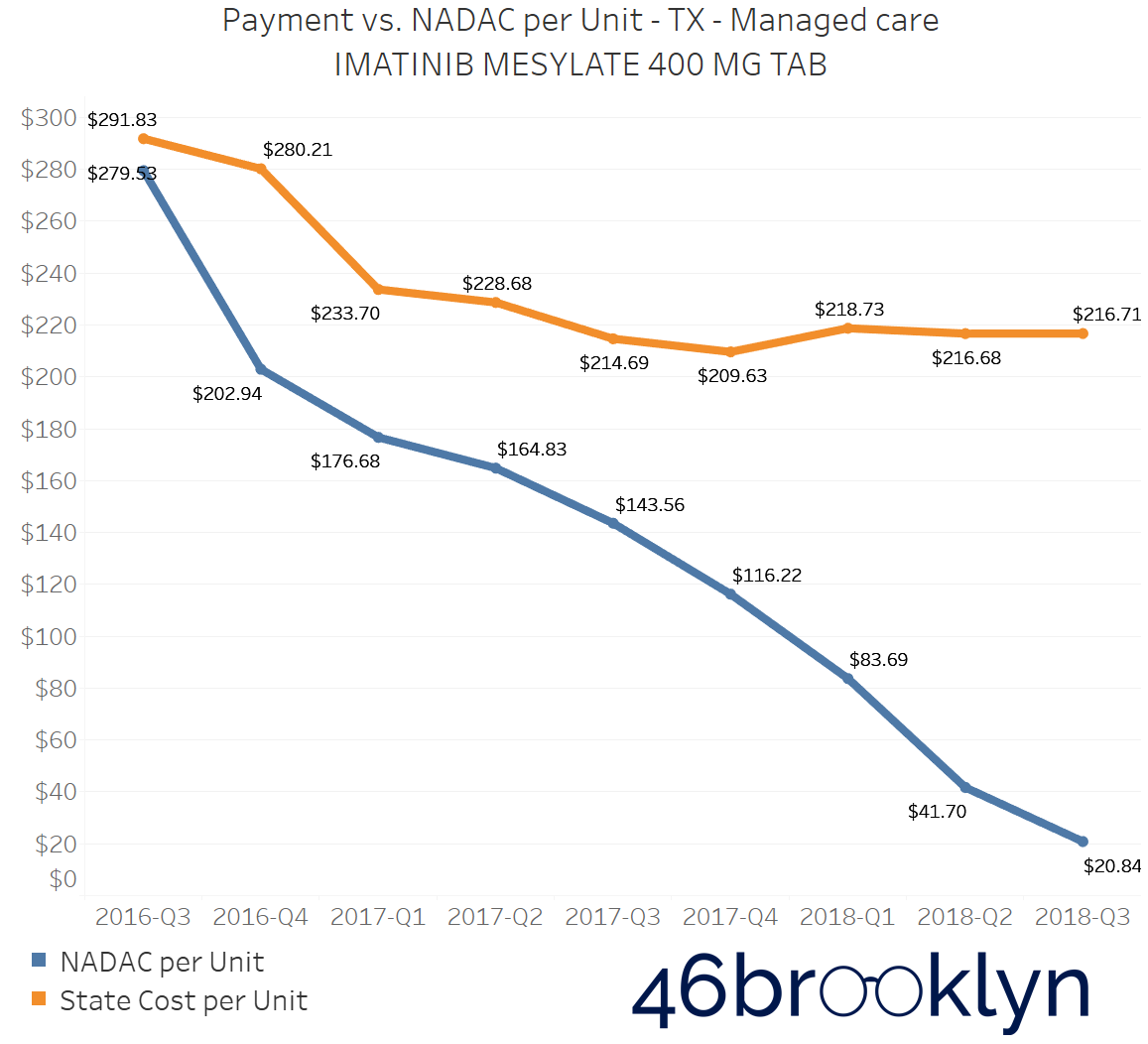
As we examine the markup changes from Q2 to Q3 2018, we can see several states where Imatinib Mesylate 400 mg Tablet markups continued growing. In fact, for many state Medicaid programs, Imatinib Mesylate had the highest markups out of every prescription drug we have the ability to analyze. Making matters worse is that many of those same states also saw this same drug have the highest per unit markup increase from Q2 to Q3. Simply put, a drug that was already the worst deal saw that bad deal get even worse.
For example, in the state of Kentucky, where PBM scrutiny within their Medicaid managed care program has begun to hit a boiling point, the markup per unit of Imatinib Mesylate 400 mg rose by $49.84 – all this at a time when the drug’s actual NADAC price was essentially cut in half.
Figure 1
Source: CMS.Data.gov; 46brooklyn Research
Being that CVS/Caremark is by far the dominant PBM in the Kentucky Medicaid managed care program (they have four of the five Kentucky managed care plans), and given that this drug’s generic release was on CVS/Caremark’s radar back in 2016, it begs the question of why the markups on this drug are so high, and why they continue to grow, given that CVS/Caremark controls what they pay to pharmacies and what they essentially bill back to the state.
The problem of escalating markups was not isolated to Kentucky. As you will see below, we saw substantial markup increases in states like Florida, Georgia, Indiana, Nevada, Ohio, and Texas (click the arrows to the right and left to flip through the figures embedded in the gallery below).
And for all you proponents of Medicaid Fee-For-Service (FFS) programs, don’t go thinking the grass is always greener. While most state FFS programs kept Imatinib Mesylate markups under control, the state of Missouri saw the biggest jump in the country, increasing by $83.58 per tablet!
Figure 2
Source: CMS.Data.gov; 46brooklyn Research
We believe that this drug deserves greater scrutiny and investigation from state Medicaid officials and CMS. Regardless of whether these markups are predominantly going to PBMs (via spread) or pharmacies (via drug margin), the learnings could help expose warped incentives for those setting the prices, and it could better equip those states to ensure current and future blockbuster specialty generics and biosimilars don’t yield similar up-charges.
Everything is bigger in Texas?
Texas is a state that we have been studying ever since our launch, and to be honest, we continue to scratch our heads over it. In states like Ohio and Kentucky, there has been tremendous controversy over “spread pricing,” which is where a PBM pays a pharmacy one rate but reports an entirely different rate back to the insurance plan or payer. The PBM then captures the differential as “spread.” We believe these PBM spreads could be a major driver of much of the markups reflected in our drug pricing dashboards (more on that later).
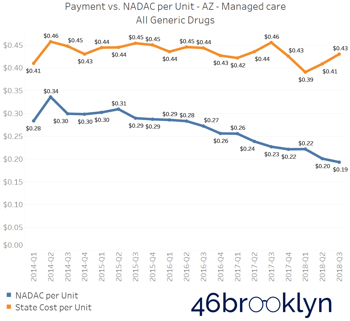
From Q2 to Q3 2018, no state experienced a bigger jump in overall generic drug markups than the state of Texas, where markups increased 4 cents per unit (Figure 3).
Figure 3
Source: CMS.Data.gov; 46brooklyn Research
Compare that to the markup on generics in Texas’ FFS program, which ever since Q3 2016 has been roughly $0.15 to $0.20 and, more importantly in our view (given that we are big fans of paying a real price for things), had trended almost perfectly with NADAC (Figure 4).
Figure 4
Source: CMS.Data.gov; 46brooklyn Research
In Texas, we are seeing even bigger markups in recent quarters of data than those that have occurred in Ohio and Kentucky, so you would think that if those states felt like PBMs gave them a raw deal, that a state like Texas should be getting an even worse deal. However, that may not be the case. According to page 334 of the Texas Uniform Managed Care Contract, spread pricing is a prohibited practice in Texas managed care, and PBMs can only be paid through set transactional or administrative fees.
This would mean that perhaps Texas is cooking those fees into their reported data, or it could mean that all of the markup is going to pharmacies. If that’s the case, it begs even more questions for why PBMs who control the pharmacy network aren’t pushing for lower costs that they are doing in other states.
Given some of the recent press in Texas questioning the value of the PBM and their possible role in inflating drug costs, this seems to beg for further inquiry from Texas State officials.
The only other two cents we will add is that for anyone that has studied Medicaid in Texas, one thing that becomes readily apparent is that the entire program is wickedly complex. There are a lot of components of Texas’ program (such as its spread pricing ban and a uniform Preferred Drug List) that read very well on paper, but we were left wondering how Texas actually managed such a monumentally complex program comprised of 19 different managed care organizations. If nothing else, the state’s perplexing rise in managed care generic drug costs could just be a friendly reminder to the rest of us to beware of complexity – it has a pernicious way of leading to outcomes we never anticipate.
North Dakota And Indiana go from worst to worst
In analyzing overall Medicaid managed care prescription drug markups from state to state, two states jump off the map: North Dakota and Indiana.
In Q2 2018, both states had the highest managed care markups in the country. North Dakota was being charged $0.29 per unit above the NADAC, and Indiana was being charged $0.31 per unit above the NADAC.
Now, that the preliminary Q3 2018 numbers are out, we’re sad to report that both states saw those markups increase. The data shows North Dakota markups increase by three cents to $0.32 per unit above the NADAC, and Indiana moved up one cent also to $0.32 per unit. Both states again have the unfortunate displeasure of having the biggest markups in the country.
Figure 5
Source: CMS.Data.gov; 46brooklyn Research
This isn’t overly surprising, as Indiana has been a focal point of Bloomberg already, and we have heard the same complaints from pharmacists in Indiana that we had been hearing about from other states that have been found to be hotbeds for PBM spread.
Meanwhile in North Dakota, the legislature has already been making some moves toward PBM reform, and even the North Dakota Medicaid Pharmacy Services Administrator has been speaking out on pharmacy benefits problems in their Medicaid managed care program, where they have tackled some serious cases of prescription steering and spread pricing.
We have obtained audio (embedded below) from a North Dakota House Appropriations - Human Resources Committee meeting from March 14, 2019, where North Dakota Medicaid’s pharmacy director Brendan Joyce revealed some pretty alarming trends that they are seeing in their Medicaid managed care program, including how massive amounts of spending just so happen to be flowing through the pharmacies owned by the state managed care plan.
Don’t be intimidated by the 30-minute length. The first twelve minutes or so are the real meat & potatoes, and it is absolutely loaded. Joyce jumps out of the gate within the first three minutes, where he reveals that after Medicaid expansion in North Dakota, two pharmacies owned by the state’s Medicaid managed care plan Sanford Health Plan ended up dispensing 4.35% of all pharmacy claims, yet received 33.77% of the state’s overall dollars for those claims. After Joyce worked to clamp down on the steering, he was able to drive the 33.77% down to around 15%.
Additionally, Joyce highlights how Sanford pharmacies appeared to be billing some pharmacy claims as medical claims, in some instances doubling the cost to the state. He also discusses how as Medicaid pharmacy director, he is not able to access the PBM contracts with Sanford.
One of the interesting things about the audio is that around the 13-minute mark, one lawmaker asks for more information about what other states are doing with pharmacy benefits, which is understandable and typical of most states. But as you can see from our data and charts, most states are in similar circumstances, so relying on other states for guidance is what helps maintain the status quo in pharmacy benefits. If not for the work of Ohio, it’s highly likely that no one today knows what spread pricing is, and it certainly wouldn’t be on the chopping block by the feds. This industry needs disruptors.
While apparently, spread pricing has been eliminated in North Dakota as of the first of this year, there are still major concerns and distortions within the program, which is why North Dakota is on the cusp of carving out pharmacy benefits for good.
We’ll continue to monitor these two states closely in the coming year.
Medicaid Managed Care Markup is increasing Across the Country
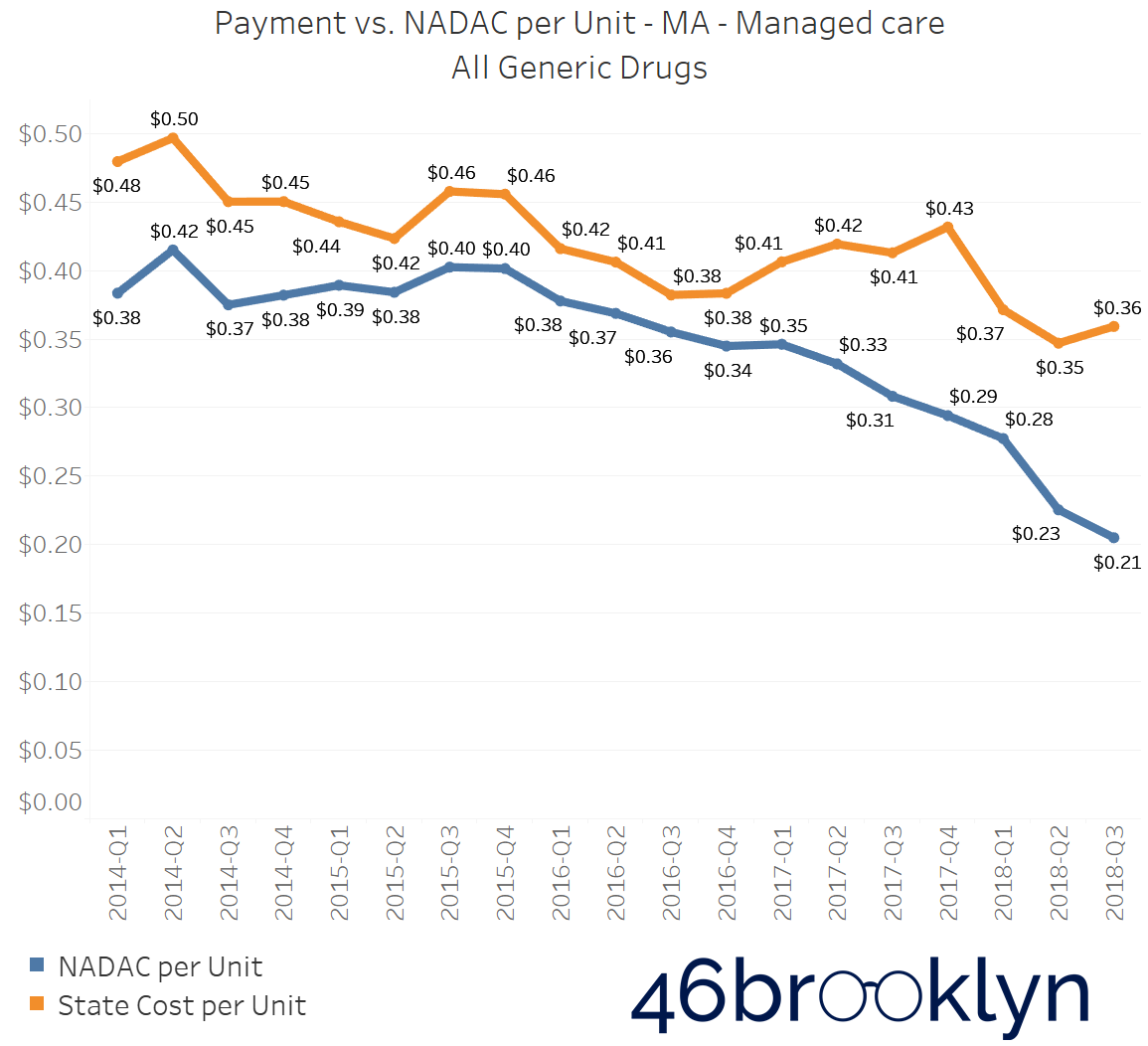
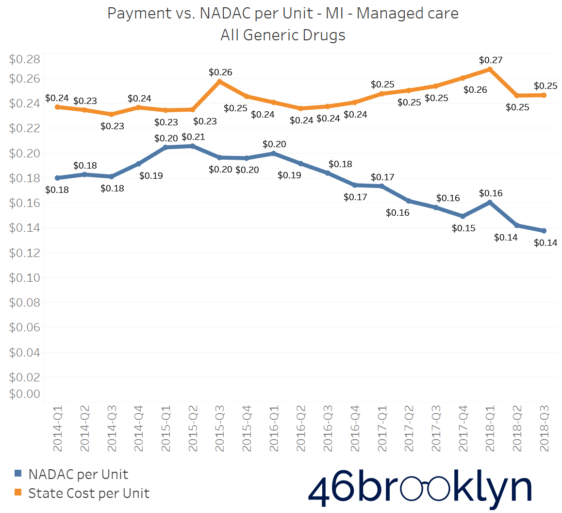
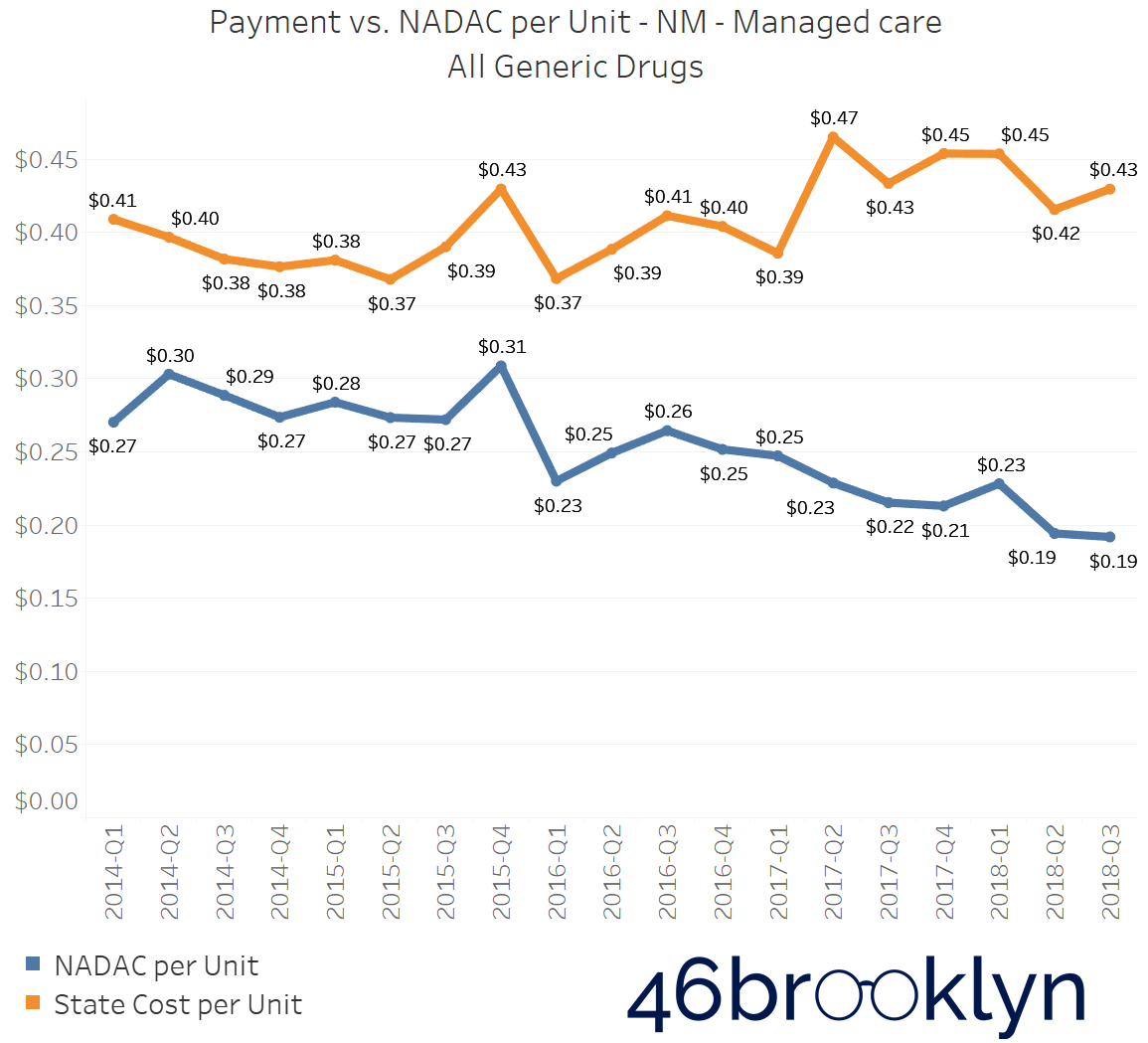
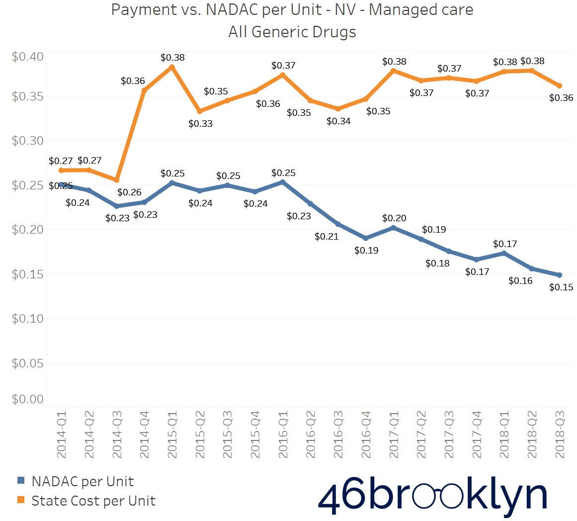
North Dakota and Indiana are not alone in their battle with generic drug markups in Medicaid managed care. If you select “All” generic drugs within our Heat Map visualization and hover over each state, you’ll find several other states where the top line (what the state is reporting generic drugs cost) is stable (or even increasing), while the bottom line (what the state’s drugs actually cost for pharmacies to acquire) is decreasing. Of course, when the bottom line falls faster than the top line, drug markup is increasing. The states that jumped out to us were Arizona, Massachusetts, Michigan, New Mexico, and Nevada. We’ve embedded figures for all of these states below. As with the gallery embedded earlier in this report, click on the arrows to flip from one state to the next.
As goes Ohio, so goes the nation?
Finally, this brings us to our home state of Ohio. The Buckeye State has been making a lot of news on drug pricing recently, as the state’s move to root out spread pricing has now created national momentum, where last week, United States Senators Chuck Grassley (R-IA) and Ron Wyden (D-OR) used their big PBM hearing in the Senate Finance Committee to announce that, based on the findings in Ohio, they were calling on the Inspector General of the U.S. Department of Health and Human Services to “conduct a federal-level analysis of PBM practices across state Medicaid programs, including practices that may allow for inappropriate profiteering and potential anti-competitive practices in state Medicaid programs.”
Meanwhile, we got our grubby hands on the Q3 2018 State Utilization Data, and we were absolutely stunned by what we saw in Ohio – so much so, that it warranted a completely separate report. For a complete deep dive into what’s happening in Ohio and for a glimpse into where the margins are flowing within the drug supply chain, click here.
Choose your own adventure
Of course, if you have made it this far in the report, you aren’t the sort of person that is going to just blindly “trust” our analysis; feel free to draw your own conclusions about the data. That’s the purpose of this site. Our research and writing is meant to first and foremost provide case studies on how to use the tools we have built for you, and secondarily to share our thoughts on the matter (for whatever that is worth). So be sure to poke around in our updated Visualizations page, and if you want to go even further, all of the source files can be downloaded right out of the embedded Tableau charts or you can grab files directly off the CMS website. Each Visualization page has raw data sources, so you can study and replicate all you want. Contact us if you have any questions, tips, pointers, or criticisms.