
New Medicare Part D 'Ski Slope' shows seniors' wild drug pricing ride
If you’ve read any of our work at 46brooklyn Research, you probably already know that much of our focus has been centered on the study of Medicaid drug pricing data. Why? Simply because it’s readily available at a granular enough level where we can tease out some interesting findings that help demonstrate the complexity and backwards nature of our nation’s highly-flawed prescription drug pricing and distribution system.
The primary findings from our slicing and dicing of Medicaid drug pricing data has been the seemingly arbitrary pricing of generic drugs in Medicaid managed care programs across the United States. It’s important to note that when we first published this work, we didn’t really know why these eye-popping distortions and markups were occurring. We figured we would throw it out into the public and someone would explain the logic behind the madness. No one sufficiently did. So we kept going.
Fast-forward to today, and we have a pretty good understanding of why this is all happening. If you are one of the seven or so people that have read all of our work, you likely understand too.
But for the less hard core 46brooklyn readers, we’ll attempt to summarize:
Like any other product, generic drugs have a true market-based cost. It’s simply the ingredient cost for the drug plus some reasonable margin to keep the supply chain (pharmacy and PBM) in business. This cost is known, or at least can be approximated using reference-based pricing benchmarks like National Average Drug Acquisition Cost (NADAC), which contains surveyed invoice costs for prescription drugs purchased by community pharmacies.
Arguably our greatest contribution to the U.S. drug pricing debate has been to pull NADAC out of the shadows and start using it as a benchmark to begin to hold the drug supply chain accountable on drug pricing – especially when it comes to the prices set on generic drugs. By seeking out public drug pricing data and comparing it to NADAC, we have been able to uncover some pretty concerning pricing behavior that is now drawing the ire of federal lawmakers.
It’s critical to note what enables those distortions in the first place: payers don’t pay for generic drugs based on their true market-based cost. Medicaid managed care, Medicare sponsors, municipalities, state employee pools, employers, and pretty much any other payer you can think of, pays for generic drugs instead based on a discount to their aggregate Average Wholesale Price (AWP).
Just one little problem with that… AWP has zero relation to true market-based cost of a generic drug.
AWP is published by a handful of companies based on suggested wholesale prices (a.k.a. “list prices”) that are set, and rarely ever changed, by generic manufacturers. So as more and more generic manufacturers come to market and compete to drive down the true market-based cost, what happens to the AWP? Absolutely nothing. See Figure 1 for an illustration using Duloxetine (generic Cymbalta) that shows the disconnect between AWP (sticker price) and NADAC (actual market-based price)! Quite inconvenient if you are a payer expecting to save money through generic deflation. Don’t hold your breath.
Figure 1
Source: Data.Medicaid.gov, 46brooklyn Research
As we have highlighted in a prior report, most payers are negotiating with their PBMs to get an incrementally better discount to AWP, without realizing that AWP itself is a completely broken benchmark for generic drug costs. It’s akin to building a house on a sinkhole. Who cares if you upgrade your kitchen to include granite countertops and a Viking range? Or in drug pricing terms, increase your multi-source generic AWP discount from 82% to 83%? You’re building the damn house on a sinkhole. Find stable ground first.
If that analogy doesn’t work for you, we’ll regurgitate our favorite one-line summary of what we think about AWP-based generic contracts. If you sign up for an AWP-based generic contract, you are getting “a fixed discount to an unknown combination of meaningless numbers.”
With all of this said, is it any surprise that Medicaid managed care prices are so random, and that states have one-by-one uncovered significant overcharges through ‘spread pricing?’ Is it any surprise that we found $2 billion in 2017 overcharges on the top 15 generics in Part D alone, compared to a true market-based cost model? None of this should be surprising when payers are signing contracts with their PBMs based on discounts to meaningless numbers.
The Medicare Part D Drug Pricing Ski Slope dashboard
With a year of shedding light on pricing manipulation in government programs under our belts, it appears that our work is helping to lead a growing chorus calling for reform in state Medicaid programs and beyond. But with spread pricing already prohibited in Medicare Part D, after our first report on the program, we knew that we had to dig deeper.
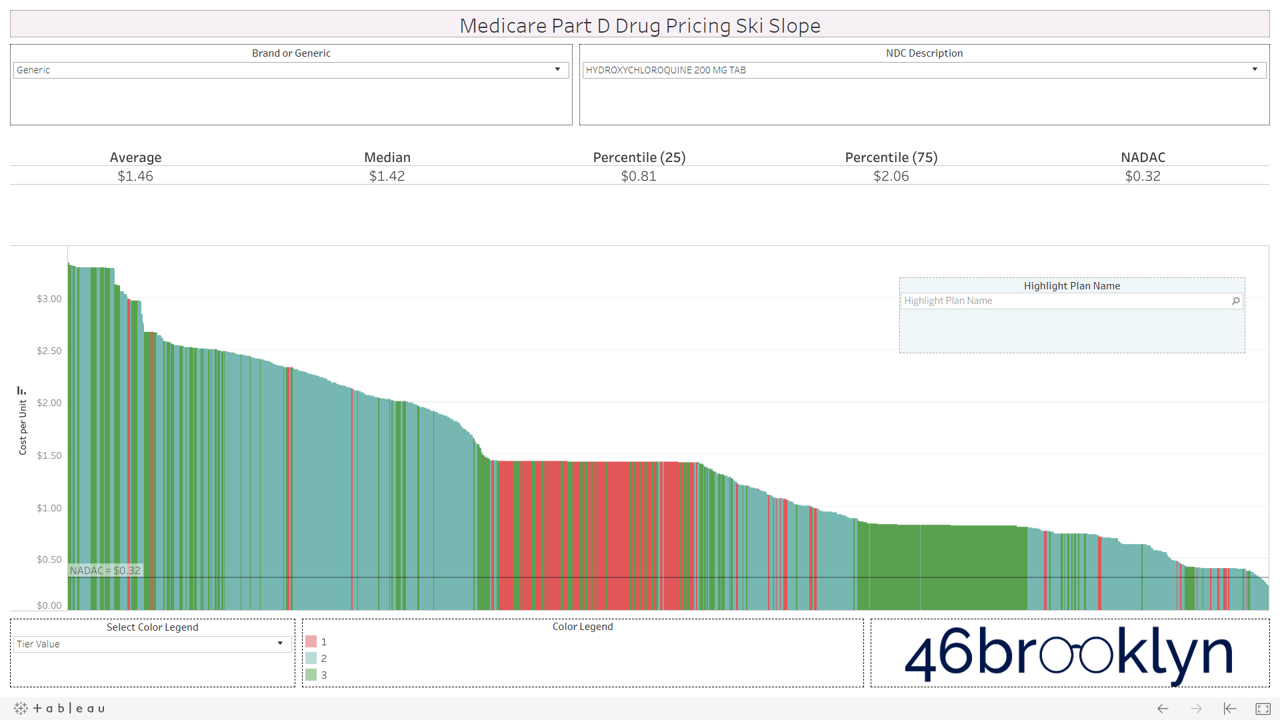
After months of study and work, we are excited to introduce the Medicare Part D Drug Pricing Ski Slope dashboard. In this visualization (or ‘viz’, as the cool kids call it), we have collected Q1 2019 Medicare Part D plan-level pricing on a massive collection of drugs (brand and generic, oral solid and non-oral solid) and sorted them by cost from high-to-low. While we were at it, we added NADAC to the chart so you can see what the drug actually cost back in Q1 2019.
We’ve embedded the new viz for you below, or you can find it alongside its other friends on our visualizations page. To use the dashboard, simply select a drug, observe the insane variability in pricing from plan to plan (especially on newer multi-source generic drugs) and behold to incredibly jacked up nature of the U.S. drug pricing system in all its glory.
Where did we get this data?
The vast majority of the data that we used to create this dashboard comes from the Prescription Drug Plan Formulary, Pharmacy Network, and Pricing Information Files available for purchase from CMS.gov. We simply purchased the quarterly file for Q1 2019 (quite a deal at $750) and spent months figuring out the best way to connect the spider web of data tables into one master table that could drive our viz. If you ever wonder what your donations go towards, it’s buying better data and better tools like this.
If you are not familiar with this Medicare database, it provides formularies and pricing for all drugs included on thousands of Part D plans. In other words, it’s a monster of a database. We literally had to upgrade our server to work with it.
If you take a look at the record layout (a.k.a. data definition file) for the database, you’ll see its complexity (Figure 2). It looks like spaghetti thrown against a wall, with some words thrown in for good measure.

Figure 2
Source: CMS.gov
If you start digging through this mess of spaghetti, you will find a field called “Cost.” This field is defined as the “average cost for specified days supply at in-area retail pharmacies.” There is also a field in the database called “Common Qty” which appears to be the quantity commonly dispensed for each days supply (30, 60, and 90). So, we simply divided the “Cost” by the “Common Qty” to arrive at the unit cost of each drug for each “unique plan” (which we defined as each unique combination of Plan ID, Contract ID and Formulary ID). The last step was to connect the average Q1 2019 National Average Drug Acquisition Cost (NADAC) for each drug to the CMS formulary database, and we had what we needed to create this tool.
One little problem…
Warning: This section extremely geeky. If you don’t care about nuances of data preparation for this tool, just skip it.
As we were constructing the database, we encountered one little problem. The complete database contained nearly 200 million rows. That in itself is not a problem for Tableau – we’ve worked with much larger data sets off-line with no problem. The problem is that all of our visualizations are hosted on Tableau Public, a “free service that lets anyone publish interactive data visualizations to the web.” Tableau Public is, simply put, the only way that we can do what we do without it costing us a small fortune. And Tableau Public has a maximum row count for any given database of 15 million rows.
So we had to tighten up the database.
The first thing we did was cut out all of the special needs plans. Second, we filtered down to only 30-day supply prices. Finally, we aggregated all county/state pricing lists to the “unique plan” level. This took out a good chunk of the database and ultimately, got us under 15 million rows.
A bit more about this last assumption, just so you fully understand what we had to do here.
As stated earlier, we define a unique plan as the unique combination of Plan ID, Contract ID, and Formulary ID. CMS stores data for each county as well. One unique plan can be offered in dozens of counties across the country. So each formulary/pricing list is repeated for every county code in which it is offered. Realizing this, as we built the database, we simply aggregated the cost and common qty for each drug to the unique plan level, which in effect collapsed all counties into one average pricing slate for each unique plan.
Bet you wish you just skipped this section? 🤓
How to use the Medicare Part D Drug Pricing Ski Slope
Ok, now let’s get into how to use the dashboard.
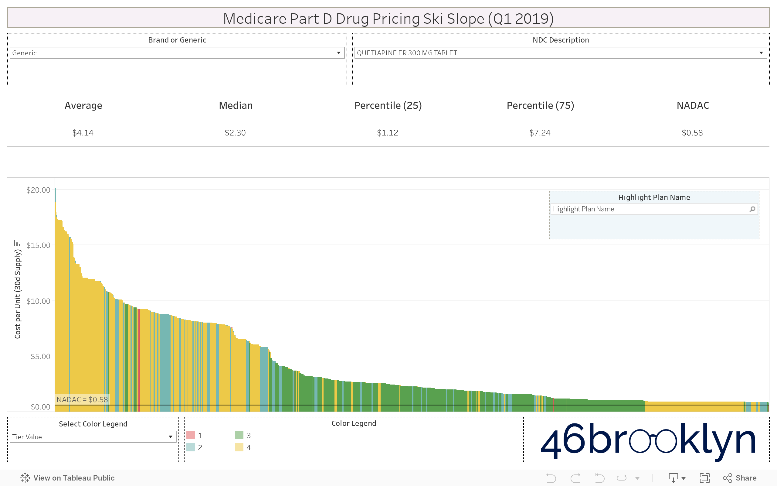
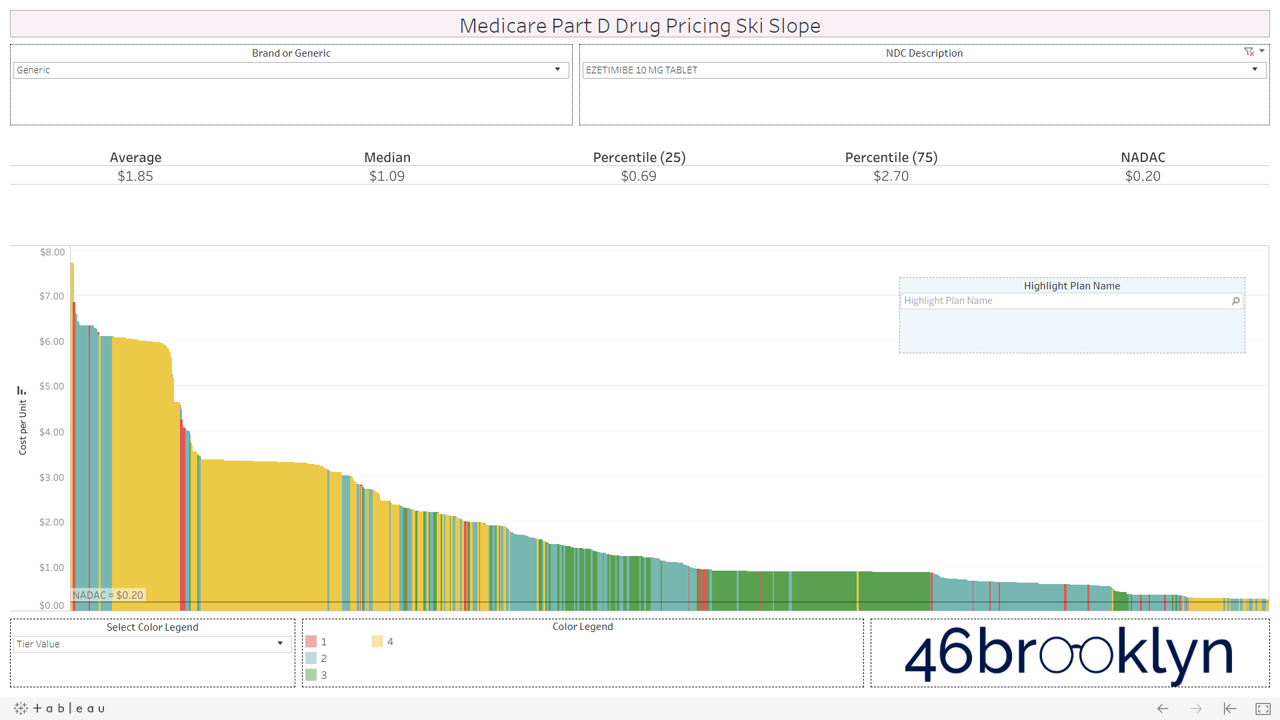
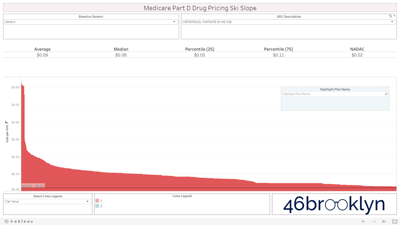
We’ll illustrate with a generic drug well known for pricing problems – generic Abilify (Aripiprazole 10 mg Tablet).
Step 1: Select “Aripiprazole 10 mg Tablet” from the Drug Name list. This list includes all drugs that are in both the CMS formulary and NADAC databases. Drugs are defined by ingredient cost, strength, and dosage form.
Step 2: The chart shows the unit cost of Aripiprazole 10 mg Tablet on every plan in Medicare Part D. Plan unit costs for the selected drug are ranked high-to-low from left-to-right, resulting in a graphic that very much resembles a ski slope. Hover over any line to bring up all relevant information associated with the Plan. The top section of the visualization shows relevant cost per unit stats for the drug in Part D – average, median, 25th percentile, 75th percentile, and the true market-based cost per unit (NADAC).
Step 3: The color legend defaults to “Tier Value.” This is the tier on which each plan has placed the selected drug. Drugs placed on higher tiers are generally more expensive and require higher patient co-pays or coinsurance. To highlight the plans that have placed the selected drug on a given tier, simply click on the desired Tier in the “Color Legend”.
Step 4: You can also switch the Color Legend to view Medicare Advantage (plans with Contract IDs starting with an “H”) versus straight Part D Plans, or “PDPs” (plans with Contract IDs starting with an “S”). To switch the color legend to this view, simply select “Program Type” from the “Color Legend” drop-down. Click on “Med Adv” or “PDP” in the Color Legend to highlight the unit costs of either type of plan.
Step 5: You can highlight plans based on a wildcard keyword search with the Plan Name field. Say you are curious where “Aetna” and “AARP” are pricing Aripiprazole 10 mg tablets. Just type “aetna” (it’s not case sensitive) into the plan name search field and the tool will highlight all plans that include “aetna” in their name. Repeat with “aarp,” or any other keywords.
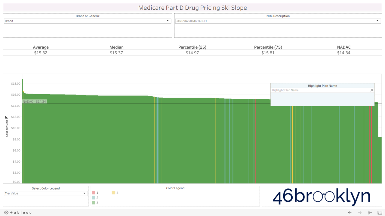
Step 6: This dashboard is not limited to generic oral solids. It also includes brands and non-oral solids (creams, ointments, gels, etc.). We’ve found that Medicare data is generally much cleaner and more reliable than Medicaid State Drug Utilization Data. As as result, we feel more comfortable including non-oral solids in this tool. However, be warned, we simply cannot guarantee that there won’t be a units of measure mismatch between NADAC and Part D plan cost per unit, or even a units of measure mismatch from one plan to another, so use at your own risk! If you want to view a non oral-solid brand – say Humalog 100 Unit/ML Vial – choose “Brand” from the “Brand or Generic” dropdown. Then simply find this drug in the list. All other features will work exactly as described in the preceding steps.
Our top observations
After studying this viz for weeks, here are our top four observations in the Medicare Part D program:
Some generic drugs are priced fairly and consistently across the board, while others show unbelievable pricing variations across Part D plans
Unsurprisingly, brand drugs do not show much pricing variability, but some charts show some interesting “cliffs” suggesting some plans could be pricing brand drugs well below list price
Not only are many generic drugs in Part D wildly overpriced, they are both overpriced and “over-tiered,” unnecessarily subjecting seniors to higher out of pocket expense
There is one more reason that speciality generics can cost more than their equivalent brands – plans are setting wildly inflated generic cost in comparison to true market-based cost.
We delve in these observations in detail in the following subsections.
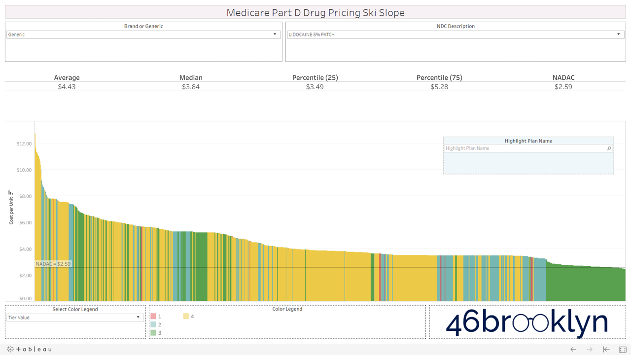
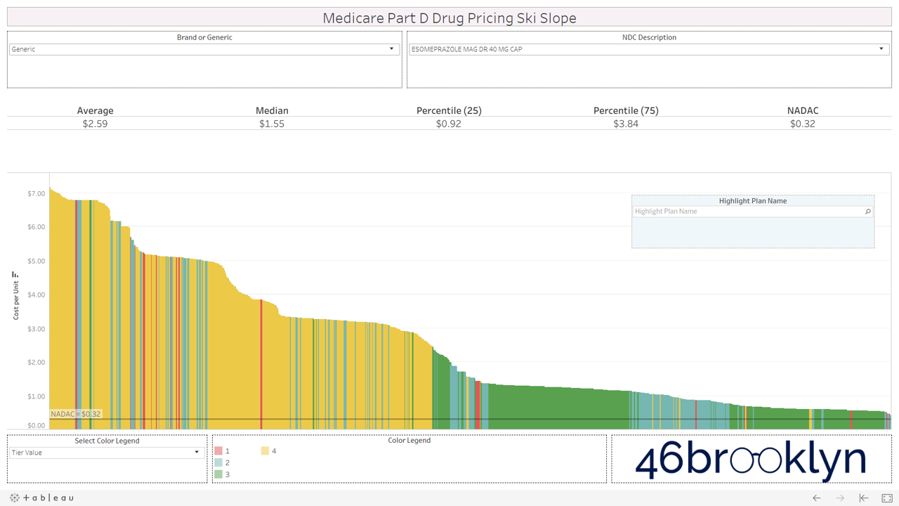
1) Generic drugs: From green circles to double black diamonds
Our first takeaway is that the profile of the pricing curves varies considerably from generic drug to generic drug – or in skiing terms, the slopes vary from “green circles” to “double black diamonds.”
If you clicked on the quick videos posted in the above tutorial section, you’ve already seen one of the nastiest double black diamonds out there. In Q1 2019, Medicare Part D sponsors (or more precisely, their pharmacy benefit managers) amazingly priced generic Abilify (Aripiprazole 10 mg Tablet) from less than $0.30 per pill to more than $22 per pill. Its true market-based cost (using NADAC) was $0.30 a pill. And it’s not like there were just a few outliers. The average price among all Part D plans was $4.27 per pill. This isn’t just a tiny, insignificant “cherry” either – plans and their PBMs are really shredding the gnar on generic Abilify, with Medicare Part D spending a sick $624 million on generic Abilify in 2017 alone.
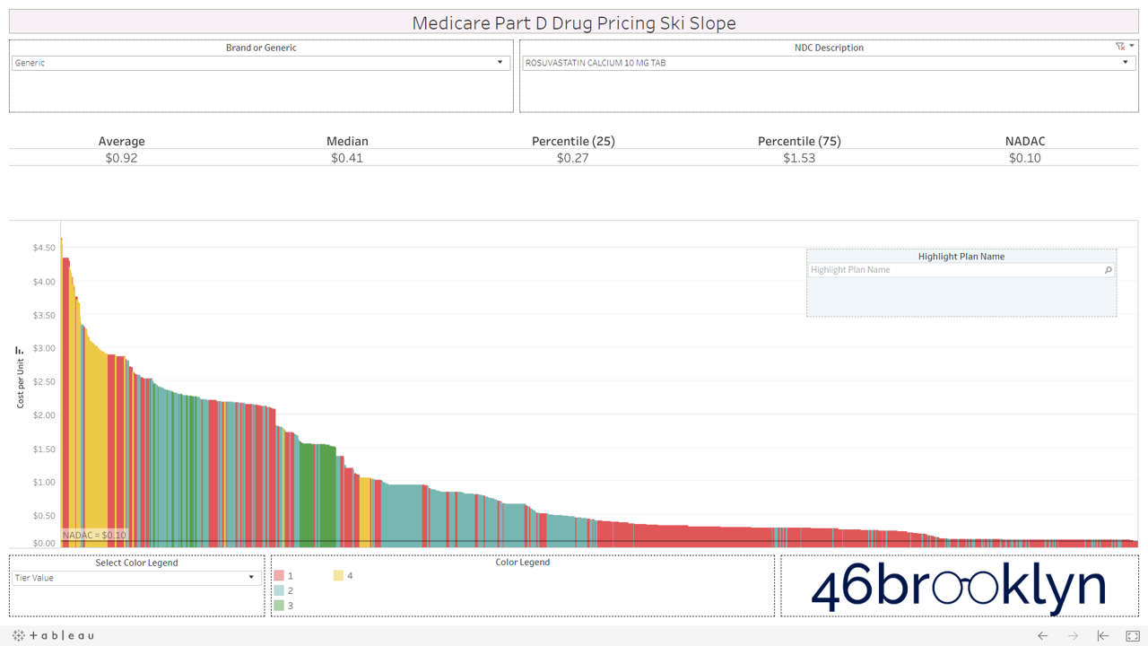
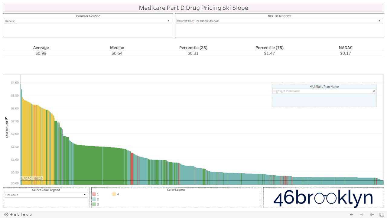
Let’s take a look at the chowder for some of the other costly double black diamonds – generic Nexium, generic Celebrex, generic Crestor, Generic Cymbalta, generic Lidoderm, generic Plaquenil, and generic Zetia (see below). Medicare spent an extreme $2.93 billion on these drugs in 2017. Total yard sale, dude.
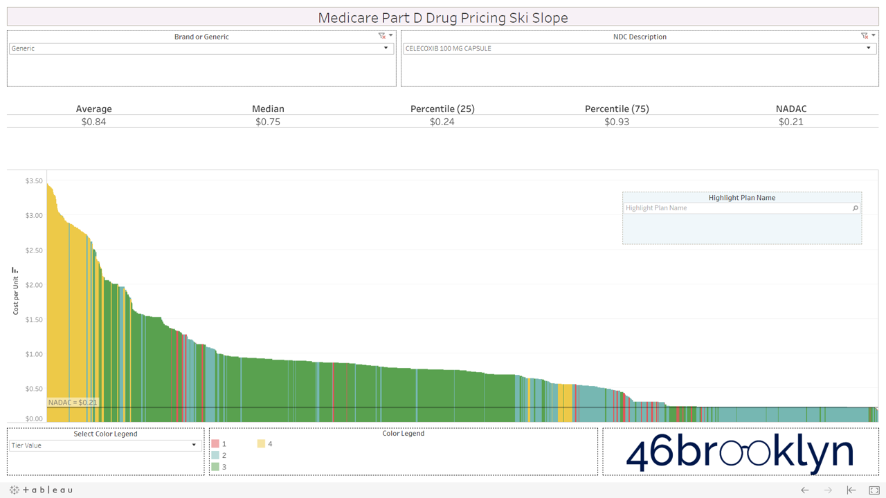


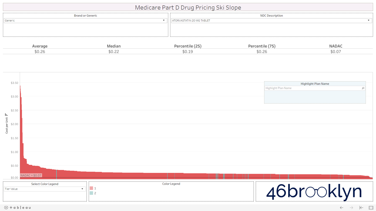
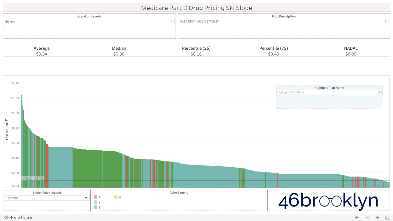
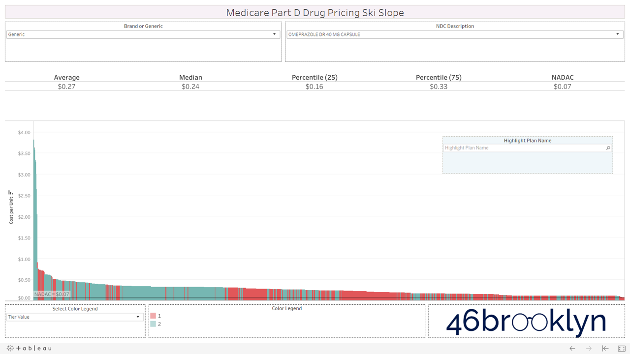
However, not all drugs are double black diamonds. As you flip through different generic drugs, you will find many drugs priced very reasonably relative to NADAC with relatively modest variation from plan to plan.
Here are some of the highest dollar spend drugs in Part D in 2017 that fall into this “green circle” category. Interestingly, even drugs that are priced well on average still show more variability from plan to plan than you may expect. Also, for each drug there always seems to be a handful of plans congregated at the far left side of the chart that are having trouble with traversing the snowy terrain and apparently never got the memo that these are old, cheap generics.

And then there is generic Zegerid (omeprazole sodium-bicarbonate).
This drug is in a category of its own. It totally ruins our skiing analogy. If all drugs looked like generic Zegerid we would have to change the name to “Medicare Part D Drug Pricing Base Jumping Charts.” Part D spent an astonishing $128 million on this drug (which is essentially Prilosec and Tums combined) in 2017.

Figure 3
Source: CMS.gov, Data.Medicaid.gov, 46brooklyn Research
2) Brand Drugs: Cross-country skiing (with a cliff?)
We’ve repeatedly mentioned that PBM brand drug pricing behavior is completely different than that of generic drugs. Generic drug pricing is the wild west. Prices are all over the place thanks to the arbitrage between different payer/PBM contracting benchmarks and true market-based pricing. Conversely, both pharmacies and payers buy brand drugs based on different discounts to the same list price. That’s why the state of Ohio didn’t find much PBM spread on brand drugs when they audited their Medicaid managed care program last year.
While anyone with a Tableau license and $750 to blow can expose generic pricing distortions in Part D, brand drug pricing distortions due to manufacturer rebates are nearly impossible to figure out from public data. Unfortunately with the news last week that HHS is dropping its proposed “rebate rule,” it looks like we’ll be stuck with these brand drug pricing distortions and the ever-growing gross-to-net bubble for the foreseeable future.
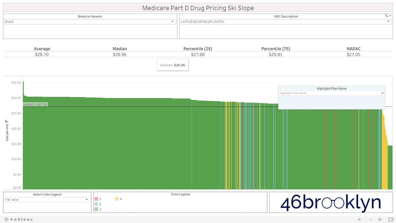
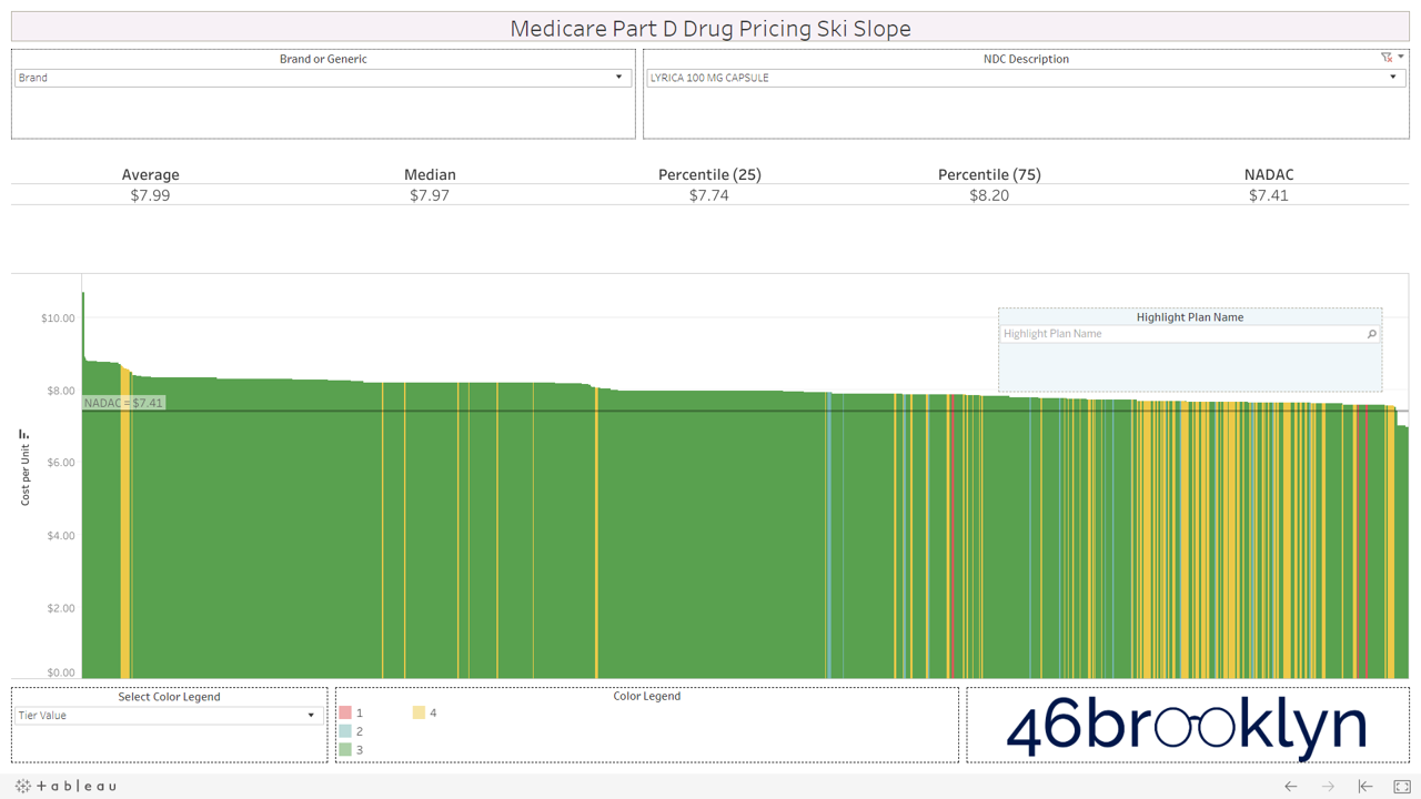
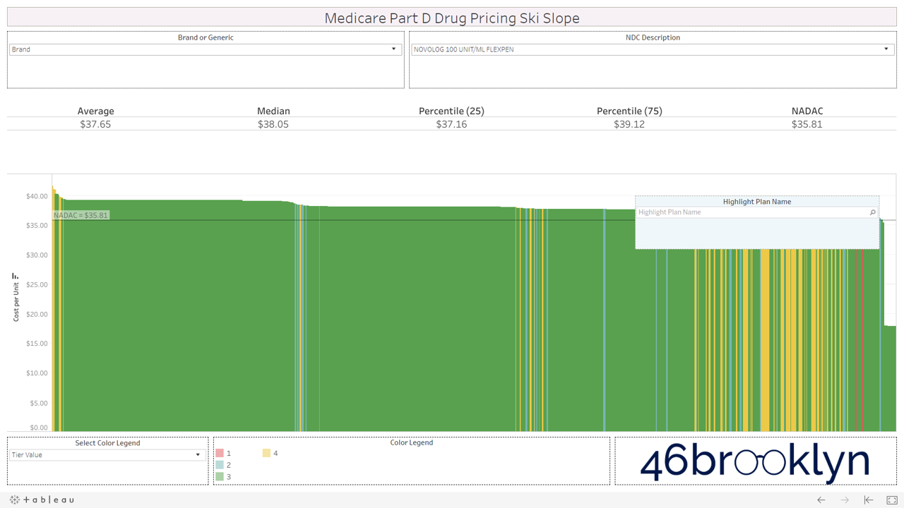
All that said, we have still provided you with the ability to view the alpenglow of brand drug unit costs in Part D in all their splendor. We’ve pulled out a handful of top spenders in Part D below (Eliquis, Januvia, Lantus Solostar, Lyrica, Novolog, Spiriva, and Xarelto). As you’ll see, there are no aggressive downhill slopes when it comes to brand drugs. A better analogy for brand drug charts is cross country skiing. In other words, there is very modest variability from plan to plan on list price. Moreover, you’ll see that average and median Part D plan costs are very much in line with NADAC. This is simply because rather than allowing the supply chain to subjectively set the prices of drugs (as it does for generics), one single price benchmark is used throughout the supply chain as the basis for all transactions for brand-name drugs.
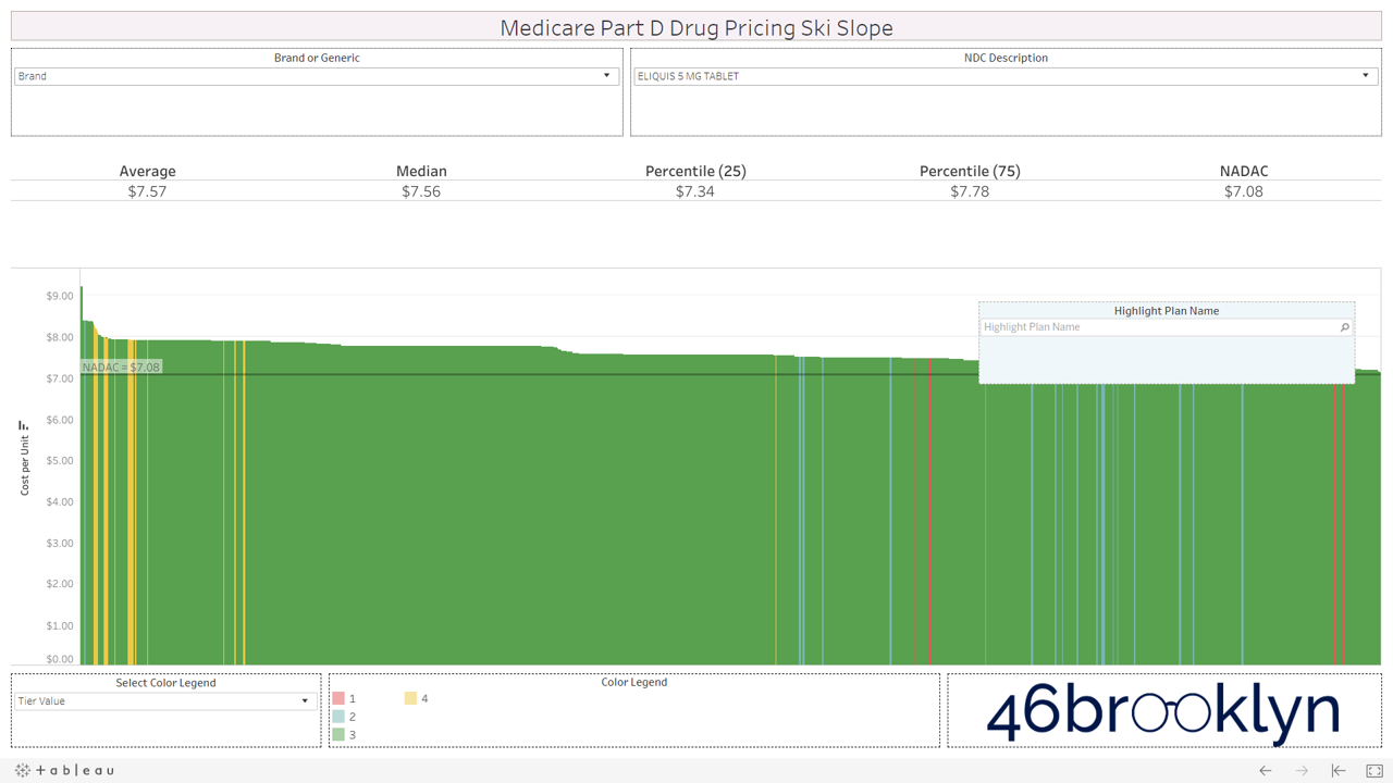
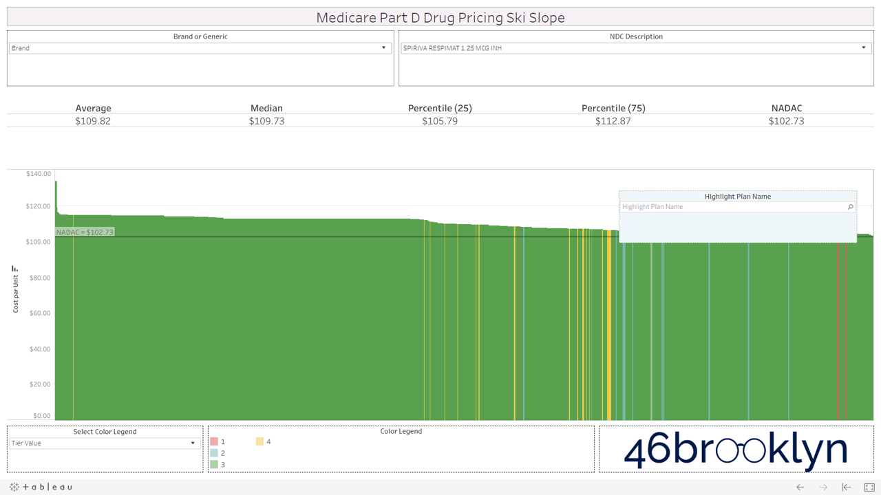
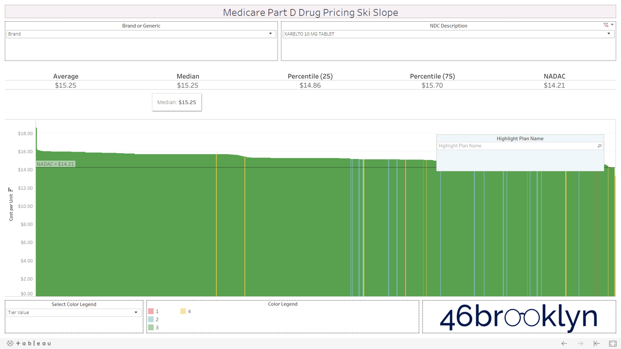
However, look over to the right of some of these charts and you will see something very surprising – a cliff. A cliff where brand drugs are astonishingly being adjudicated at rates that are below their actual cost.
We were shocked to see this, because it means that some plans are already pricing rebates and discounts into their point-of-sale prices – exactly what the failed HHS rebate rule was trying to do.
But dig in a bit deeper and you’ll find that there are really only two “plans” that are materially below list cost for brand drugs.
Silver slopes for SilverScript Allure
First, there is SilverScript Allure, the first plan with point-of-sale (POS) rebates for brand name drugs. Unfortunately, according to drug supply chain expert Dr. Adam Fein, 2019 enrollment in this plan was a “flop” with fewer than 22,000 seniors enrolled. Dr. Fein speculated that, “Allure was designed to be an intentionally unattractive plan.”
We checked the monthly premium on Q1Medicare.com (Figure 4) – $80 a month! That’s a pretty penny for seniors (relative to typical plan premiums) without knowing how much you are going to save at the point-of-sale. We then double-checked this number in the CMS formulary data – all SilverScript Allure unique plans carry this $80 monthly premium. No wonder why so few people signed up!

Figure 4
Source: Q1Medicare.com
The good news is that with this new Medicare Part D data, we can use our new database to give you a good idea of the discounts/rebates on this plan versus other Part D plans. And we now know that this plans gives you:
53% off on Novolog and Novolin!
52% off Symbicort!
50-51% off Advair Diskus!
51% off Lantus Solostar!
50% off Breo Elliptia!
These are massive discounts off of drugs whose manufacturers have been raked over the coals for their list prices over the years, and come to find out that they are essentially cutting the price in half through its discounts and rebates paid to plans and PBMs.
There are lots of gems in this SilverScript Allure drug pricing file as it essentially reflects the net prices for drugs purchased through the program. Here’s the entire thing. Have fun.
Before we move on, kudos to CVS Health for creating this plan. We have to give credit where credit is due. This approach could really help save seniors and the federal government money. It’s just a shame the premium was set at double the national average prescription drug plan (PDP) premium. What’s the purpose of this? Is there more “work” (i.e. cost) required to manage a plan that passes through rebates at point-of-sale versus collecting them after the fact? Or does this instead indicate that PDPs financially benefit off of the whole high list price, high rebate system? So if rebates go away (as they supposedly did with Allure), do PDPs need to increase member premiums to recover lost profit?
Maybe… or maybe this was all just a PR stunt. Maybe premiums were set high enough to ensure that the concept would fade into obscurity.
But hey, look at the bright side; at the very least we’ve been able to use this plan to perform an ollie and push a list of approximated rebates out into the public domain.
Kaiser, the Wiser
The other group of plans that are realizing materially lower point-of-sale prices on selected brand drugs are the Kaiser Permanente plans. Take a look at the following EpiPen pricing chart. If you’ll recall, it was back in 2016 where Mylan’s EpiPen became the poster child for our nation’s broken prescription drug distribution system. It was EpiPen that really injected rebates into the public discourse.
Well, in Q12019, Medicare Part D plans are pricing this drug at and average of $310 per unit. The NADAC is $292 per unit. We used the Ski Slope viz to find and highlight Kaiser’s plans. You’ll see them off to the right, materially below the rest of Part D. Depending on the unique plan, Kaiser has this drug priced between $129 and $240. Not only is the much cost lower than other plans, but all Kaiser plans have the drug on Tier 2, which carries a lower member copay than Tier 3/4 drugs.

Figure 5
Source: CMS.gov, Data.Medicaid.gov, 46brooklyn
This, in our view, is the Part D utopia that HHS was envisioning with its ill-fated rebate rule. Bring rebates to point-of-sale and make the drug cheaper. Then cheaper drugs can be placed on lower tiers, saving the member money. What a concept.
Here’s another high-profile brand-name drug – Humulin Kwikpen. Anyone who has studied drug pricing for more than 10 minutes should know about the controversy over insulin affordability for diabetics. We knew that insulin was being caught in the rebate mashed potatoes, but had no idea that net prices could be so low. Well, check out the magnitude of Kaiser’s upfront discounts on this drug. And it’s on Tier 2 as well, reducing the patient responsibility. Very cool.

Figure 6
Source: CMS.gov, Data.Medicaid.gov, 46brooklyn
To be clear, not every drug is like this for Kaiser, but many more are. So we got curious and started digging around looking for some more information on what makes them different. Here’s what we found (from the Kaiser’s commentary to Secretary Azar on the rebate rule):
“We receive a range of price concessions under contracts we negotiate with manufacturers and distributors. While we receive some rebates from manufacturers, “on-invoice” or “upfront” discounts—price concessions realized at the time of purchase—constitute the large majority of our price concessions from manufacturers. We recognize these price concessions in our member pricing, which determines cost-sharing at the point-of-sale when coinsurance or a deductible applies.”
OK, sounds great… but what’s the average monthly premium on a Kaiser plan? Is this just another high-premium SilverScript Allure situation? Not so. For the 54 unique plans in our database, the average monthly premium is $29.56, which happens to be a paltry $0.36 above the average Part D plan premium (both MA and PDP).
So there you have it. In the middle of an ocean of price confusion driven by insidious hidden rebates and discounts that don’t completely make their way to patients, there is at least one insurer that is hot dogging and trying to do things differently.
Bravo, Kaiser. Our trust/confidence level in the U.S. healthcare system has now risen to 0.7 out of 10.
3) Over-tiering of generic drugs
Let’s say you are a Part D member reading this, and your reaction so far is “So what? I’m not paying the bill for these crazy made up generic prices. All I pay is my copay/coinsurance.”
Well, if plans were placing generic drugs that are truly cheap (but according to the Plan, are not) on Tiers 1 or 2, then you would be right. All you would pay is your $5 to $25 co-pay, and then the rest of the overcharges are someone else’s problem (until they turn into higher premiums for you next year).
But sadly, this is not what is happening. Generic drugs that truly are cheap are being assigned expensive, made up prices, and then being placed on tiers reserved for drugs that are expensive.
That’s right, grandpa and grandma – the price of some of your truly cheap generics have been goosed by your plan/PBM, and then slapped on Tier 3 or 4 so you can pay the bill for it.
Let’s go back to one of the video snippets we created to illustrate how to use the visualization. Watch this again, but this time, look at how many plans appear when we click on Tier 4. Despite Aripiprazole carrying a true market-based cost of just $0.30 per pill, the majority of Part D plans have priced it much higher and then placed it on Tier 4, sticking the member with a bill for a good chunk of the made up cost. Bogus.
Let’s provide a hypothetical example. Let’s say grandma is on a plan that has Aripiprazole priced at $10 per pill. In the deductible phase, a 30-day supply from grandma’s local pharmacy would cost a total of $300. But grandma is past the deductible phase of her coverage, so her cost share has kicked in. Her plan placed this drug on Tier 4, which means she has to cough up a $100 copay for the prescription. So without knowing any better, that’s what she does.
A few days later, grandma sees a GoodRx card in her physician’s office. She gets curious and checks the price for a 30-count of Aripiprazole on GoodRx, and finds out that by using this cash discount program she could have paid just $18.35. She then calls her pharmacist friend (or checks 46brooklyn) and finds out that a 30-count of this drug can be acquired by her pharmacy for just $9.
This wouldn’t be an immediate problem for grandma if this drug were placed on Tier 2, where her co-pay would be, let’s say, around $15 – less than the GoodRx price. But by placing this drug on Tier 4, she now has to pay more than 5x the cash price.
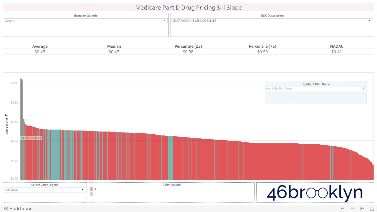
We encourage you to flip through the generic drugs to see this dynamic at work. You won’t see this on very mature generic drugs (like Levothyroxine). Those are largely on Tiers 1 and 2, as they should be. It’s mostly an issue with the newer multi-source drugs – i.e. the double black diamond drugs. Actually, here’s the same set of double black diamond charts we presented earlier. Watch them as they cycle again… except this time look at the colors. Look at how much green (Tier 3) and yellow (Tier 4) there is on these generic drugs.


If you are anything like us, this will leave a harsh sitzmark on your soul. It’s one thing to take advantage of bureaucrats or nameless/faceless taxpayers, but monkeying with both the pricing and tiers of cheap generic drugs exploits seniors that are blindly trusting this system. It’s our parents and grandparents, most of which are on limited, fixed incomes. Maybe that’s why this is to unsettling. We can put a face to the targets of this exploitation. Our seniors deserve a system they can trust (and we can verify).
4) One more reason why specialty generics cost more than brands
In early-July, a groundbreaking study was published in Health Affairs entitled “Sending The Wrong Price Signal: Why Do Some Brand-Name Drugs Cost Medicare Beneficiaries Less Than Generics?” Led by Dr. Stacie Dusetzina, the researchers found that certain specialty generics and biosimiliars required higher out-of-pocket spending than their equivalent brand-name drugs. Why? Because patients receive a manufacturer discount on brand-name drugs in the coverage gap, but not on generics.
However, what we have learned so far in this report is that Medicare Part D generic costs don’t necessarily reflect true market-based generic costs. Imatinib Mesylate (generic Gleevec), which was one of the drugs in Dr. Dusetzina’s study (and the subject of our very first drug pricing report), is the poster child of this dynamic (Figure 7). The first thing we can see here is a lot of purple. Purple is Tier 5, or the specialty drug tier.
Figure 7
Source: CMS.gov, Data.Medicaid.gov, 46brooklyn
The next observation is that a huge chunk of plans – maybe a third of all plans – have this Imatinib Mesylate priced around $275 per tablet. Move to the right of the chart, and there are a lot of plans that have the drug priced much more reasonably at $50 per tablet or less. How much does it cost the pharmacy? $14.36 per tablet.
This is extremely important, because it has implications on how we approach “fixing” this significant problem brought up by Dr. Dusetzina. Clearly, the benefit design must be looked at to ensure it makes sense for people needing expensive drugs. But maybe we should first make sure that drugs that we think are expensive really are expensive? In other words, maybe a good start is to make sure that Part D plans are paying a price that’s at least in the ballpark of the true market-based cost?
Where is all of this money going?
In April, we tied a bow on a lot of our preliminary drug pricing work and the growing drug pricing controversy in Ohio, and were able to approximate where the big drug markups were going within state Medicaid programs. So, what about these big markups in Medicare Part D?
That’s where this all gets very complicated. Medicare is different from Medicaid and commercial in there is no traditional PBM “spread.” So, the wacked-out numbers you see in CMS’ Medicare data on our viz should represent both what the Plan pays and the pharmacy receives for a drug – at least, at the point-of-sale.
The problem, as has been well-publicized recently, is that the dollars that transact at the pharmacy point-of-sale are largely becoming irrelevant. Pharmacies are paid some sum of money at the time of transaction, and then sometime in the future, that amount is adjusted by the PBM in a true-up or clawback.
If it’s a Medicaid or Commercial claim, it’s adjusted through a contractual term called Generic Effective Rate, or GER. How GER works is a topic for another report (equal in length to this one), but suffice it to say that the mechanism simply allows the PBM to pay one amount to the pharmacy at the point-of-sale and then adjust it later on based on complex formulas devised by the PBM. The good folks over at the Columbus Dispatch just released an excellent report yesterday highlighting these new GER contracts that are rolling out in Ohio, right as state officials were seeking to get a handle on excess PBM spreads in their Medicaid program.
Medicare is somewhat different, however. Typically, instead of GER, plans use direct and indirect remuneration fees (DIR fees) to adjust the pharmacy reimbursement after the point-of-sale transaction (although some plans use a GER construct to calculate DIR). Most DIR has some PBM-defined performance element. In other words, for some DIR, the better the pharmacy performs on certain PBM-defined outcomes/quality metrics, the less money is clawed back from the pharmacy.
There’s a ton of debate on whether these quality metrics are designed in a fair manner for pharmacies, and whether it makes sense to “reward” top performing pharmacies by clawing back a smaller portion of their revenue. But that’s not our concern at this time. In theory, paying a pharmacy based on performance and outcomes makes sense and is something that pharmacies should embrace.
Our main concern is the fact that the majority of plans/PBMs assess pharmacy DIR fees as a percentage of the drug ingredient cost. This wouldn’t be as much of an issue if PBMs didn’t control the prices set to determine ingredient costs. But as we have shown you in this report, they have lots of flexibility when setting those prices. If they didn’t, we wouldn’t be able to find any of those gnarly slopes.
So here we have a situation where the PBM is setting the price for the generic, and then also setting the pharmacy “rebate” (Note: pharmacy DIR fees can just be viewed as rebates). Medicare experts have explained time and again that the high list price, high rebate model is good for plans and PBMs.
Don’t believe them? Let’s ask the millions of people trading on news-flow each day that we collectively call the “stock market.” Those guys and gals added more than $22 billion to the combined market cap of CVS, UnitedHealth, and Cigna the day the rebate rule was pulled last week.
We love the stock market, because it allows us to effectively crowd-source the prevailing opinion on any key debate from millions of people for free. Are rebates good for massive PBM/insurers? The stock market just said, “hell yeah, they are.”
At least with brand-name rebates, you purportedly have one party (drug manufacturers) setting the list price of the drug and the other party (the PBM) demanding the rebate. You have some sort of true negotiation, and then two parties agree on terms.
That’s not the case with pharmacy DIR on generics. With pharmacy DIR, the PBM/Plan effectively sets the price AND also sets the rebate (because the contracts are essentially “take it or leave it”). One party effectively makes both decisions. And assuming that party is trying to maximize its profits, we know what decision the stock market wants it to make – increase prices and increase rebates.
après ski
We understand pharmacies are closing in part due to escalating DIR fees (see here, here, here, and here). Admittedly, it’s hard for this not to sting given our co-founders’ backgrounds in pharmacy. But to the chagrin of the pharmacists that may be reading this, this is not the reason we are so vehemently opposed to DIR. We dislike the current DIR status quo, because we see it as one of the key enablers of the warped incentives that are driving the generic drug pricing distortions that we have found in this report. Pricing distortions that are leading to tier distortions that are leading to higher out of pocket costs for seniors.
Without major reform to DIR, we simply can’t expect the supply chain to address this on their own. Why? Because a pharmacy DIR fee is nothing more than a fixed percentage rebate. So the higher the generic drug price, the higher the rebate. And then the higher the rebate, the higher the stock price. We learned that last week.
Our drug pricing work in Medicaid has helped shed light on how PBMs are manipulating generic drug prices to pad their wallets through spread pricing. In Medicare Part D, where spread pricing is prohibited, it appears that similar pricing behavior is occurring, except the logistics and mechanisms have moved from the front end of the transaction to the back end. And unfortunately, seniors have become the means to make it happen.
Ultimately, our hope is for a simpler supply chain that prices drugs fairly and transparently. A supply chain that both seniors and CMS can trust is competing to drive down their cost of care. Sadly, we think we’ve compellingly proven that we are a long way away from this being a reality. Addressing the root causes of what is motivating the supply chain to produce these upsetting results is where we need to focus. DIR/rebates reform is clearly one of them. The Part D benefit design, which unbelievably includes massive federal reinsurance subsidies for plans that create a warped incentive to prefer drugs with higher list prices, is another.
There are a lot of people that are way smarter than us that know how to fix this program. It shouldn’t be rocket science. We trust they are working to do exactly this. In the meantime, we’ll keep pushing out data and facts to give everyone a better sense of how necessary reform really is.