
Drug pricing's $268 billion non-event
In a time of intense scrutiny on all things drug pricing, you would think amid all the political football being played on the issue that the release of the latest drug-by-drug spending data from the largest payer in the country would be “news.” But you would be wrong.
If you visit the CMS website, you will find a press release dated December 19, 2019, innocuously titled “CMS Releases Enhanced Drug Dashboards Updated with Data for 2018” tightly sandwiched in between the certain crowd-pleasers, “Comparing the InCK & MOM Models” and “Organ Procurement Organization (OPO) Conditions for Coverage Proposed Rule: Revisions to Outcome Measures for OPOs.”
We scoured Twitter to try to find any coverage of this news and found a whopping 11 tweets linking to the release, four of which came from CMS Administrator Seema Verma. Her first tweet announcing this important data release garnered only 14 likes and 9 retweets (as of January 19). And from a quick scan of Google news search results, it appears that Maia Anderson at Becker’s Hospital Review wins the trophy for being the lone journo to cover the release.
CMS’ release of this vital, insightful drug pricing data was for all intents and purposes a complete non-event. We feel you, Seema.
Only in drug pricing can the detailed line-item level disclosure of $268 billion in government spending ($168 billion Medicare Part D; $33 billion Medicare Part B; $67 billion Medicaid) be a non-event. It also doesn’t help that CMS’ takeaways in its release were more confusing than a 46brooklyn report:
“The proportion of prescription drugs with a unit price increase went down from 2017 to 2018 in both the Medicare Part B program and Medicaid. In the Medicare Part D program, the proportion of prescription drugs with a unit price increase remained steady from 2017 to 2018. However, in Medicare Parts B and D and in Medicaid, the proportion of prescription drugs with unit price increases of 10% or more dropped from 2017 to 2018.”
And as far as takeaways from this $268 billion database, that’s it.
Drug pricing mystery SOLVED, right? Hardly.
But kudos to Seema Verma and the team at CMS for getting this out into the public. CMS’ role is to put out this data as a means to help inform public policy, and it’s up to nerds like us to analyze it. And while predictions are by no means guarantees, we believe that you’ll find the results of this deep dive to be fascinating.
It’s Cleanup Time!
First things first. CMS – we love you – but for folks that want to slice and dice this data, the underlying data file is kind of a hot mess, so we spent some time cleaning up the file to make it easier to use for analysis. And even though you released a dashboard, we just couldn’t resist making our own. Behold the new 46brooklyn Medicare Part D Drug Pricing Dashboard:
The first and most important thing you will notice in our version is that we have gone through all categories and labelled them as BRAND, GENERIC, DME (Durable Medical Equipment) or VACCINE. This is critical, because as we have written ad nauseam, the pricing “games” played with brand drugs (rebates) are completely different from those played with generics (drug price arbitrage), so any analysis that aims to align with the reality of how the marketplace works must separate products into proper categories.
Moreover, with “specialty drugs” getting ever increasing attention, we figured it would be helpful to easily view how much Part D is spending is on them. So we used CMS’ definition of a specialty drug ($670 or more for a one month supply) to flag the drugs in any given year that, from a cost perspective, CMS considers to be special.
Using the Medicare Part D Drug Spending Dashboard
Here’s a quick orientation on how to use this dashboard. Note, the description below applies to the layout of the viz on a desktop, laptop, or tablet. If you are viewing on your phone the layout may be slightly different, so make sure you turn the phone sideways so you can see everything.
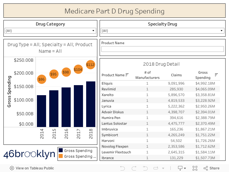
Figure 1
Source: CMS.gov; 46brooklyn Research
First off, there are two charts in the dashboard. The chart on the left shows gross spending (blue bars) and gross spending per claim (orange bubbles). The table on the right shows a list of all Part D drugs, sorted by 2018 gross spending. Click on the header of any column in this table to sort by a different field.
There are two filters at the top: “Drug Category” and “Specialty Drug.” These two filters apply to both the chart and the table. In other words, if you select “BRAND” from the Drug Category drop down, both figures will update showing you only brand drugs. Same deal for specialty.
If you want to update the chart on the left to see the historical trend for a given drug, simply click on the product name in the “2018 Drug Detail” table. To remove this product name filter, just click the same product name again, and the bar chart will revert back to showing all drugs.
There is a third filter on the dashboard under the specialty drug filter called “Product Name” filter. This will allow you to find any drug you want directly in the 2018 Drug Detail table.
Make sure to hover over the blue bars to view other important metrics such as total beneficiaries, total units, total claims, and gross spending per unit, claim, and beneficiary.
Armed with this enhanced database and this new viz, we can dig into Medicare Part D spending data a bit deeper. Here are our key findings:
2018 Part D Gross Spending Rises at Fastest Rate Since 2015
We find it interesting that CMS’ sparse commentary revolved around the number of drugs with “unit price” increases, which is an unweighted measure (i.e. doesn’t take into account how much of each drug is consumed) rather than the weighted unit costs you can uniquely derive from a data set with actual spending, like this one. If you haven’t read any of our monthly generic pricing updates, one of the key things we do – each and every month – is reinforce how important it is to weight drug price changes. Many drugs could be rising at a slower clip than they were last year, but if they aren’t heavily utilized, it won’t matter all that much. It would be like if a football team went out and signed a big-time free-agent wide receiver to their roster, but he either rarely saw the field or never played at all.
Anyway, it’s quite straightforward to simply add up all Part D spending in each of the last five years and trend it out. And when you do that, you’ll find that gross Part D drug spending rose at the fastest clip since 2015.
Figure 2
Source: CMS.gov; 46brooklyn Research
But what about rebates?
But there is that nasty little six-letter word that complicates just about everything when it comes to drug pricing – that’s the “REBATE.” Of course, it would be silly to expect any savvy Part D Plan Sponsor to actually pay LIST PRICE for any drug. Hah! That sort of nonsense is reserved for lowly small self-insured employers (who see barely any rebates) and patients with high deductible health care plans or who lack any coverage whatsoever (who see no rebates at all). Instead, these plans, through their pharmacy benefit managers (PBMs), negotiate rebates with manufacturers (and pharmacies in the form of “DIR fees”) that secure discounts to list prices. PBMs then pass these rebates (at least the portion that are actually called “rebates” rather than “____ fees,” where you can pretty much fill in the blank with any descriptive word you would like … e.g. admin, processing, convenience, beer celebration, etc.) back to the Plan Sponsor, which it ostensibly uses to lower member premiums the next year.
Take Expensive Drugs. Please.
Apologies in advance… We must venture off on a tangent to reinforce something here that you may have missed, which, in our view, is extraordinarily backwards. Drug prices are set artificially high and then rebated back to Plan Sponsors. These payers then can use these rebates to subsidize premiums for all of their members the following year. So money collected from rebates on drugs taken by sick people is used to lower premiums for healthy people.
This point was echoed by Bristol Myers Squibb CEO Giovanni Caforio this month at the J.P. Morgan Healthcare Conference:
“The rebates are used to reduce the monthly premiums of healthy individuals ... I think incentives have turned 180 degrees from what they should and shouldn’t be.”
Pretty backwards and convoluted, isn’t it?
Wouldn’t it be easier if there was just one net price for a drug for everyone? Then plans can simply focus on driving the smartest and most efficient utilization across all drugs for their members?
Yes, that would be much simpler … except here’s the rub. In Medicare Part D, once a patient racks up more than $9,719 in total gross expenses on drugs in 2020 (which they can hit in one month nowadays given the immense costs of specialty drugs), the plan is only on the hook for 15% of all incremental expenses. This is called the “catastrophic” phase of coverage. The federal government steps in picks up 80% of the tab after that (leaving the patient with a 5% share). This is called “federal reinsurance.”
Figure 3
Source: Kaiser Family Foundation
This wouldn’t be as much of a problem if the plan only got to keep 15% of the rebates on drugs dispensed to members in the catastrophic phase. But that’s not how it works. They get to keep all of the rebates … at least until they exceed some maximum overall profitability target, after which they have to share those excess profits with the government (this is called “risk corridors”).
Can you see how this changes all of the economic incentives for Medicare Part D plans to prefer high cost, high rebate drugs?
If not, let’s turn to an auto insurance analogy…
How do auto insurers make money? They collect your premiums each year and pay out your expenses if you get in a wreck. Let’s say Samantha and Matt paid $500 in premiums to Progressive. Samantha and Matt are extremely safe drivers, and didn’t get in any accidents during the year. As such, Progressive made $500 off of Samantha and $500 off on Matt, for a total of $1,000.
Now let’s say that Rex is not such a safe driver. As such, he had to pay $1,000 in premiums to Progressive. But true to form, Rex ran a red light, got in an accident, and totaled his car, which Progressive now has to replace. After Rex paid his deductible, Progressive has to cough up in $20,000 for the new car. Doing some quick math, they lost $19,000 on Rex’s account.
So how does Progressive make money? Of course, find more Samanthas and Matts and less Rexes. But all the Rexes out there need insurance, so if they want to meet that demand, they need to at least price the risk appropriately. This is what the army of actuaries at insurers are there for. Lastly, they can try to make all the Rexes less risky, which is what tools like Progressive Snapshot help with.
This all should seem very logical. A normal insurance company makes money by pricing and managing risk effectively.
But now let’s travel to an alternate auto insurance universe where two “little” things are different. First, the federal government has a program called “federal reinsurance” to pay 80% of the tab for “catastrophic” auto insurer claim expenses (i.e. any incremental claims above $10,000 per customer in a given year). Second, cars are generally priced at egregious list prices and then heavily discounted to insurance companies after the fact.
Now let’s work through the economic consequences of these changes.
First off, there is no change to the profit Progressive makes off of Samantha and Matt. It still totals $1,000.
But Rex is much different now. First off, that $20,000 vehicle? Its list price is actually $60,000. Same vehicle, same net cost, just a wildly inflated list price. So Rex gets in that accident, and Progressive now shells out $60,000 for the $20,000 vehicle. But remember, the government picks up 80% of the tab for anything over $10,000. So Progressive really only has to pay $20,000 for the vehicle: $10,000 + 20% x $50,000 – the same amount it would have paid in the universe we currently inhabit.
Source: imgflip.com
However, now Progressive is now entitled to a $40,000 rebate on the purchase of Rex’s replacement vehicle (the $60,000 list price it paid less $20,000 true cost of vehicle). This of course massively changes Progressive’s profit on Rex… They collected a $1,000 premium from Rex, paid $20,000 for the new vehicle (after government subsidies), and received a $40,000 rebate. In other words, Progressive made $21,000 off accident-prone Rex.
What’s Progressive do with this windfall? Well, they may have to share some with the government, but not before making its shareholders very happy on its next earnings call. Then with whatever is remaining, Progressive surely will have more than enough money to say, slice $50 or so off of Samantha’s and Matt’s premiums next year, putting it in a better competitive position relative to its peers. Even more mind-boggling, is that this demonstrates the incentive for Progressive to take on higher risk drivers, with the hopes that more fender-benders can yield similar returns. (Note: 46Brooklyn is not endorsed by, directly affiliated with, maintained, authorized, or sponsored by Progressive. We just can’t get Flo out of our heads.)
We apologize for the long-winded analogy, but this concept is so critical that we wanted to be sure that the incentives of the system could be better understood. In a logical insurance world, safe drivers are more valuable to insurers than accident-prone drivers. But after adding rebates and reinsurance into the mix, accident-prone drivers (with high list price, high rebate vehicles) are more valuable to insurance plans than safe drivers. It’s the exact opposite of what we like to think the system is. As such, these two “R-words” risk creating an auto insurance industry that loses, or even reverses, its primary societal benefit – to create safer drivers and ultimately safer roads for us to traverse.
Unfortunately the R-words are far from fiction in healthcare. Rebates and federal reinsurance are both very real concepts, but instead of working together to create more risk on the road, they are working together to incentivize the creation of more sick people. Because in this R-word driven system sick people taking expensive drugs can amazingly be more profitable to insurers than healthy people taking pedestrian drugs.
Yes, it sounds depressing, but that’s the system. Politicians, media, and patients bemoan this system for its surface-level flaws. But in our view, the bigger issue is that the system is rotten way down in its core.
Getting back to the numbers
Recall back before our R-word tangent, we told you that the 2018 year-over-year increase in gross Part D spending increased by 8.6%, the fastest clip since 2015. Well, when you account for rebates, we estimate the Part D net drug spending only increased by 3.7% year-over-year, down from 3.9% in 2017.
Figure 4
Source: CMS.gov; 46brooklyn Research
But hold on, playa. Where did 46brooklyn get Medicare Part D rebate information? If you have poked around in our new viz, you’ve noticed there is no mention of rebates anywhere. Thankfully though, each year Medicare publishes a Trustees Report that includes a table that looks like this:

Figure 5
Source: 2019 Medicare Trustees Report
We simply combined gross spending from CMS’ December 19, 2019 release with the rebate percentages from the latest Medicare Trustees report to arrive at an estimate of net spending.
And now that we’ve done that, there are a few other views we can present.
First, Figure 6 shows what Dr. Adam Fein calls the “gross-to-net bubble,” except whereas Dr. Fein illustrates the bubble for overall U.S. drug spending, this “bubble buddy” is only for Medicare Part D.

Figure 6
Source: CMS.gov; 46brooklyn Research
But calling it this a bubble implies that it will eventually “pop” (think the “dot-com bubble”). In actuality, this “bubble” is structural; constructed on a solid foundation made of rebates and reinsurance. The only way this “bubble” pops is if the federal government sends in Shaquil Barrett to destroy the foundation – easier said than done as the White House learned last year.
So let’s instead call rebates what they are: Money from Sick People. And Money from Sick People is booming – up a cool 162% between 2014 and 2018. Imagine this. If only you could directly invest in Money from Sick People – you would have outperformed the market by nearly six times over the past five years.
Figure 7
Source: CMS.gov; 46brooklyn Research
How good is thE 3.7% YoY Net Spending Growth Number for 2018?
It turns out that net Medicare Part D spending growth pricing growth could actually be higher than 3.7%. If you scroll back up to Figure 5 (the Medicare Trustees Report that is the source of rebate percentages), you may have noticed that 2018 rebates are “intermediate estimates” rather than actual “historical data.” The begs the question on how accurate the CMS Office of the Actuary’s intermediate estimates have been in the past? We looked into that by comparing the last rebate estimate published by CMS for a given year to the actual amounts for that same year.
It turns out that it’s a mixed bag. 2014 was spot on. 2015 rebates were underestimated. Then 2016 was a whopper of an over-estimate, with rebates coming in more than two points lower than estimated (note: the missing rebates in 2016 relative to CMS’ forecast were worth $3.1 billion). 2017 wasn’t much better, coming in at an over-estimate of one point, or $1.5 billion.
Figure 8
Source: CMS.gov; 46brooklyn Research
Long story short, our 3.7% net pricing growth estimate for 2018 is not at all a final number. If the actuaries overestimated 2018 rebates by even one point (i.e. they come in at 24.3% instead of 25.3%), 2018 year-over-year net spending growth increases from 3.7% to 5.1%.
Gross Spending by Drug Category
That’s enough about rebates for now. Let’s break out our new, enhanced Part D drug spending database and see what else we can learn from gross spending numbers.
To start, Figure 9 shows Part D drug spending broken down by brand, generic, and specialty drugs (we dropped out DME and vaccines from this view as they were relatively insignificant).
Figure 9
Source: CMS.gov; 46brooklyn Research
Figure 10 shows a different view that helps illustrate the change in market share by drug category over time.

Figure 10
Source: CMS.gov; 46brooklyn Research
So no surprise here. Specialty drug gross spending in Part D is growing like a weed.
But Figure 11, which shows drug category market share by claims rather than spending, may be a bit of shock. See that little aqua-colored sliver on top of the giant orange bar? That’s specialty. Its market share on a claims basis (up from 0.6% of claims in 2014 to 0.7% of claims in 2018) is so insignificant that Tableau can’t even figure out how to show the label.
Figure 11
Source: CMS.gov; 46brooklyn Research
The key takeaway here is that in 2018, 33.5% of all Part D gross dollars were shelled out on just 0.7% of Part D’s claims. These claims are indeed very special.
It follows then that the per claim costs of specialty drugs must be out of this world. And as shown in Figure 12, they are, and then some. Weighted average specialty drug cost per claim eclipsed $5,308 in 2018, up 16% versus 2017. The percentage increase wasn’t that much better for brand drugs, which were up 12% versus 2017.
Figure 12
Source: CMS.gov; 46brooklyn Research
At this point, one would look to that giant orange bar back up in Figure 11 – the generics – and hope that they at least are deflating to offset some of the cost increase in brand and specialty drugs. As we have explained each and every month for the last year and a half, acquisition cost for generic drugs did deflate in 2018, considerably so. But as a reminder, Plan Sponsors and their PBMs are in no way required to tie unit costs to actual acquisition costs, instead pricing generic drugs based on contractual discounts to a wildly inflated, arbitrary, unilaterally-set benchmark called Average Wholesale Price (AWP). If this is a new concept to you, you have some 46brooklyn reading to do. Take a look at this and this and this and this. All that said, the outcome of this unfortunate reality is that Part D collectively delivered zero generic deflation per claim in 2018, during an environment of mid-double-digit deflation. In fact, Figure 12 suggests that Part D has delivered zero generic drug deflation over the past five years.
Brand Drug Spending
Let’s drill into the $75+ billion of non-specialty brand drug spending first.
To do this yourself using the new viz, simply choose “BRAND” from the “Drug Category” filter and “No” from the “Specialty Drug” filter. Your dashboard should look something like this:
Figure 13
Source: CMS.gov; 46brooklyn Research
Then just click on any of the drugs in the list to the right to explore the trend in spending and cost per claim by year for your chosen drug.
In typical cooking show fashion, rather than you having to poke around in the dashboard to look at all of the top brand drugs, we’ve collected some of the more relevant facts and metrics for the top 15 Part D non-specialty brand drugs by 2018 spending (Figures 14 and 15). We’ve also thrown in 2017 data and year-over-year (YoY) comparisons for good measure.
Figure 14
Source: CMS.gov; 46brooklyn Research
Figure 15
Source: CMS.gov; 46brooklyn Research
The first thing that smacks us in the head is that it appears to be good to be Bristol Myers Squibb (the drugmaker that produces Eliquis, a popular medication used to reduce the risk of clots). Part D gross spending on Eliquis rose a whopping 62% YoY to nearly $5 billion, on a 43% increase in claims. According to CMS’ data, gross spending per claim on Eliquis was up 13% YoY, primarily driven by a 9% YoY increase in cost per unit. Of note, the $6.99 Part D cost per unit (which you will find in Figure 15) almost identically matches the drug’s 2018 WAC ($6.98 per unit) – a good point of validation for this data set.
Of course, this is all gross pricing. We know nothing about net pricing for Eliquis, right? Actually, that’s not entirely true. Companies that are publicly traded must file all sorts of financial and business disclosures with the Securities and Exchange Commission (SEC). For drugs that are big enough sellers for a public company, odds are relatively high that the company will disclose their net sales. So is the case with Eliquis, which according to Bristol Myers Squibb’s (ticker = BMY) 2019 10-K, generated $3.76 billion in net revenue, up 30% from 2017.
A note for readers who want to find these documents. Simply go to EDGAR (the SEC’s company filing lookup tool), and type in the company’s ticker. Then in the “filing type” blank, type “10-K” (i.e. annual reports). Then choose the annual report you want to comb through and Ctrl-F for any text that suits your fancy. In this case, we just searched for the term “Eliquis” within BMY’s 2019 10-K and found these numbers.
One very obvious takeaway is that the 30% net growth number in BMY’s 10-K is much lower than CMS’ 62% gross Part D spending growth for Eliquis. What could be the difference? Well, first off, we are missing commercial and Medicaid spending data. So let’s go ahead and add in Medicaid’s 2018 spending on Eliquis, which is also available from CMS, and pales in comparison to Part D’s spending on this drug (only $248 million in 2018). After summing the two programs together, we arrive at a YoY Eliquis spending growth rate of (drum roll please!) … 62% – all that work for nothing!
We are still missing commercial spending, but it’s now seeming highly unlikely that this will somehow explain this very wide gap between the gross and net. That leaves only one other culprit, and that of course is REBATES. All this data leaves us with a very strong suspicion that the of the 9% gross pricing increase on Eliquis that we saw in 2018, possibly all (and maybe even more than all) went to fund higher rebates and concessions, potentially resulting in net price reductions for BMY on this drug.
So we went back to BMY’s handy-dandy 10-K and searched for the word “rebates” and look what we found:
“Eliquis (apixaban) ... U.S. revenues increased in both periods due to market share gains partially offset by lower average net selling prices.
”
Case closed. Net Eliquis unit prices went down in 2018, meaning that more than all of Eliquis’ 2018 gross price increase was passed on to Medicare Part D Plans and PBMs, who then likely used them to help drive lower member premiums in 2019. The data supports this. According to Kaiser Family Foundation, average monthly premiums declined in 2019 for the first time since 2015. This is a good thing – in isolation.
But as we truly believe, we can’t simply focus on the outcome and ignore the process. How do you explain the inequities that this model creates to those on the receiving end of them? The Part D machine (which again, is designed to create swollen list prices and rebates) doesn’t work in a vacuum. The inflated list prices it creates impacts others, far and wide:
The self-insured small business owner that is facing a 20% increase in health care costs for her employees, in no small part driven by the fact that she is barely getting any rebates off of rapidly rising list prices
The employee of that same small business that makes $18 an hour and has a $6,000 deductible to meet, who knows nothing about the reason why his brand drug’s list price is so much higher than it was last year
The young, budding entrepreneur with a family who can’t leave her job to start the small business of her dreams because – without ever seeing a dime of all the drug rebates sloshing around - she can’t afford decent health insurance?
These are just some of the real consequences of the way Part D is designed to save money for some people (mostly the ones that least need its benefits). Amid all the finger-pointing on drug pricing, a greater amount of focus should be directed to the real people all across the U.S. directly and indirectly suffering from the backwards design of Part D. It’s imperative to stop ignoring the dangerous, long-term economic consequences of this design.
Generic Drug Spending
Much like quarterbacks and wide receivers, brand name drugs get all the attention, and the tough guys in the trenches – those hard-working, nameless generic drugs – never get the attention they deserve. But not at 46brooklyn.
Figures 16 and 17 show the top 15 Medicare Part D generic drugs by 2018 spending:
Figure 16
Source: CMS.gov; 46brooklyn Research
Figure 17
Source: CMS.gov; 46brooklyn Research
Our key takeaway here is that we have yet again more proof that Part D collectively has little clue what some of its top generic drugs actually cost. Take generic Abilify (aripiprazole; a medication used to treat certain mental health or mood disorders). Some folks may be impressed by its 28% decline in gross spending per unit in 2018. If you are, we know a used car salesman willing to sell you a 2010 Toyota Camry with 150,000 miles for $30,000. It was just reduced from $40,000. What. A. Deal.
This example helps illustrate the problem with looking at percentages without any underlying true cost basis. It’s pretty obvious that $30,000 is not even close to a “good deal” for this old and cheap vehicle. If data were more readily available, it would also be pretty obvious that $4.78 per pill is a horrible deal for aripiprazole, owing to the fact that is cost, on average, $0.42 per pill for your pharmacy to buy in 2018.
We’ve already tread over this ground in prior 46brooklyn reports. We discussed this at length in our Ski Slope report, and you can see it for yourself in our Medicare Part D Ski Slope Viz.
Figure 18 shows the aripiprazole 5 mg tablet ski slope for Part D in Q1 2019. Each tiny vertical line on the plot is a different "unique Medicare Part D plan,” with the color corresponding to the Tier on which the plan placed the drug. This shows that in Q1 2019, plans priced aripiprazole 5 mg tablets between ~$0.30 and >$15.00 per pill, with a median plan price of $4.48 per pill. It actually cost pharmacies ~$0.26 per pill to acquire at the time. Long story short, PBMs, on behalf of their plan sponsor clients, are pricing this drug at all sorts of different levels and placing it on all sorts of different tiers (resulting in patients overpaying for this drug), when at the end of the day, underneath all of this distortion is just an old and cheap drug that got Jacked Up.
Figure 18
Source: CMS.gov; 46brooklyn Research
Here are some of the other top 15 generic drugs that Part D Plan Sponsors (on average) apparently bought from some underhanded used car salesmen in 2018:
Generic Crestor (rosuvastatin calcium) - used to treat high cholesterol
Part D = $0.77 per unit ; NADAC = $0.12 per unit
Generic Nexium (esomeprazole magnesium) - used to treat stomach conditions
Part D = $2.57 per unit ; NADAC = $0.43 per unit
Generic Cymbalta (duloxetine HCl) - used to treat depression or anxiety
Part D = $0.86 per unit ; NADAC = $0.20 per unit
Generic Zetia (ezetimibe) - used to treat high cholesterol
Part D = $1.93 per unit ; NADAC = $0.24 per unit
Generic Renvela (sevelamer carbonate) - used to control phosphorus levels
Part D = $1.93 per unit ; NADAC = $1.05 per unit
We just have one thing to say to the PBMs … C’MON MAN!
Between the rebate conundrum and ever-increasing launch prices of specialty drugs, there are already serious headwinds to controlling drug pricing in this country. Deflation from generic drugs should help to offset these factors. But clearly in Medicare Part D, which (as shown back in Figure 12) has delivered generic deflation amassing to a heaping pile of nothing over the past five years, this ain’t happening.

Source: Gfycat.com
Metformin
Before we leave the topic of generic drugs, we have to talk about one of the most C’MON MAN generic drug situations out there – metformin (used to treat diabetes). Now you may be thinking, isn’t metformin that extraordinarily cheap type 2 diabetes drug that’s been around forever? You would be right. Generic metformin intermediate release (IR) came to market in 2002, followed by an extended release (ER) version in 2004. Together, Part D reported a weighted average cost of $0.06 per tablet for these drugs in 2018.
But over the years, manufacturers replenished their aging rosters and introduced new ER versions of metformin, changing the way metformin was released into the body over time. First came Fortamet (metformin osmotic), which was the followed by Glumetza (metformin gastric). Today, both Fortamet and Glumetza have lost patent exclusivity and are now available as generics.
It’s not our place to opine on the relative value of different time release mechanisms… But we can show you the relative cost paid by Medicare Part D:
Figure 19
Source: CMS.gov; 46brooklyn Research
For this math to make sense, it follows that in 2018 a logical payer would only dispense metformin osmotic over plain old metformin if they believed the osmotic version to be at least 110 times more effective than the original ($921.40 / $8.36 = 110). Furthermore, one would have to believe that the gastric version was 481 times better than the original to choose that ($4,021.48 / $8.36 = 481).
In 2018, we counted 57,427 times when Part D (in effect with its dollars) said, “sure, paying a 481 times premium for the gastric sounds reasonable. Let’s do it.” Part D rung up an astounding $230 million in total spending on the gastric form on metformin in 2018 (+23% YoY) on these 57,427 claims. For reference, the total spending on old-school metformin was $256 million – on 30,897,971 claims. Stated differently, we could have paid for nearly 30 million claims of metformin “version 1.0” with just 57k claims of metformin “version 1.2.”
Figure 20
Source: CMS.gov; 46brooklyn Research
Let’s play devil’s advocate for a minute. Let’s for arguments sake say there is no disagreement that both newer versions of the drug are wildly overpriced in Part D. Well, Part D could claim, “we got it right 99.5% of the time.” And they did. Out of the 31.1 million generic metformin claims, 30.9 million were for the original. But here’s the problem: drug pricing is so out of whack with its own internal reality that 99.5% accuracy is no where near good enough, given the differential spending.
To be clear, there may be a valid clinical reason for a small number of patients to require these new formulations of metformin. But the insane cost differential between versions means that plans need to be extremely careful with this. Figure 20 shows that the 0.5% of the time that a newer version was dispensed cost Part D more money than the 99.5% of the time when the original was dispensed. Put simply, unless someone brings some logic to the relative pricing of drugs in the same class, Part D collectively must do a better job with formulary management to protect taxpayers from these sort of C’MON MAN generic drug situations.
Public Service Announcement: For all of the physicians and nurses reading this, we know that you have a ton of things on your plate, and the last thing you need is one more distraction from your focus on a patient’s disease state (distractions can be frustrating). But, if at all possible, please try to earmark some time to pay attention to relative acquisition cost of drugs you prescribe. At least be open to having a dialogue with pharmacists about the prices of available options. Even though the current payment models generally provide little to no incentive for you to consider cost - or have any provider-to-provider collaboration - it is a huge way to help push back on this system’s gluttonous auto-pilot. If you don’t have time to come to visit 46brooklyn to get this information (we 100% get that), then start demanding that your Electronic Health Record (EHR) provider include it in their systems. We think that it goes without saying that given its current incentive system, the prescription drug supply chain cannot be trusted to get this right.
Pharmacy DIR Fees
Keep in mind, for generic drugs, the plan typically does not receive any manufacturer rebates, so essentially, all of the costs presented in this section are REAL. Kind of…
PBMs, on behalf of Plan Sponsors, receive non-negotiable discounts from pharmacies called “Pharmacy DIR fees,” (on both brands and generics), which most Plans demand from a pharmacy that desires to be considered “in network” or “preferred.” If you’ve heard of DIR fees before, it’s highly likely that it was first from an anonymous pharmacist Twitter account that liberally uses the CapsLock function and exclamation point key.
Sadly, despite what can be obnoxious complaining from the pharmacy community, the reality is that their frustration is born out of seemingly arbitrary use of hefty, unpredictable clawbacks that can completely flip the financial picture of their practices overnight.
Dressed up typically as pharmacy quality metrics, most Pharmacy DIR fees are based on a percentage of the drug’s ingredient cost set by the PBM, which as we showed earlier in this section can be set as high as the PBM chooses for generic drugs (i.e. $4.78 for a $0.42 aripiprazole tablet … or metformin’s case, $47.24 for an $18.42 metformin gastric tablet). Recall from earlier (Figure 3) that thanks to rebates and reinsurance, plans can make more money shelling out more expensive drugs in Part D. This isn’t just a brand drug phenomenon. It’s true for generics as well. Here’s how it works:
PBM artificially inflates the ingredient cost of the drug for the purposes of pharmacy reimbursement
PBM pays the pharmacy this inflated amount
PBM claws back a portion of the payment made to the pharmacy via DIR, which again, is normally a percentage of the price set by the PBM in step #1
The higher the number set in #1, the higher the DIR taken in #3
The Part D plan is only responsible for a portion of the inflated ingredient costs, as it receives significant subsidies from federal government to cover these costs for claims in catastrophic phase
PBM passes an unknown portion of the Pharmacy DIR fees back to the plan, which plan ostensibly uses to lower member premiums the next year
See how this is fundamentally no different from rebates on brand drugs? However, at least for brand drugs, one entity is setting the list price (the drug manufacturer) and another is extracting the rebate (PBM). For generics, it’s arguably worse, as the PBM sets both the adjudicated price and the rebate (i.e. DIR). And higher prices + higher rebates = more profit for all parties involved.
You don’t have to have to be the Swami to forecast the direction of U.S. drug prices. You just need to follow the money. And barring any significant changes to Medicare Part D, the money clearly tells us to expect higher rebates and thus, higher prices.
Specialty drug spending
Last but certainly not least, we turn to special teams, a relatively small part of the game from a volume standpoint, but due to its overall impact, a foolish segment to overlook.
Figures 21 and 22 show the top 15 Medicare Part D specialty drugs by 2018 spending. These 15 drugs were responsible for 40% of all Part D specialty drug spending in 2018 (there were 478 specialty drugs in Part D in 2018).
Figure 21
Source: CMS.gov; 46brooklyn Research
Figure 22
Source: CMS.gov; 46brooklyn Research
One convenient thing about how CMS defines specialty drugs (simply based on cost per beneficiary) is that it allows us to look at a small but growing class of drugs – specialty generics. You can do this in the viz simply by filtering on Drug Category = “GENERIC” and Specialty Drug = “Yes.” You should get a chart that looks like this:

Figure 23
Source: CMS.gov; 46brooklyn Research
Notice that specialty generic spending has gone from a paltry $39 million to a still relatively small, but no longer insignificant $1.1 billion. That’s a 2,654% growth rate over five years.
Digging down to the drug level, you will very quickly see that by far the largest driver of this increase was Gleevec (imatinib mesylate; used to treat cancer) going generic.
Figure 24
Source: CMS.gov; 46brooklyn Research
To be clear, the growth of generic Gleevec in Part D, and generic specialty drugs in general, is not inherently a bad thing. Theoretically, we should be saving money when expensive brands go generic. But as we wrote about on Day #1 of 46brooklyn’s existence (and also just above in the generic section if you were paying attention), PBMs are not required to pass through the full extent of competitively-driven savings on generic drugs. That’s true in privately-run Medicaid programs (a.k.a. managed care), commercial programs, and Medicare Part D.
If you flip over to our NADAC Drug Pricing Dashboard and search for imatinib mesylate (100 mg and 400 mg), you will see that 2018 was an especially good year for deflation on these drugs (Figure 25). The 400 mg strength started the year carrying an acquisition cost of $123.65 per unit and exited the year at $20.40 per unit, down 84%. Fast forward to today, and it’s down another 54% to $9.33. The less commonly dispensed 100 mg strength also plummeted in 2018, down 87% from $46.79 per unit to $6.09 per unit.
Figure 25
Source: CMS.gov; 46brooklyn Research
Meanwhile in 2018, Medicare Part D paid $125.19 per unit for a some combination of the two strengths. If we conservatively assume that all generic Gleevec dispensed in Part D was the more expensive 400 mg version, we calculate that Part D paid $86.50 per tablet in profit to the supply chain to dispense generic Gleevec in 2018, which works out to be $373 million. In other words, 69% of all the money Part D paid to procure generic Gleevec in 2018 went to the supply chain, while only 31% was the actual drug.
Groundhog Day
We have come to the end of our exploration of the CMS 2018 Medicare Part D drug spending data. We keep intending to write short updates, but ending up with long-winded and meandering dissertations. We think we’ve diagnosed our problem though. We feel like Phil Connors in Groundhog Day – reliving the same story again and again.
Each new drug data set that we can get our hands on tells the same story of confusion, smoke & mirrors, distortion, and inequity that is the U.S. prescription drug supply chain, and this most recent release from CMS is no different. Each time we share new data sets and visualizations, we feel compelled to dredge up examples and analogies to provide the data the context it deserves, because we believe that those seriously interested in drug pricing should be better armed with the facts of how the system actually work. The more we learn and connect the dots, the longer the reports seem to get.
Examining these details is very important, because these details show how members of the system can use the latitude or ambiguity of the rules of play to get an advantage. While some operate outside the rules, the fact is that you don’t need operate outside the rules in order to take advantage of the flaws inherent in our system. By highlighting the deficiencies in the model, the warped incentives of its participants, and the unfair results that the system can sometimes yield, we believe that we can help inform those whose job it is to protect it from those seeking to exploit it at the expense of others.

Source: Knowyourmeme.com
Ultimately, our goal is to provide the public with clean, usable, data, and education on what the data can tell us about drug pricing in this country. It’s a messy process that doesn’t lend it self to easy tweets and soundbites. Instead, we aim to pull you through the same muck that pull ourselves through. Eventually, as you wipe that muck and turf off your facemask, you come to the realization that we can’t avoid the complexity and details in this discussion, because the problem is the system’s complexity and details. Only when this is understood will we be able to cross the goal line and start fixing it.