
Brand drug launch prices: A game of perspective
What’s for launch?
We have long bemoaned the fact that when it comes to studying drug prices in the United States, one of the first challenges we face is that we cannot agree as to which drug price matters. Is it the manufacturer-set list price? Is it the net price of the drug after rebates are shaved off the list price? Is it the net price after all discounts or just the ones being passed through to the patient? The payer? Speaking of “pass through,” why do the prices charged to health plans or patients vary when the manufacturer list prices don’t vary at all? Perhaps, said differently, why isn’t the net price after discounts the same across all similar payers? Why are there so many different prices for a drug?
“I take what is mine. I pay the iron price.”
Wait, there are different prices for a drug? So when people sound the alarm that “drug prices are skyrocketing,” “drug companies are taking advantage of their monopoly pricing power,” “sky high drug prices threaten Americans nationwide,” and “drug companies are making record profits, excessively hiking prices,” which prices are the source of angst? Heck, in July 2022, a report from Patients for Affordable Drugs on midyear drug price increases references the word “price” more than 30 times. While we’re pretty sure it’s primarily the list prices they care about, it’s nearly impossible for your resident 46brooklyn drug pricing nerds to not sit upon our virtual thrones of excel sheets and smugly rub our chins while musing aloud, “ah, 30 mentions of price – one mention for approximately each different way to quantify price.”
The truth is that regardless of the different ways to contextualize the price of a drug, for most, there is only one price that matters: “the price I’m paying.”
And since drug prices vary significantly from payer to payer, then it’s worth pressing detractors of “the prices” for a better sense of their exact target. Is the end goal to take a precision strike of the catspaw dagger or to simply spit dragon’s fire over it all?
While we’re probably kidding ourselves if we didn’t assume that some folks desire the latter; we believe that many still want rational drug pricing policy that is centered on getting a good value for what we’re buying. But back to where we started at the top: how can we accurately determine value when “the price” is so hard to pin down?
Well, for a selection of drugs, the recently signed Inflation Reduction Act may soon provide a bit more clarity – and perhaps a bit more distortion – into the prices of medicines. For the first time, Medicare will be able to muscle its way into our “competitive” market to negotiate (or set price controls, depending on your lens) a drug’s price on a select group of drugs.
When prescription drug insurance was originally concocted for Medicare back in 2003, a clause – known as the “non-interference clause” – stated that the federal government couldn’t get involved in saying what drug’s cost in Medicare would be. There were (and still are) some Congressional concerns that the federal government would mess up the competitive drug pricing market if Medicare got involved in determining the prices paid for medicines. And well, after 20 years of non-interference, seniors are still struggling to afford their drugs. So the Inflation Reduction Act is changing the game by allowing Medicare to enter into pricing negotiations on a select group of some of the most expensive medications in Medicare. Said differently, the status quo is changing, results of which are to be determined.
Medicare drug price negotiation is to occur largely on the premise that, all things being equal, products targeted for negotiation are not priced in a competitive enough fashion relative to expectations (i.e., the general premise that competitive markets, like prescription drugs, should decrease prices over time and not increase them). The law’s language says that Medicare can enter into negotiations on a limited set of drugs that have been on the market without a generic competitor for longer than exclusivity periods granted under Hatch-Waxman (and successive bills to address biosimilars) may have conceived. Said differently, no brand drug is intended to be a one-of-one in the U.S. market forever, and the language in this bill seems to target those drugs whose expected time of exclusivity should have come to an end, thus market competition from generics or biosimilars should have theoretically reduced prices by that time, but for whatever reason has not. This premise, of course, is all complicated because we cannot agree on which drug price actually matters in any of this (list vs. net) and we have very little transparency into price (sure we can see list prices have gone up, but have net prices gone up, down, or sideways … ¯\_(ツ)_/¯ ).
While there is debate on whether the government should be engaging in the more heavy handed approach to setting the prices it pays, one could argue that drawing the line in such a way that the process can’t occur until after the expected period of exclusivity has lapsed is a more balanced approach than more aggressive alternatives.
Ultimately, the group of drugs that Medicare enters into price negotiations will also have an impact on the broader market.
On one hand, business groups like the Purchaser Business Group on Health have expressed concerns that pricing concessions achieved by the government can create more pressure on non-government payers. Pharmacy benefits companies like Prescryptive and organizations like the American Benefits Council have echoed similar sentiments. Certainly, here at 46brooklyn. we’ve often discussed how when someone else gets the best price, everyone else gets a worse price.
On the other hand, there is a belief that Medicare price negotiations could have a benefit to the commercial marketplace. The thought is that once Medicare negotiates a set price for a drug, a lot of pressure will likely exist for other payers (i.e., commercial) to match that negotiated price or for competitor manufacturers to potentially match the price of a competitor product whose price was negotiated. Of course, whether the rest of the market, including forces outside of the manufacturer, will raise prices to address these new price concessions is something that could conceivably happen to blunt the impact of price negotiation. For those of us who love metaphors, the drug pricing provisions of the Inflation Reduction Act strike us as an attempted prequel re-write of Medicare Part D's pricing history thus far.
While the IRA has done some needed incentive realignment in coverage phases (loyal readers will recall our Copaxone report highlighting these problems) and meaningfully reduced the collateral harm that our inflated drug pricing system has on patients by capping insulin costs and setting a $2,000 limit on annual patient out of pocket expenses on Part D drugs (Part B drugs are still excluded), the law’s package of reforms has come under fire from the investment community for some of its other incentive changes that could create new market challenges and chill resource allocation for new therapies. Certainly, if you believe what manufacturers are saying – and doing – with the recent announcements of Alnylam and Eli Lilly that they were discontinuing progress on therapies in their pipelines, one could argue that naysayers are being validated to a degree.
Other critics of the bill have generally pointed to the effects that Medicare’s negotiation powers may have on reducing investment in new medications, potentially depriving us of future cures to diseases not yet discovered, as well as suggesting that the provisions in the bill that attempt to constrain manufacturers’ ability to raise prices on other products (due to newly enacted Medicare rebates) that the result will be ever higher launch prices of medications going forward. So much so that moving forward, the future of drug pricing policy may need to address launch prices rather than products at or near the end of their exclusivity period already.
But with that debate and framing out of the way, in today’s latest 46brooklyn drug pricing report, we wanted to hone in on the latter point in regards to launch prices. We previously did a deep dive on launch prices three years ago when we noticed that an undue focus on brand drug list price increases year-over-year was potentially missing the broader point that the alternative for manufacturers to taking list price increases each year would be to simply set a list price high out of the gate and never change it – or to not be as reliant on price increases over time. This is territory that has been traversed in different ways by others recently, including Reuters, Harvard researchers, the Congressional Budget Office (CBO), and more recently, Rep. Katie Porter. With the growing attention on launch prices, we haven’t updated our launch price dashboard in almost three years; so we set out to re-launch the dashboard and offer some additional data-driven context to launch prices as they have been experienced over the last 10 years, particularly in relation to our ongoing work on monitoring drug price increases.
Now that January list price increases are in the rear view mirror, if this virtual song of fire and ice sounds like something you want to know more about, please read on, but it’s important to keep in mind that even the best construed data analysis will always have limitations which we should fully appreciate and contextualize. At the risk of making the analysis more of a slog to get through, we attempt to provide this nuance throughout the report (rather than burying curated bits of it in the fine print at the tail end of report) in the interest of understanding and transparency. As always, recognizing that you may encounter some industry jargon that you may not be familiar with, feel free to look things up in our glossary, and if you have questions about the report, drop us a note.
How we’re measuring launch prices
When we first set out to measure launch prices three years ago, we used some coding to attempt to identify the first brand price point for a product in our datasets. In simple terms, we first developed a list of products we’d consider “brand” (i.e., the product has an U.S. Food and Drug Administration (FDA) application type of New Drug Application (NDA) or Biologic License Application (BLA) that were marketed under trade names). We then took this list of brand products and asked the database to tell us the first date it had pricing available for that brand name product. And while that may appropriately contextualize aspects of the brand market place, such as the launch of any new formulation of a brand product like Lyrica and Lyrica CR, it may not really measure the value of new and novel therapies. For the unfamiliar, Lyrica CR is little more than a controlled release version of the generically available regular release product that was launched prior to Lyrica’s patent burning party. The manufacturer, Pfizer, took the existing Lyrica product, re-formulated it, and offered it at a higher price to the generic for the convenience of taking one pill as opposed to two to three pills per day. These re-formulation practices are not uncommon, and while the added value they offer can differ from product to product; there is nothing materially novel about these types of formulation changes – especially when compared to the launch of truly new therapies. It may be helpful to think of these products as the heir apparent to the throne that the novel product carved in the market to begin with.

However, there were those who took issue with this approach to contextualizing launch prices. The thought being that the market should be able to appropriately control the use of these products, beyond just what the price of the products are. For example, if the re-formulations were in fact of low value relative to the alternative versions, pharmacy benefit managers (PBMs) could exclude these products from their formularies or limit their use through prior authorizations and other tools meant to erode utilization. This is akin to the Great Council trying to reset the order of succession – such is their power. If you’re a fan of our analogies, think “the seven kingdoms will never support a woman on the iron throne” from either season of Game of Thrones. To be more specific, if Lyrica CR offers little added value relative to Lyrica, but is significantly more expensive, then the market can already control these costs by limiting use to just generic Lyrica at this point. Ultimately, beyond the fact that patients and providers may see some value in these types of “product life extenders,” in order for them to get a foothold in the marketplace, it is likely because the forces overseeing the market wanted them to. While drugmakers have been criticized for these reformulation launches, in fairness, we could reasonably argue that they wouldn’t bring them to market if PBMs and healthcare programs weren’t communicating their desire for more, as evidenced by their willingness to cover them in the first place.
So how do we account for this in our exercise to measure launch price trends? If we want to more specifically measure the value of novel products being launched, how can we do that better?
The Center for Drug Evaluation and Research (CDER) is a division of the FDA that is tasked with making sure prescription drugs in the United States are safe and effective. Annually, CDER publishes a list of New Molecular Entities (with their sister agency, the Centers for Biologics Evaluation and Research (CBER) publishing the list of vaccines, allergenic products, blood and blood products, plasma derivatives, cellular and gene therapy products). These products are what are typically considered the innovative or novel drugs that came to market over the past year. These may be the products we’d be concerned with if there were less of them year-over-year following Medicare price negotiations. Said differently, the broad patient community would likely be ok if Lyrica CR never came to market after Lyrica, but comparatively, would be harmed if Kymriah (a novel cancer medication) was never launched. Many of the products on CDER/CBER lists contain active ingredients that the FDA had not previously approved, and consequently these products often provide important new therapies for patients.
Relaunching a Dashboard
So for this overhaul of the 46brooklyn Drug Price Launchpad, we decided to pull the list of CDER and CBER’s products each year over the last decade and capture only the launch prices of those products. We did this by downloading the list across both the New Molecular Entities and New Biologic Entities from CDER and CBER. We then went to our database and asked for the first price available (either the Wholesale Acquisition Cost [WAC] or Direct Price [DP] if no WAC price was available) for these selected/identified products. From there, we did what we did last time, which was to attempt to contextualize price in terms of average cost per prescription per month. We did this by relying upon the data for average quantity per prescription in Medicare and Medicaid, followed by the typical daily dose according to the product’s package insert (and package size). As before, it goes without saying that with as much manual assembly work as it took to develop our custom usual/common dosage database, it’s unlikely that every single one-month treatment cost is correct. If you see anything that looks blatantly wrong, shoot us a note and we’ll research and fix it.
After we assembled a database of prices, we attempted to contextualize price in a variety of ways that users of the tool could control themselves. New options in the dashboard include the following:
Display the launch price in terms of the reported value in the year the product launched, or the 2023 equivalent of those dollars.
Give users the option to weight launch prices based upon the product basis (i.e., treating each brand name product equally) or a utilization basis (weighting the impact of the launch price based upon the number of prescriptions)
We decided to give users arguably too many weighting options as they can choose to weight in Medicaid in the year after the product was launched for launch price prescriptions or in Medicare in the year after the product was launched - either for just the number of prescriptions or the dollar spending of Medicare).
Contextualize launch prices across those approved by CDER products and/or CBER products.
Evaluate prices for products that appear to be short-term, or one-time use, products vs. chronic, or recurring.
To identify products as chronic, we identified within Medicare whether the medication was dispensed three or more times per person on average based upon the information for the drug in the Medicare Part D Dashboard. Again, if you see anything that looks blatantly wrong, shoot us a note and we’ll research and fix it.
Identify which products have taken list price increases from their initial launch prices.
This was done by identifying if the current price in effect for the product was higher than the launch price on a per unit basis (i.e., we are not identifying a product as taking a price increase if the average number of units for the product increased over time).
Identify products that now have generic alternatives available.
If the concern with the Inflation Reduction Act is the lack of competition on price of drug products over time, we figured it would be beneficial to see just how many actually had generic alternatives available. Now the term “generic” is a term of convenience, as it really isn’t defined in a statute anywhere. For us, we’re attempting to use generic to signal whether there is a direct, interchangeable product (i.e., a product that the pharmacist could substitute without calling the prescriber). Again, the problem here is that individual states regulate the pharmacist’s ability to interchange products; not the federal government. Rather, the FDA provides a list of products that are AB rated (through the Orange Book) or interchangeable biosimilars (through the Purple Book). For our tool, we term these products as “Interchangeable Available,” though individual state laws may vary. If you’re interested in researching this further, Cardinal Health has a pretty handy state-by-state tracker on biosimilar interchangeability laws.
Drug categorizations (colorized) so that we can better understand what disease states are being addressed through newly launched products.
According to the data we collected from CDER and CBER, there were 540 products approved from 2011 to 2022. We derived monthly launch prices for 485 of those products in our databases (90%). Some of the missing products are due to simply not having a WAC or DP in our database (i.e., Allocord). Others are missing, as we couldn’t accurately derive an average number of units per month for (i.e., Fibryga; a complete list is on the dashboard page). To be clear, these later products generally belonged to the drug categories of vaccines, hemophilia, and nutritional products. Figure 1 helps identify the differences between the CDER/CBER list and our database.

Figure 1
Source: CDER, CBER, Elsevier Gold Standard, 46brooklyn Research
Note that part of the differences per year can be explained by the fact that just because the FDA approved a product in a given year, it doesn’t mean the launch price overlaps with the year of approval. Consider a recent product example like Adbry. This product was approved by the FDA on 12/27/2021. While our dashboard has Adbry within it, it identifies the launch price in 2022, not 2021, because that is the date the price was published. We don’t think these differences are meaningful, but it is important to note that our launch prices are derived not upon the approval date of the drug, but based upon the publication of the product’s price (which can have an impact on trending launch prices year-over-year). Again, when studying launch prices, it is important to understand the details of what we’re measuring. Are we measuring all brand products’ launch prices (as we did with version 1 of our tool)? Are we measuring the value of just novel products (as we’re attempting to do now)? Are we assigning the launch price based upon the year of approval (even if it wasn’t available on the market to have an impact yet)?
Alright, with all that said, let’s launch into what the data is actually telling us.
Launch Prices
First, when we mapped out our launch pricing data based upon the derived average monthly cost, we initially got results that were difficult to interpret on a linear axis due to the outlier effect of a few (n= 13, mostly gene therapies) products whose launch prices were above $200,000 (Figure 2).
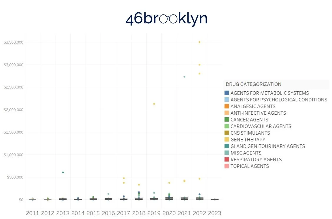
Figure 2
Source: CDER, CBER, Elsevier Gold Standard, 46brooklyn Research
This is the same thing we encountered when we first analyzed launch prices back in 2019. To that end, we modified the standard linear axis to a logarithmic scale so that we can better visualize the results. As before, we are displaying the results in a box and whisker (box plot) to better understand some of the trends (median, lower quartile (25th percentile), upper quartile (75th percentile), outliers, etc.) year-over-year (Figure 3).
The Dashboard
Visually, the data suggests that launch prices are rising year-over-year, at least under our default view parameters (displaying dollars in terms of the year they were launched, calculating launch prices based on a product basis, and not filtering out products based upon either price increases, generic availability, short/chronic use, or CDER vs. CBER status). We visually see the trend increasing based on a simple check of the median launch price in 2011 compared to 2022 (last full year). In 2011, the median launch price was $4,675 (highest was Firazyr at ~$25,000) compared to a median of $142,598 in 2022 (highest was Hemgenix at $3.5 million). However, as the great Jedi saying goes, “our eyes can deceive us; we can’t necessarily trust them.” To that end, we added trend lines to launch pricing data. Trend lines can help us ensure that the prices are increasing year-over-year like our eyes are perceiving.
The gallery below is the aggregate average for the overall data as well each drug grouping, alongside the line of best fit we could find for each, to better investigate the drug pricing trends in the dashboard.
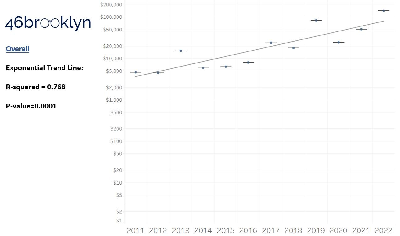
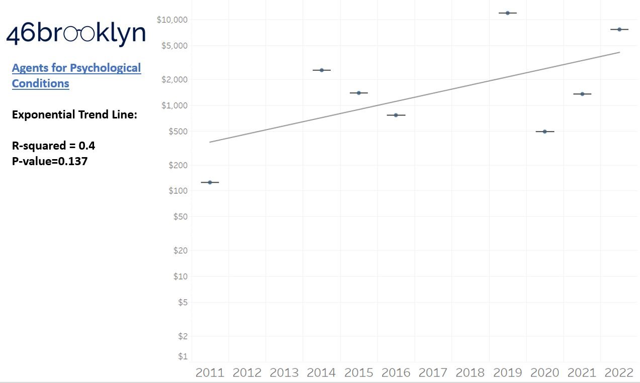
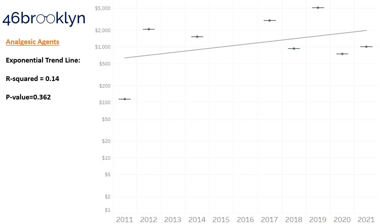
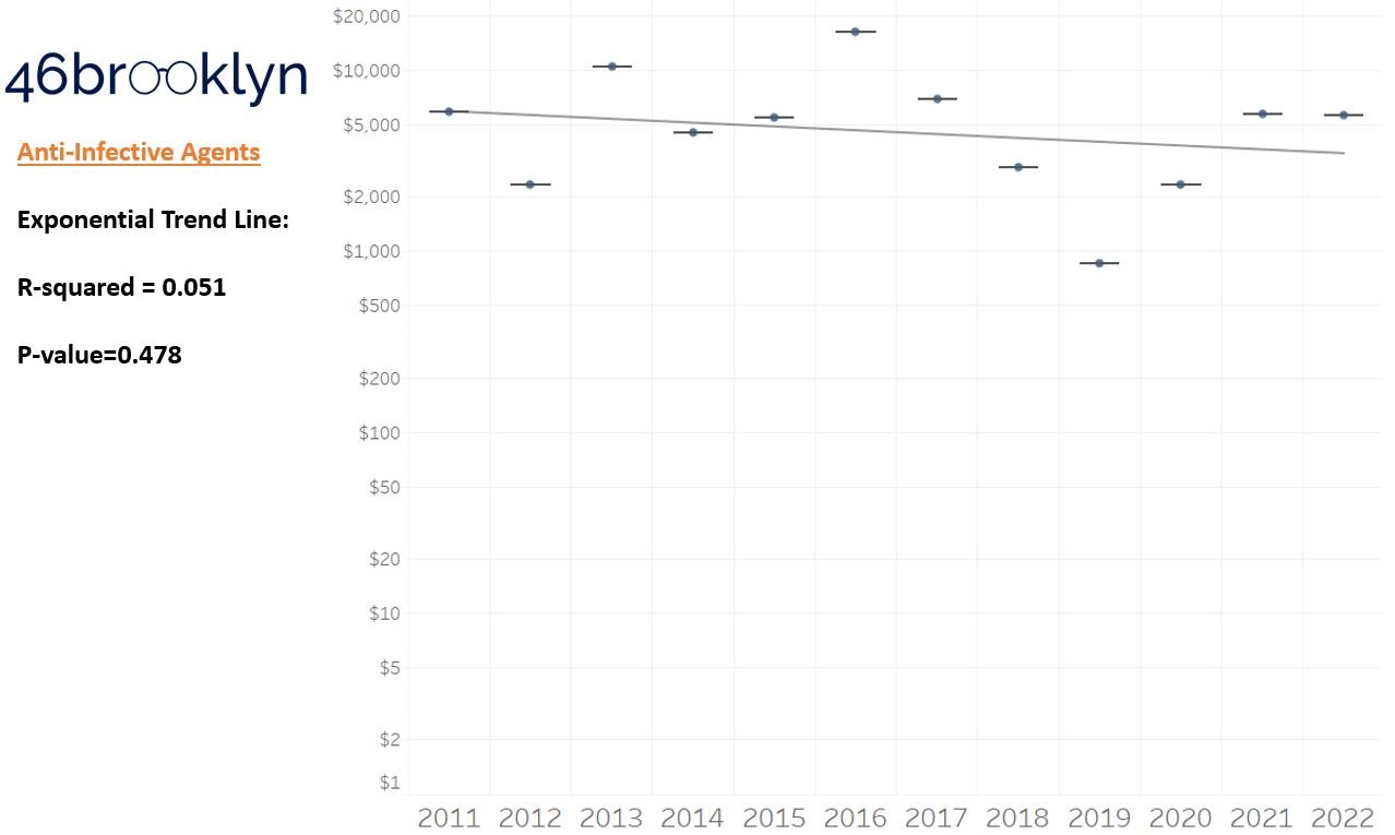
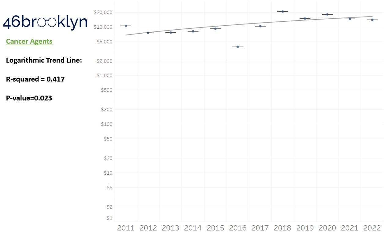
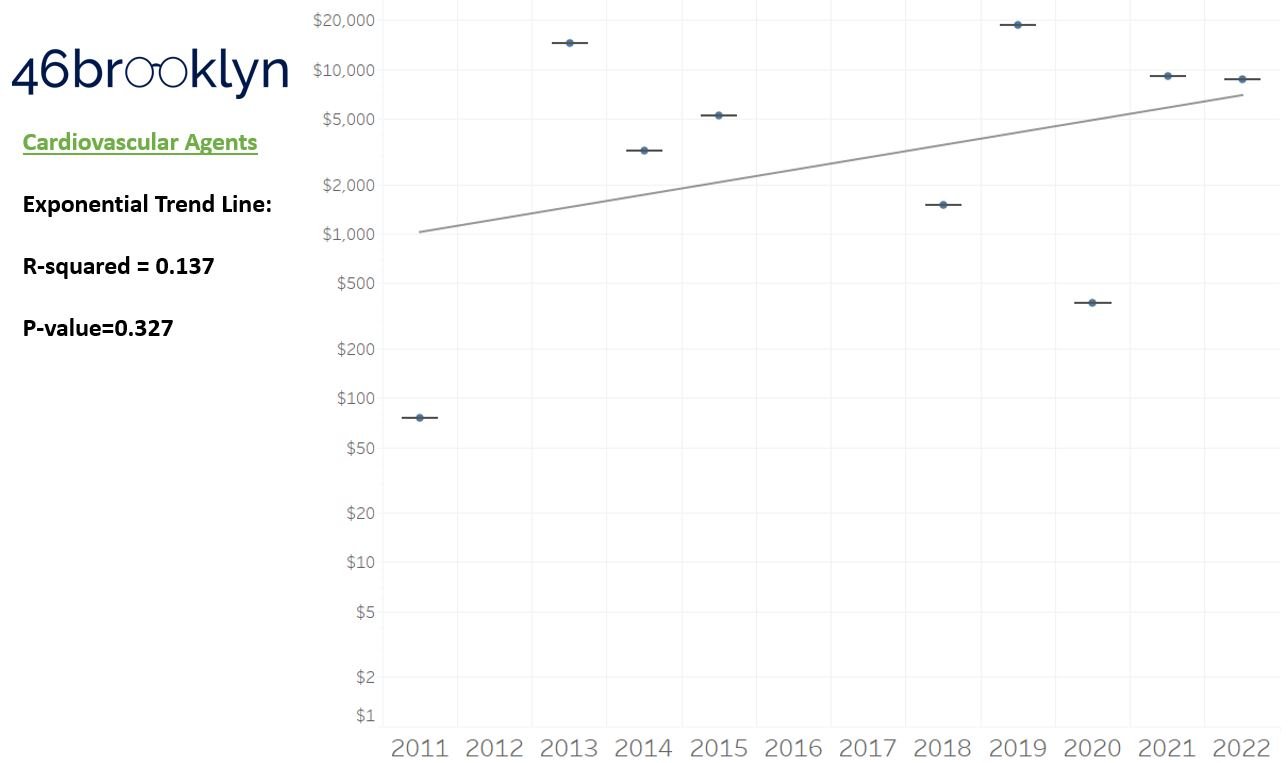
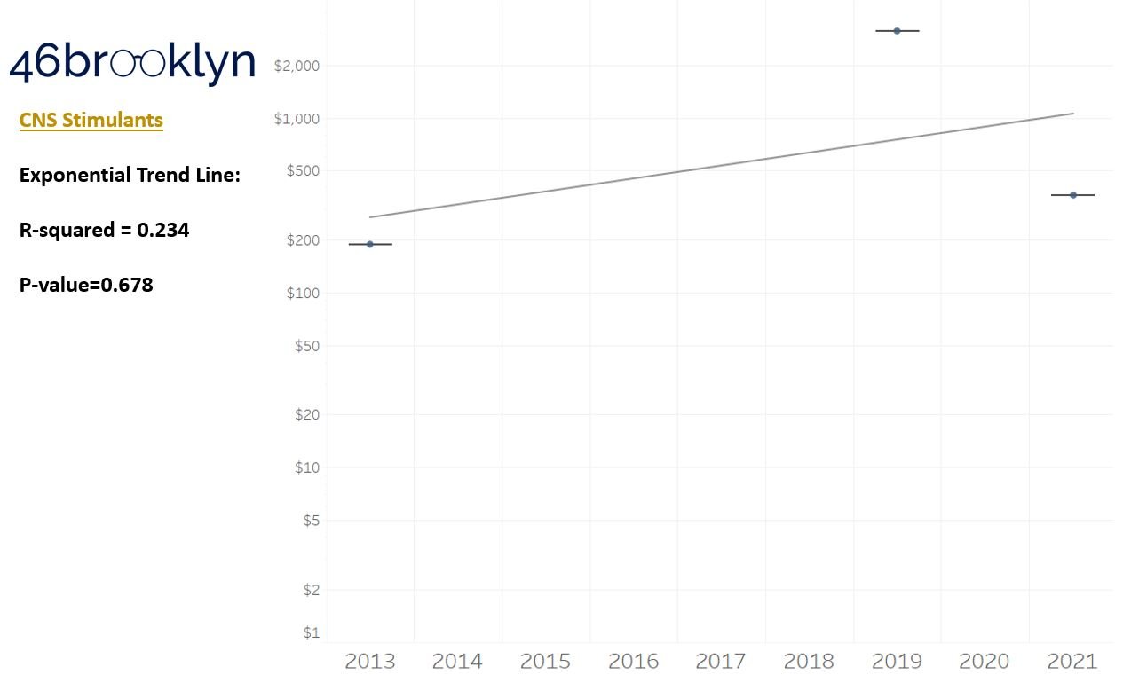
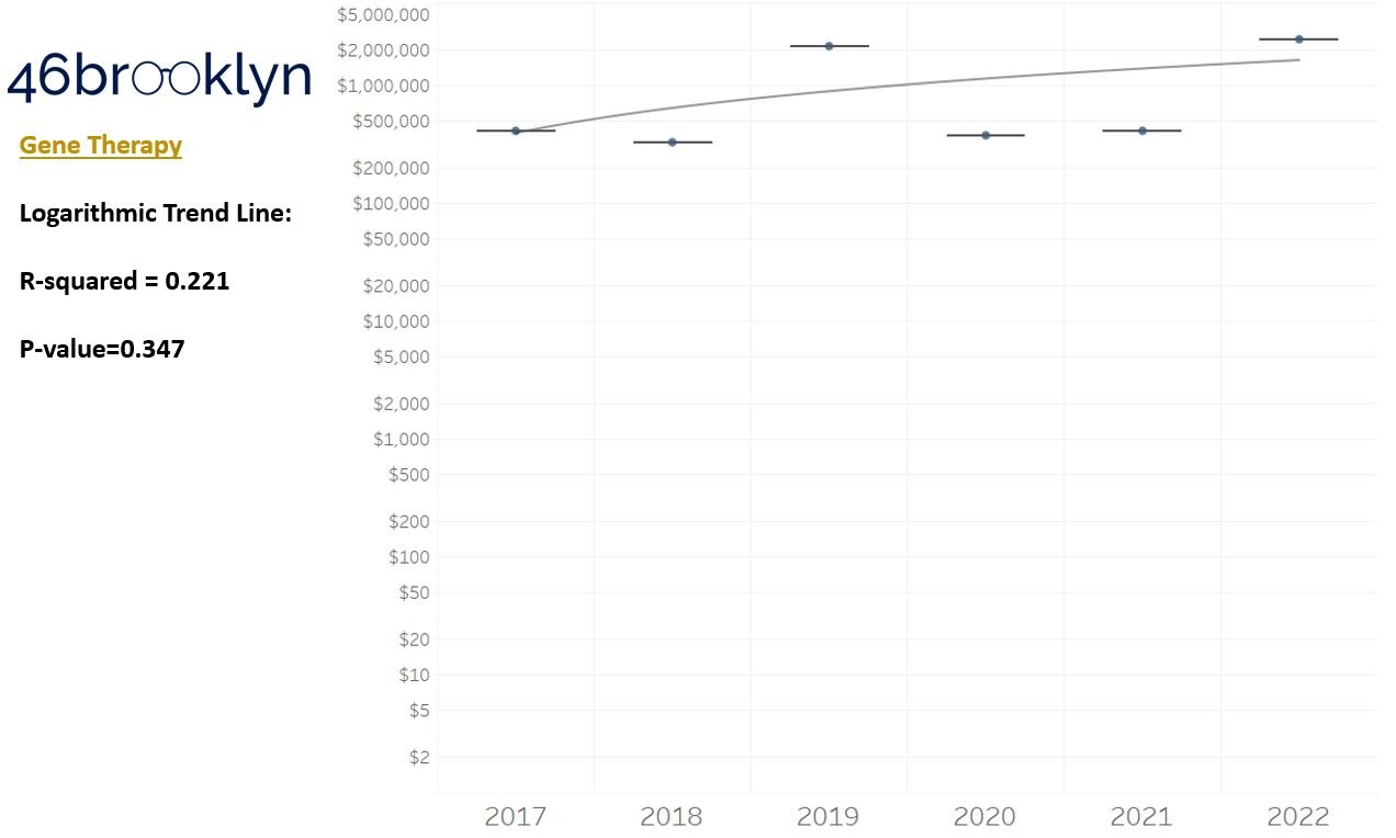
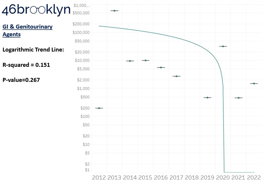
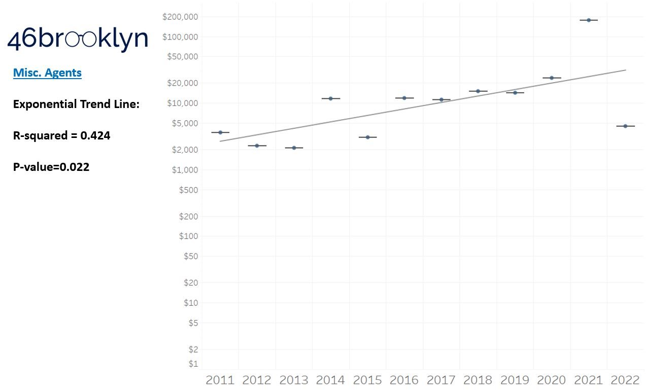
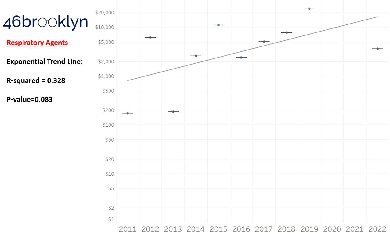
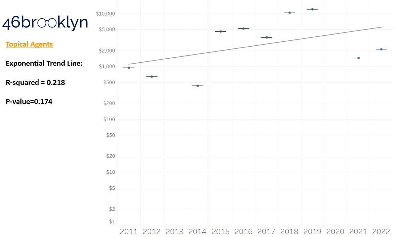

As a reminder to our high school math lessons, recall that a trend line is nothing more than a line of best fit to portray the overall direction of data over time on a graph. We use r-squared and p-values to have a better understanding of what our trend lines are actually telling us (to avoid our eyes deceiving us). R-squared gives us the percentage variation in y that can be explained by x-variables, which in non-math speak means we can understand how influential launch year is on the price value (i.e., launch prices). A value close to 0 means that our trend line cannot explain any of the variance year-over-year, whereas a value of 1 means the trend is fully explained by our trend line. Similarly, a p-value gives us a measure of statistical confidence in our trend, where the lower the p-value is, the more confident we are that the model will be valid with new data points. So, for us, this means that whether more drugs come to market, or more years elapse, the p-value gives us confidence that what are eyes are seeing would continue to occur in the future (i.e., upward trend would continue upward as new products come out).
For us, the overall model seems to be pretty clearly trending up in a way that gives us a reasonable degree of confidence (based upon p-value) that “Winter is coming; we know what’s coming with it,” and that this trend will continue into the coming years.
We think it is worthwhile to take a second for a tangent, and to consider what our real expectations with launch prices year-over-year actually are. All things being equal, it seems rational to expect launch prices to go up year-over-year. Drug companies are publicly traded, for-profit companies. Our capitalist system more or less requires that if you want to be successful, you will need to make more money this year compared to next year. We of course know that from our experience examining the PBM marketplace. So from a drugmaker perspective, as you bring new products to market, it seems rational that the price of those new products would be higher than previous products. Inflation plays a role in this phenomenon (a 2011 dollar is more valuable than a 2023 dollar), but so does the incentives of our system (make more money). Furthermore, consider where we know incentives are aligned for manufacturers. We have set incentives to make orphan drugs. If the input costs are more or less the same (same cost to develop and study and bring the product to market), but the customer base is smaller (i.e., orphan), the product will be more expensive than products with a broader reach (i.e., a cholesterol medication which we will all likely take at some point). Ultimately, we are trying only to study directional trends with our dashboard. We are not passing judgement on whether those trends are good or bad or that they are priced reasonably or not, but it seems worthwhile to set some expectation that it is likely going to be that prices go up over time. The better question seem to be, is the growth in line with the value we get? End tangent.
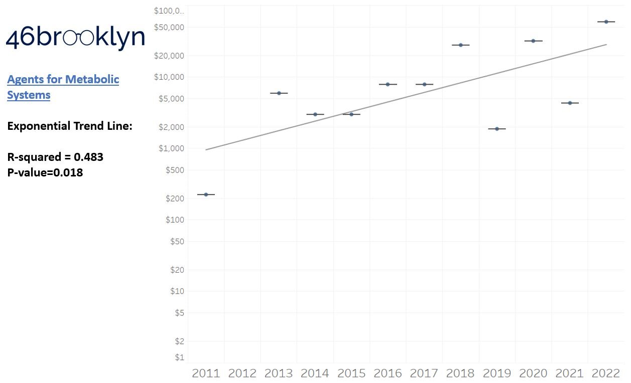
So we saw that for the overall trend, prices went up year-over-year, which more or less is aligned to our expectations. However, for each individual drug class, none of the trend lines provide a great deal of confidence that we can explain year-over-year variance (low r-squared values). This may be explainable when we consider our box plot graph, which, in general, shows that over time, the number of brand products falling outside the upper whisker of our price experience has grown, resulting in a greater potential outlier effect (i.e., more variance that becomes harder to explain). A picture might better explain what we mean here; so in Figure 4, we count the number of brand name products whose launch price falls outside our upper whisker year-over-year and display both the count of the number of products as well as identify what percentage of all launched products in a year those products represent. Again, this trend isn’t very accurate in terms of explaining variance over time, but does appear accurate when evaluating the direction of the trend over time.

Figure 4
Source: CDER, CBER, Elsevier Gold Standard, 46brooklyn Research
Returning to the gallery above, while we may not have much confidence in what variability in drug prices will be, there are is one category – cancer drugs – where we’re pretty confident (based upon the p-value) that the trend we’re seeing of price increases in the aggregate (which we’re confident in) will continue year-over-year. That said, we also know that a bunch of cancer medications get approved year-over-year. Alternatively, we see that anti-infective launch prices are all over the place, and are maybe a sign of how difficult of a time we’ve had in finding the right incentives to push development of those products.
Addressing some of the criticism of past launch price research
Now as we mentioned earlier, we are not the first folks this year to look at launch prices this year. And much as others have already pointed out, when measuring prices for newly launched products over time, the trend is upward. As prior researchers have stated, “The proportion of drugs priced at $150,000 per year or more was 9% (18/197) in 2008-2013 and 47% (42/89) in 2020-2021.” Said differently, you’re more likely to see really expensive products in 2020-2021 than you were back in 2008, hence trend is upwards. However, it can be reasonably argued that an approach to measure launch prices over time that treats each product as equally impactful to the launch price trend over time is missing some context. As a result, we want to address some of this criticism through our updated launchpad tool, which as we’ve stated, also has its own limitations. To do that, our tool allows the user to change launch price trends from a product name basis, where each product is equally weighted, to one that considers utilization to weight launch price trends. We used Medicaid drug utilization data, because it is the largest public dataset that provides NDC-specific product utilization, as well as Medicare Part D utilization and expenditure data, because Medicare is the largest federal program purchasing drugs. To be clear, Medicaid is the more robust data set and allows us to get an accurate assessment of product utilization year-over-year, especially in comparison to the Medicare Part D Dashboard data (which is not NDC-specific for some reason; keep your secrets Lord Varys). As a result, our tool provides four alternative ways to view launch prices over time: Following Yr Medicaid Rx (Newly Launched Only), Following Yr Medicare Part D Rx (Newly Launched Only), and Following Year Medicare Part D Spending (Newly Launched Only) (Figure 5).

Figure 5
Source: 46brooklyn Research Launch Price Contextualizer
How this weighting is actually performed for each of these alternative options is explained below:
Following Yr Medicaid Rx (Newly Launched Only)
Because products are constantly coming to market throughout the year, we need a “fair” way to weight utilization after launch. To this end, we decided to take our learnings from our Brand Drug List Price Change Box Score and apply them to weighting launch prices. For the unfamiliar, our brand price increase tracker (i.e., brand box score) uses prior Medicaid utilization to weight the impact of price changes. In that visualization, we use prior year data because we cannot know current, real-time, utilization trends with public Medicaid data. Ideally, we’d use current utilization to weight the impact of brand price increase, but that data isn’t available yet, so we used the best we could.
We face a similar issue with contextualizing launch prices within our dashboard. However, rather than use the prior year of Medicaid data (which wouldn’t make sense since the product wouldn’t be on the market yet and utilization would be zero), we use the year after launch to contextualize launch price trends. So this means that for products launched in 2011, we’re capturing how many prescriptions were paid for in 2012. For products launched in 2012, we capture the number of prescriptions dispensed in 2013 (and so on). Theoretically, all products launched in 2011 have an equal number of days to capture utilization in 2012 (although in practical terms, a product launched in January 2011 has more time to capture utilization in 2012 than a product launched in December 2011, but such are the limitations of the data). Public Medicaid data won’t report utilization that is less than 11 prescriptions, so for products with no utilization data, we assigned a value of 1 prescription to their utilization (this is impactful to low-use products, like gene therapies).
Once we identify how many prescriptions for each product were dispensed the year after launch, we then sum up the total prescription count for all products in that launch year (i.e., the sum of identified 2012 utilization for all products launched in 2011). We then proportion the number of prescriptions for the individual product relative to all launch products and multiply that value by the product’s launch price to get a weighted product launch price.
Yes, we know you likely had to read the above multiple times, so hopefully the equation and Firazyr example below (Figure 6) helps explain what is going on:

Figure 6
Source: 46brooklyn Research
Following Yr Medicare Part D Rx (Newly Launched Only)
As the name implies, this weighting works the same as the Medicaid version of the same name, but is using the Medicare Part D dashboard as the source of prescription drug counts as opposed to Medicaid SDUD. So you could look at Figure 6 above and replace every instance of the word Medicaid with Medicare Part D and get a sense for how the math for this weighting is working.
A decree from the virtual throne of excel: It is important to note that, as we’ve complained about before, the Medicare Part D data in the public domain is the Joffrey of drug pricing information (by Medicaid standards anyway). As a result, we almost didn’t include this view in the tool (but it became an itch we couldn’t help but scratch [plus the early screeners of the tool kept telling us to do it, so we caved; we do listen to your feedback]). To be more specific, Medicare data is not NDC-specific, so although we’re rolling up the behavior on a brand-name aggregate basis, we may be getting the weighting of product / strength / dosage form usage wrong with this Medicare numbers in ways we cannot really overcome. Secondly, Medicare data doesn’t go back very long in time. They only give us a five-year snap shot (Medicaid goes all the way back to 1990!). We have seven years, because we started storing the data on the 46brooklyn Medicare Part D Drug Pricing Dashboard, so we don’t lose data as the years go on. But even with our seven year view, we are going to have a lot less products we contextualize prices on relative to the 11 years of newly launched products that we analyzed throughout the rest of the report. Thirdly, Medicare Part D data is not the only way Medicare purchases drugs. The Medicare Part B program makes billions of dollars in drug purchases too, but those drugs are not going to be summarized in our tool due to its reliance on Medicare Part D. We’ve made a note to start incorporating Part B data into the Part D dashboard, but that isn’t going to happen until later this year. This ultimately means that we get a more complete picture of all types of drugs from Medicaid than Medicare. Again, if we had our way, SDUD would be the standard that CMS used for both Medicare and Medicaid, but alas our kingdom does not extend into their territory (heck, why collect Medicare DIR information on an NDC-basis if you’re not going to put NDC-specific information into the public domain in Medicare?!).
Following Yr Medicare Part D Spending (Newly Launched Only)
This weighting works the same as the Medicare version above, expect instead of weighting based upon drug utilization on a per prescription basis we’re weighting based upon a gross prescription dollar basis. So in looking at Figure 6, we need to change Medicaid to Medicare Part D (like above), but also switch our tallies from prescriptions dispensed to gross prescription spending. Why weight on dollars spent as opposed to prescriptions out the door? Well, because drug spending is not exactly rational (have you read our work before?), but especially so in Medicare. Far too often we see costs in Medicare far higher than in other federal programs. This happens in part because we know that DIR exists and will reduce these costs after the fact, but that alone isn’t enough to explain the differences (don’t worry, we have a dozen different drug pricing benchmarks which can help with that). Medicare drug spending can be particularly problematic in the specialty drug space, and a lot of these novel therapies are specialty drugs, so we felt adding yet another opportunity to contextualize the price was worthwhile.
We should note that the tool toggles the value of the average monthly launch price dynamically within the calculation. This means if a user selects to view dollars in 2022 equivalents (rather than as reported in the year the product was launched), the weighted price will be altered to reflect 2022 dollars.
So, with this fancy new weighting, does our understanding of launch price trends change?
Reviewing weighted Launch Price trends
Changing our filter of the data from a product basis to the Following Yr Medicaid Rx (Newly Launched Only), we first must acknowledge that we lose products in 2021 and 2022. This is a function of our approach to weighting where we don’t have utilization in the years after those products have launched to perform weighting (i.e., 2022 is ongoing and we’re not yet in 2023). That said, our understanding of the overall direction of launch price trends isn’t changing with toggling the tool to display the results in a weighted fashion (Figure 7).

Figure 7
Source: CDER, CBER, Elsevier Gold Standard, CMS State Drug Utilization Data, 46brooklyn Research
That said, there are significant changes to which products we’d identify as the most significant launch price events per year. Take a look at 2019 (Figure 8). Under the per product basis (left side of Figure 8), Zolgensma, the first $2 million gene therapy, was by far and away the most significant high cost launch product in that year. However, under the Following Yr Medicaid Rx (Newly Launch Only) basis (right side of Figure 8), the most significant product is Trikafta (whereas Zolgensma ranks as the 21st costliest therapy out of 39 in 2019 on a weighted basis).

Figure 8
Source: CDER, CBER, Elsevier Gold Standard, CMS State Drug Utilization Data, 46brooklyn Research
Why the difference? Because Zolgensma had less than 11 prescriptions dispensed in Medicaid in 2020, whereas Trikafta had nearly 70,000 prescriptions dispensed. So while only a Lannister can afford a $2 million therapy, the number of people needing that therapy is pretty small. Note that if you switch the toggle to either of the Medicare views, you still see Trikafta as the most important Medicare Part D drug on a weighted-basis (of course it’s not really a fair comparison cause there is no Zolgensma in Medicare Part D to compare to, hence why we almost didn’t include it, but can’t help but note the importance of Trikafta in Medicare).
If you’re a payer, it is easy to focus on a product like Zolgensma and be concerned about its cost (for obvious reasons), but if we assume that a payer is responsible for a patient’s care for their entire life (even though they’re not), most payers would rather incur a $2 million claim once than a $23,000 claim every month for the rest of a person’s life (for example, those ~70,000 Medicaid prescriptions had a list price of almost $2 billion in 2020, a cost that will likely be incurred year-over-year).
So while the data is largely telling the same story when weighted to products, the style and key characters in the story have changed. In no year do the products identified as having the highest launch price on a per product basis overlap with the highest launch priced products on a weighted basis. Ultimately, we feel that highlights the importance of context when discussing drug prices. That said, the dashboard still has more filters we can explore to hopefully derive greater context around what we’re seeing with launch prices.
Did any of the newly launched products take a price increase?
One of our general frustrations with the prevailing discourse on drug pricing is the consistent lack of nuance. So often, significant context is absent and overlooked, like the impact of the gross-to-net bubble and the realities of pricing markups within the drug supply chain. The public craves simple answers for a complex system, and far too often, talking heads serve up what the customer wants instead of the much more complicated and detailed reality. So when we first scaled the wall to look into launch prices in 2019 (which is itself an incomplete picture of the landscape given that we’re solely focusing on list prices), we did so because we felt that an undue focus on brand product list price increases was potentially missing what we thought was going on – namely, that in order to work around mounting pressure on price increases for existing products, manufacturers would move to list brand product prices higher at the start and just not take a price increase with the product later on. And well, much to our surprise, the data doesn’t really support that as a phenomenon upon first glance (context to follow).
According to our data, 343 of the 432 products that we have in our dashboard have taken a price increase since their launch (Figure 9). This is measured simply by comparing whether the current price of the product today is higher than the launch price we identified (i.e., the first available price). When 8 out of 10 of all products in our dashboard have taken a price increase (with some of them not even being on the market for a year, which means that they theoretically haven’t even had an opportunity to take an annual price increase after launch), then maybe our assumptions regarding launching high and never taking a price increase are mistaken. As recently as 2020, 80% of the newly launched products have taken a price increase. And it is probably too early to say that 2021 and 2022 represent real shifts away from the practice of year-over-year price increases.

Figure 9
Source: CDER, CBER, Elsevier Gold Standard, CMS State Drug Utilization Data, 46brooklyn Research
Launch price vs. list price increases?
So now that we’ve got at least one point and perspective that challenges our base assumption over the last three years, the question inevitably comes: which is it 46brooklyn, launch prices or list prices? Our understanding of whether launch prices or price increases are the more important phenomenon would probably be made easier if we had a benchmark to compare or reference between the two. Is there some arbiter in the middle we might use to contextualize which pattern of behavior is more important (i.e., higher launch prices year-over-year; or existing products taking price increases year-over-year). In attempting to assess this, we decided that, for all its potential methodological flaws, the consumer price index (CPI-U) might serve as our arbiter of truth in the conversation launch price vs. price increase. For the unfamiliar, CPI measures the average change over time in the prices paid by urban consumers for a market basket of consumer goods and services (with CPI-U being those baskets us urbanites [e.g. the majority of folks] tend to purchase). As a result, we can use CPI-U in both our launch price and price increase tracker to get a sense for how prices are changing over time for the basket of products we’re attempting to study in this report.
To that end, our first attempt was – for the subset of newly launched products that have taken a price increase (i.e., 80% of them) – to compare their launch price relative to the last price point (i.e., most current price) available for their drug in relation to CPI-U at the time. So for a product launched in 2011 that last took a price increase in 2013, we determined how the 2011 price would have increased compounded at the annual rates from 2011 to 2013 and identified if the actual 2013 price was higher or lower than the CPI-U compounded price. The results of this analysis are summarized for all products by launch year in Figure 10. What we see is that, many of the products are above what their theoretical CPI-compounded price would be; however, there do appear to be some shifts in the more recent years (i.e., 2019 on) that align with the idea that launch prices are starting to matter more and more relative to price increases over time.

Figure 10
Source: CDER, CBER, Elsevier Gold Standard, CMS State Drug Utilization Data, 46brooklyn Research
In examining Figure 10, we should keep in mind that this analysis captures cost as it was last increased and makes a comparison on the fixed window in time between launch price and last price increase. Which in keeping with our earlier example may not be entirely the right context for what we’re attempting to get at. Returning to that earlier example, is it fair to stop looking at the pricing of a product launched in 2011 that last took a price increase in 2013 in 2013? It could have kept taking price increases into 2022. And well, every year after 2013 that the product didn’t take a list price increase, it effectively took a price decrease (because the price wasn’t keeping up with the rate of inflation). To examine this potentially different context, we re-did our Figure 10 analysis in Figure 11, but this time captured the maximum potentially inflated price relative to the launch price (according to CPI-U). So now we’re comparing a 2011-launched product’s current price to the price if it would have been tied to inflation for all years since launch (an approximate 39% growth in price according to the effects of compounding).

Figure 11
Source: CDER, CBER, Elsevier Gold Standard, CMS State Drug Utilization Data, 46brooklyn Research
The overall trend in Figure 11 is not that much different from Figure 10. Both seem to indicate that as newer products have come to market, the number of new products are less likely to keep pace with inflation over time (on a list price basis). Effectively, every year these products don’t take a price increase, they’re taking a price decrease (so long as inflation is still a thing; which to be clear, the financial folks have typically wanted but just not to the degree we’re seeing this past year). Figure 11 might explain why, back in 2019, we made an argument that launch prices were starting to matter more then list price increases. Again, we already saw our assumptions about how many products were not taking price increases over time was wrong, but these new graphs might better explain the sentiments we were trying to get at. A product launched in 2021 that hasn’t taken a double-digit price increase (on a percentage basis) since launching is effectively discounted relative to its 2021 price (thanks to inflation).
Inevitably, the question becomes: are we better off if the prices were pegged to inflation or not? Said differently, how much more expensive are these products with price increases? Well, that depends a lot on which year you’re talking about and how we want to measure it. To us, since this is a per product price increase question, it makes sense to measure across a per product basis (though the results would be different if we measured based upon weighting prices to utilization). In Figure 12, we see that most products have had a price increase above 1%, but less than or equal to 22%. With median product launch prices in the thousands of dollars, these percentage increases can certainly add a lot of potential cost over time if the rebates and discounts being realized by payers aren’t keeping up with the rate of growth of the list prices. With recent data suggesting that the growth of rebates and discounts are outpacing list price growth, it would seem that with net prices slightly declining, the impact of the list price increases over time would largely be dependent on the degree with which PBMs are passing along the value of those growing list price concessions.

Figure 12
Source: CDER, CBER, Elsevier Gold Standard, CMS State Drug Utilization Data, 46brooklyn Research
But Figure 12 doesn’t really address whether these prices are keeping up with inflation. So we’ve attempted to contextualize that in Figure 13. To construct Figure 13, we’re starting in present day (2023) and looking backwards and asking the question: what is the current price for products launched in 2022, and are their prices higher than the inflation rate of 6.4%. To the extent that they are higher, how much higher is the basket of products? (This is on a product-name basis and not on a utilization basis.)
We then examined the products launched in 2021. How are their current prices relative to the theoretical increase to the launch prices compounded at CPI-U (8.6% in 2022; 6.4% in 2023; compounded is 15.6%). We did the same for the rest of the years to make Figure 13, where we can look at the blue line and see how things would have played out pegged to inflation vs. how they actually transpired.

Figure 13
Source: CDER, CBER, Elsevier Gold Standard, CMS State Drug Utilization Data, 46brooklyn Research
If you’re struggling with Figure 13 because the time line is backwards, we present the same information in Figure 14 (just ordered from oldest to newest as opposed to newest to oldest).

Figure 14
Source: CDER, CBER, Elsevier Gold Standard, CMS State Drug Utilization Data, 46brooklyn Research
In either case, we should appreciate that 12 years of data is a long time. A 2011 dollar is worth 39% more than a 2023 dollar (thanks to compounding). But drug list prices have been pretty significantly higher than inflation over time.
Of course, these are just list prices, and as mentioned previously, there are massive concessions that are discounted off those list prices, which distorts the reality of what’s truly happening with “the price.” More on that at Drug Channels. So while 46brooklyn doesn’t have great, holistic data examining what’s happening with the gross-to-net bubble, this data is at least giving us half of the equation from the gross perspective.
We could dig into this more (and maybe some day we will) to talk about what trends seem to suggest a drug is going to take a list price increase? Is it market share growth (setting higher prices to juice greater price concessions to get market share)? Is it market dominance (either within a competitive therapeutic class or in a stand-alone drug category without competitors)? Is it based on when generic drugs entered the market? Ultimately, those are analyses that will have to wait for another day, because we still have more to explore within this dashboard than just this really long tangent about what we thought we knew three years ago.
If our previous assumptions regarding higher launch prices being associated with less frequent or impactful price increases was a little bit right and a little bit wrong, are there other aspects of launch prices we should re-visit? At a minimum, it seems worthwhile to explore whether any of the products on our list have generic alternatives. As stated in the intro to this piece, presumably the basis for Medicare’s price negotiation will be for products whose exclusivity period should have come and gone, which begs the question: have any of our analyzed products gone generic?
Did any of the newly launched products go generic?
When it comes to identifying whether a product has gone generic, it is important to identify what we mean by “generic.” Historically, outside of PBM contracts, generic products were relatively easy to understand and categorize. They were products approved via an Abbreviated New Drug Application (ANDA) that relied upon the clinical information of the original NDA. However, the market has changed since the Hatch-Waxman Act gave us ANDAs. Most people, we think, would consider Lantus to have a generic alternative at this point (though they might disagree as to whether Basaglar, Semglee, or insulin glargine was the “generic” product). The issue stems from the fact that the ANDA pathway for generics wasn’t really designed to address products approved by the later refined biologic approval pathway. And so now, we have to contextualize what we’re trying to measure when we say, "does this product have a generic alternative?” For us, we’re attempting to use the term “generic” to signal whether there is a direct, interchangeable product (i.e., a product that the pharmacist could substitute without calling the prescriber). As mentioned earlier, the problem here is that states regulate the pharmacist’s ability to interchange products, not the federal government. That said, many state substitution laws rely upon FDA guidance. The FDA provides a list of products that are AB rated (through the Orange Book) for NDA products or Interchangeable biosimilars (through the Purple Book) for BLA products. For our tool, it’s these products which we term “Interchangeable Available” in our tool, though individual state laws may vary. Ultimately, our tool does identify that a few of the products (n=15) that have come to market have gone generic at this point (Figure 15).

Figure 15
Source: CDER, CBER, Elsevier Gold Standard, CMS State Drug Utilization Data, 46brooklyn Research
Of course, in looking at the results our tool is producing, we’re a little dissatisfied with what we’re finding. And perhaps dissatisfied isn’t the correct term, but when we talk about generic product availability, we’re generally talking about products whose pricing faces a more competitive marketplace than it did before the originator’s exclusivity is lost. And that is not what our flag is really identifying. Several of the products that we’ve identified as having generics available don’t face pricing pressure from competitor manufacturers beyond the originator of the initially launched brand product. Take for example the Heptatis C therapies of Epclusa and Harvoni. Both products have generics on the market, but they’re only authorized generics, and the same manufacturer that set the price for the brand is setting the price for these generics. There is no material added competition for these products – rather the manufacturer has decided to offer a product at a “generic” price without rebates vs. a brand product with rebates. While we know how the market reacted to the lower list price versions, we’ll save the discussion on that matter for another day given how long this report is already coming in at.
Our watch has ended
So that is our attempt to let you contextualize drug launch prices in different ways over last year. What does the future of drug pricing research hold? We don’t know. As you can see from this report, we cannot necessarily agree how to measure launch prices (on a per product basis or a weighted utilization basis), nor do we know whether it is more important to keep our focus on brand price increases year-over-year or switch our focus to launch prices. At the end of the day, while we’ve done our best to give users of our tool the opportunity to contextualize launch prices as they want to (based upon perhaps too many filters), none of this work accurately reflects the cost people have paid for these drugs, because that cost is highly dependent on the benefits plan they have (very little cost share in Medicaid, 25%+ cost share in Medicare and/or commercial).
Ultimately, we feel comfortable highlighting that drug pricing has been, and likely will continue to be, about context. Take for example, the identified drugs likely for price negotiation within Medicare. Based upon the methods outlined in the bill, it is relatively simple to identify what the short list of drugs is likely to be. Here is the work of Bloomberg on just that topic (Figure 16):

Figure 16
Source: CMS, Bloomberg Government
To that, let’s add some context around current U.S. prices based upon some of the largest drug programs (namely, Medicare, Medicaid, and the VA) and our favorite publicly available drug pricing benchmark, National Average Drug Acquisition Cost (NADAC) (Figure 17).

Figure 17
Source: Elsevier Gold Standard, CMS State Drug Utilization Data, 46brooklyn Research
Finally, while every country has different dynamics that can impact the prices of drugs within their borders, let’s add in some of the costs in Canada and Australia for these same products (taking the local currency and converting it to USD), which may provide some insights around where net U.S. prices may hover around (Figure 18).
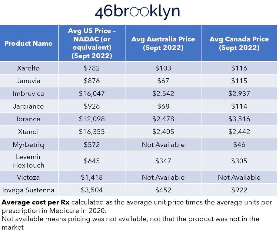
Figure 18
Source: Elsevier Gold Standard, CMS State Drug Utilization Data, 46brooklyn Research
You know what we love about this exercise is that fundamentally nothing changed from Figure 16 to Figure 18 – it was the same products with the same manufacturer-set pricing and yet pricing was so dynamic. Maybe, just maybe, an over-focus on the extreme ends of the supply chain (manufacturers and pharmacies) have left us blind to the conflicts that exist in the middle of the drug supply chain and their role on influencing price. Said differently, the drugs underlying this comparative pricing approach are the same. The pharmaceutical manufacturers are the same, and the pricing they’re setting into the market (based upon our pricing benchmark of WAC) is the same in every context and yet pricing is all over the board. Perhaps that is the greatest point we can make. Lawmakers, media, and even researchers have spent years working to contextualize drug prices based upon the manufacturer price alone, and yet you don’t need to be a three-eyed raven to see the above figures and tables and wonder if perhaps we’re missing an important variable.

The debate over Medicare negotiations is fascinating for drug pricing nerds like us, and it’s one worth monitoring the rollout to assess whether it has a marked impact on squeezing out maximum value for the drugs we pay for in Medicare, what the impact will be for the commercial market, the degree with which the incentive constraints meaningfully impact the robustness of the drug pipeline, and whatever other unintended consequences (or follow-on benefits) could arise. But even with the most positive of perspectives, we’d be remiss if we didn’t offer our skepticism that the Inflation Reduction Act is in fact the end cure for our nation’s drug pricing ailments. While there have been some great strides in Part D re-design and some overdue erosion of patient out of pocket costs in the program, much of the broader marketplace phenomena continue their unyielding white walker march. We think even the proponents of the IRA would agree that there is more work to be done. But there is likely going to much debate on what that work should look like.
In the inevitable pursuit of further reform, will we continue to focus solely on the manufacturer-set list price, or will we begin to work within our system’s shoddy plumbing to tackle some of the lower hanging fruit that may be contributing to some of the high sticker prices that so many bemoan? Or will we shift our focus away from the list prices in recognition of the fact that the costs we pay as employers, taxpayers, and patients can be somewhat or even completely detached from the list price?
Regardless of the direction, we believe that a solid foundation of holistic data is necessary if we even hope to claim the iron throne of drug pricing value.
